Home
Home

 Artists
 Search
 Recent
 Random
 Posts
Posts
 DMs
DMs
 Tags
Tags
 Random
 Importer
 Import
 FAQ
FAQ
 Account
 Register
 Favorites
 Login
Login

Comic Report #61.1 - The Hard Things (Patreon)
Content
Hello! This week I had to do a lot of traveling for personal matters and I didn't get as much work done on the comic page as I'd have liked. I always try to land on some kind of state of the comic at the end of a week where I can make a meaningful post about some aspect of the process, and where I ended up today was at the "inked, flatted and prepped for painting" phase. Inking all the characters on this page ended up taking a lot longer than I anticipated, so I thought today I might write a little bit about the things in art that I have always had difficulty with, and how that informed the way my art style has progressed over the years.
For as far back as I can remember, going way way back to public school, I've had a mental block regarding granular tedium. Very minor, repetitive details wear my brain out, so I tend to try to avoid them- I can recall an old lesson about stippling, or using a bunch of dots to create gradients, that made my brain feel like it was stuck in a vice. It's something about the act of rendering many tiny iterations of the same one thing- a dot, a line, a little U shape or hash mark- that gets me stuck in my head and makes my art feel like it's stuck in the mud, and it's been a problem for me even today. I'm not great with repetitive fine details.
Dead Winter is a comic which, I think, has a lot of detail in it. I really enjoy making it, so in reflecting on my difficulty with fine details I had been thinking about what makes this particular kind of detail easy for me to process. The process I use to paint from this current flat-grey phase to a final phase involves lots and lots of layering opacity on top of itself; when I started my comic way back in 2007 I used Photoshop's smudge tool to make my grey detail gradients, it was actually only after the first color dream sequence where smudge tooling wasn't really viable anymore that I began developing the process I use today. All my figures are on their own lighter-grey Photoshop layer, so when I want to paint an area I can ctrl+click that layer to select all the pixels in it, and then I can make really broad brushstrokes around the edge of my figure and not worry about losing my silhouettes. I like motion, and a lot of my painting is big motions and lots of constant movement. I might make all these big paint strokes over large or small areas, but I'm always going somewhere with my paintbrush and that makes my brain happy.
I think that this broader, big-movement painting style works out well for me because it means I can ink my lines in a way that compliments that style well. My working theory on painting comics is inks and tones are two elements that share the stage, like a band. One is the lead performer and the other is backup, one is the main guitar and the other is the bassline that backs it. If inks are complex they are the primary element, and simpler toning is the correct compliment to support the inkwork. If the tones are the primary element, as is the case in my work, then simpler inks frame the broader shapes that you can then flesh out with rich, complex tonework. If both the inks and the tones are equally strong they can end up competing with each other, in which case you just merge the darks of your inks into your tones and run a no-outline painting-only style and blend the two together; this is very labor-intensive, the inks help a lot with defining clear, sharp shapes and help save time in that way. If neither inks nor tones are really stand-out focal elements then it can leave a work feeling somewhat incomplete, which is why you want one or the other to be the frontman.
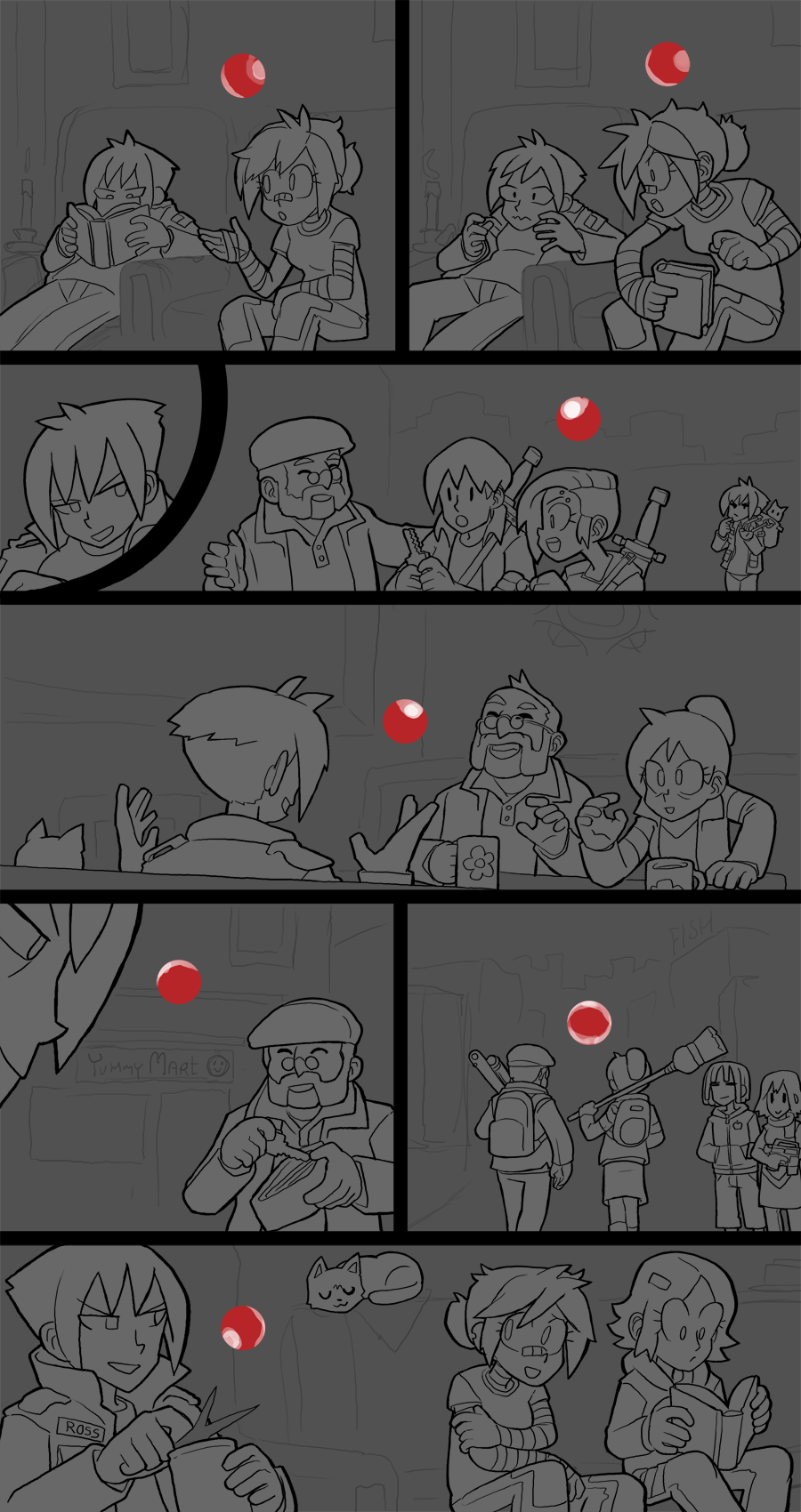
You can see in today's update how simple my inks are without any paint behind them, this is because of the above reason, I want them to frame my painting, not step on its toes. Wrapping back around to the main subject of today's post, doing simpler inks helps my brain a lot because I don't have to get into the kind of granular inkwork that makes me feel stuck in place while I'm painting. I actually employ this same method for my black & white intermission pages, framing the simple ink outlines first, but instead of painting tones I'll create another layer and start doing my toning inks below them. When I do crosshatching to achieve a sort of mid-tone shading I'll try not to cross more than two directions at once, to keep it from looking crowded, and in recent intermissions have tried to tone with only one uniform hashing direction, anything more than two starts getting too granular for me and then I fall back into struggling with The Hard Things again.
Thank you for being patient with my work this week. I'm over the inking hill so this coming week I should have plenty of time to get a lot more of this page finished- there's still a lot of individual characters on this page for me to paint but they're mostly shoulder-up shots so it shouldn't be too bad. I'll post more about that aspect of my work when I make my next report. I'm gonna try to have this page done before next Friday's update. Thank you, as always, for sticking with us and supporting this comic. We couldn't be here without you.
Files