Home
Home

 Artists
 Search
 Recent
 Random
 Posts
Posts
 DMs
DMs
 Tags
Tags
 Random
 Importer
 Import
 FAQ
FAQ
 Account
 Register
 Favorites
 Login
Login

Comic Report #59.1 - Fresh Perspective (Patreon)
Content
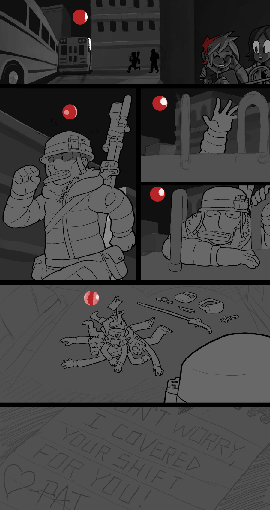
I didn't get quite as much work done on the page as I'd have liked, but fortunately there's not a whole lot left undone on this page. I expect it to be finished by the end of the weekend, or maybe sooner if I catch a burst of momentum, but even still this shouldn't take longer than Sunday to finish. Since I started painting the page and it's the last page before a scene change, today I'll talk a little bit about planning lighting for different scenes.
The scene I've been working on for the past however long has been an outdoor night scene, and before that was an interior scene with overhead lights- those are two extremes but I think they can help convey the thought process for how to convey "dark" and "light" while maintaining good readability. When I think of which kind of atmosphere I need to paint I try to think of the air within the scene as something with volume, and the light passing through that volume affects how you see everything deeper within the fishbowl space of a scene.
For light scenes, everything isn't just painted in lighter values, but rather the light diffuses outward, like when you drop food coloring in a cup of water and watch it spread out. Light creates very high contrast shapes because there's always going to be parts of a figure or object that are opposite the direction light is coming from, or interrupt the radiating rays coming from a light source, so you'll have this space where the food coloring in the water has to go around something solid, and you can see the coloring through the undiluted water but the absence of color within it is noticeable when it makes contact with a surface, like the edge of the glass. Cast shadows play a really strong role in defining light in this way, since they can really help shape the depth of a space that light is filling by defining where the light is not.
For darker scenes like the one I am concluding with this page the theory is similar, but a bit different. The atmosphere is still thick, but rather than the light filling it in the way food coloring does with water, it's more like that thick atmosphere absorbs what light there is the way cream disappears into dark coffee. There has to be some kind of ambient light for things to be visible, whether it's from distant floodlights or from the moon and the stars above, or in an interior shot the night light coming in through a window or a candle on a table- there's always going to be something creating some faint bit of light- but rather than expanding outward the light tends to get sucked up and lost, so rather than shadows defining where the light isn't, you can paint in and describe areas where the light -is-. Painting darkness in greyscale means working with a smaller range of contrast in my dark values, like if you assume 0 is pure black and 100 is pure white, then rather than working in a 30-90 range like a light scene would call for, I want to work in something like a 5-40 range, a tighter set of values accented by highlights of 60 or 80 with bright spots of 90 at direct light sources, like the floodlight bulb. To help sell the lower ambient light I even make the light outline I apply to my characters darker than normal, since there's not as much light to rim-light with.
i'm excited to get this page wrapped up because that means I can move on to a new scene with a new set of lighting rules. I have been doing outdoors night fighting for a little while now and it will be nice to paint something other than buses and stars for a little bit. Keep an eye out this weekend for a finished textless page post. Until then, thanks as always!
Files