Home
Home

 Artists
 Search
 Recent
 Random
 Posts
Posts
 DMs
DMs
 Tags
Tags
 Random
 Importer
 Import
 FAQ
FAQ
 Account
 Register
 Favorites
 Login
Login

Comic Report # 57.1 - The Quick & The Red (Patreon)
Content
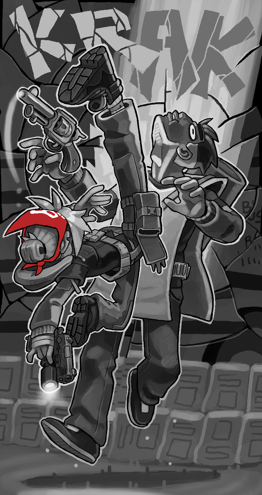
Okay so something's gotten into me with this action scene and I'm just knocking pages out real quick trying to keep the pace up. Here are the finished textless pages for the next two updates- they're going to be textless anyways but you get to see them both at once. I swear I'm not on some macho workaholic binge, I have plans to go out and enjoy New Years with my friends, so I'll get right to the write-up
The first page: I'm real happy with how all the dust and lighting effects came out on this one. I wanted to really capture time expanding to a craw. The dust cloud in panel two isn't just painting translucent white over a scene, I tried to bleed mid-tones together to give the dust a kind of thickness, like the sky, the building and the bus are very similar shades because you're seeing them through the dust.
Panel three I wanted to capture Marv pulling first so I put a bunch of dots in the background with a second-hand needle ticking away, as my attempt to try to capture the flow of time between the moments and how close they actually are.
For the flashlight panel I just darkened the outside of the light cone and selected everything in that panel except the light, painted it and then painting inside the light cone separately. Doing it this way kinda breaks up the straight lines from the outside to the inside of the cone and gives the light a sort of thickness of its own which I enjoy, sometimes I just use a translucent white brush for this but you don't get those breaks. Also, I chose not to paint any stars in the sky or the light beams from the gate bus floodlights because I wanted Lizzie's flashlight blasting Marv in the eyes to be the primary focus, and including any other light source would ruin that.
The rest of the first page is pretty standard fare. I tried to use the gunshot from the penultimate frame as a light source to kinda show Lizzie ducking low, like her shortness being an attribute in this situation like she was talking about in the pages leading up to her sneaking into the bust in the first place. The last panel I wanted to be quiet and still, setting up the page to follow.
Now, the second page! Oh boy this is the shot I've been building up to for a while now! I wanted this page to be 100% impact. When I plan a splash page I take into consideration how the page is viewed on a website- the reader starts from the top and scrolls down. The part of the comic that sticks out above the bottom of the screen is called whats "above the fold". Since this page is immediately following the last one I wanted the KRAK to be the first thing you see above the fold, with Lizzie's foot up in the air. Then, scrolling down, you can see more of the moment of impact unfold. To kinda capture the "up-ness" of the kick I made the blast of light extremely vertical; I'd planned a kind of outward jagged burst effect but that lost the singular focus of putting your foot on someone's chest and then swinging your whole body into a kick up under their jaw, so I switched it to a column of light.
That on its own wasn't really selling the force I wanted, so I tried out "shattering" the world behind Marv, like Lizzie hit him so hard reality broke around him. One of the details I like to use for a shattered look like that is to break up the horizontal lines between shards, like the glass turning slightly causes the world behind it to refract differently. Since there's lots of lines and letters on the side of the bus it's easy to capture the effect, plus applying it to the column of energy gave it a bit of the jagged burst aesthetic I originally was looking for!
When I first set up my website I wanted the background to be all black so it could serve as the outer border of my comics- by crisscrossing my panel borders all the way to the edges of my page I can get the maximum amount of space I need and then the borders kinda blend into the rest of the website, that's why I keep it all black. For this second page I wanted to really sell the shattered background look, so I started trimming off the straight lines on the edge of the page with some black shapes so that none of the shards really line up perfectly. When I put the page up on New Year's Day it should look nice and shardy against the black background.
I'm gonna put the next page up now, but since there's not really a text variant for this update to be exclusive to, you can see the whole update all at once, nice and early. Thanks for sticking with us this far, 2020 is gonna be full of big things for Dead Winter! I'll see you there.
Files