Home
Home

 Artists
 Search
 Recent
 Random
 Posts
Posts
 DMs
DMs
 Tags
Tags
 Random
 Importer
 Import
 FAQ
FAQ
 Account
 Register
 Favorites
 Login
Login

Comic Report #54.1 - Over The Mountain (Patreon)
Content
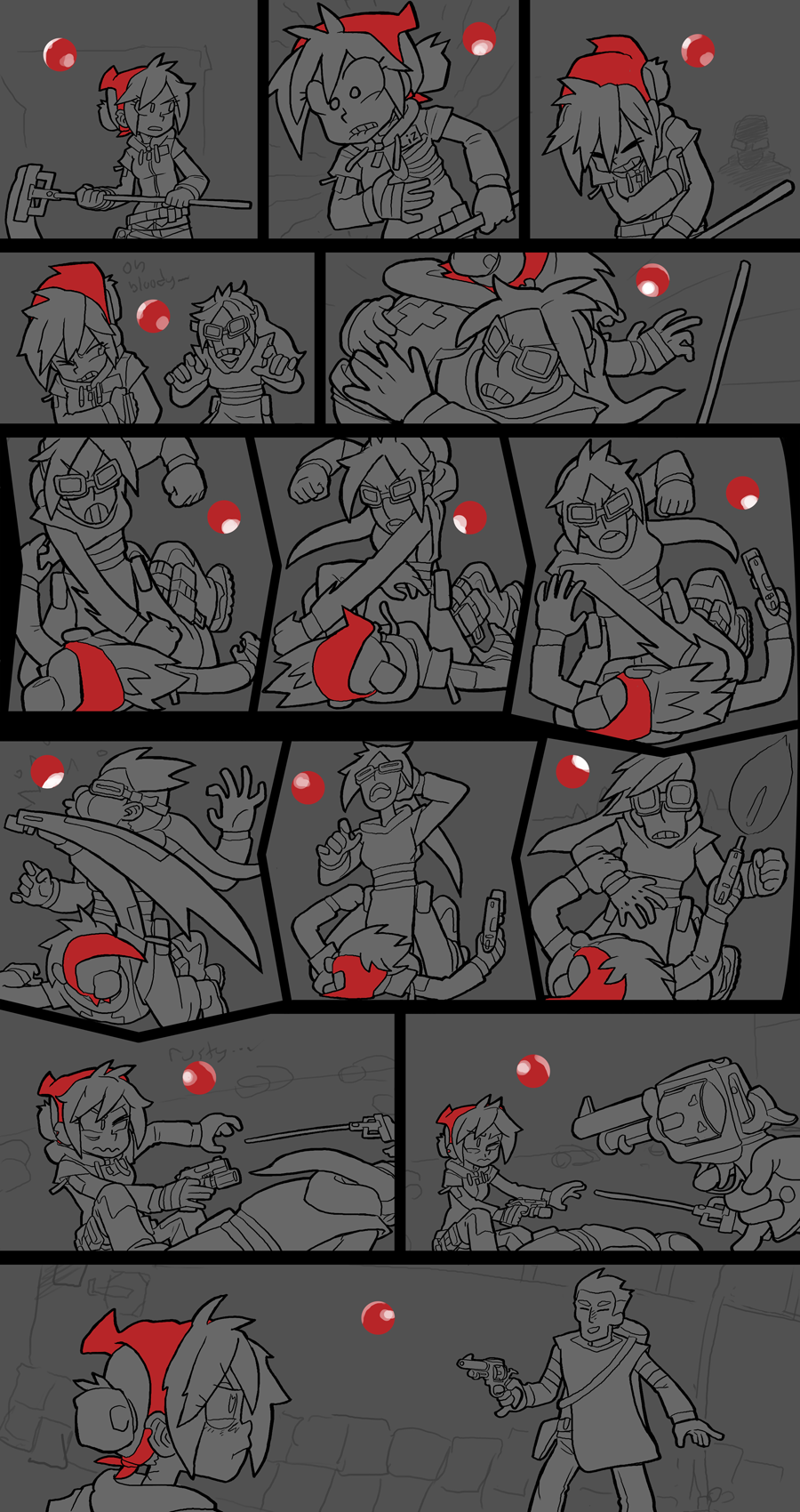
This week has been a rough one for me, I've been working on preparing for a big move to a new apartment, and this coming week I have to actually execute that move. I wanted to make meaningful progress on the comic, though, so I got it to the halfway point before all the work is downhill again. Like the last page, drawing and inking was the hardest part about this one, and when I can sit down and paint freely again I should be able to knock this page out in a week, if the last page was anything to go by. For now, though, I'll write up a little shop talk about what I'm planning for this page. This might be a short update this week since I'm extremely tired but I always want to have something for you.
When I sketched out this page I had the second panel plotted as an inverted color panel, with my sketch-red color for the background and white pencil art for the details. I want that second panel to have a strong emphasis as a turning point or a dangerous event, but when I prepped it in my ink-and-midtone phase I lost all of that impact I had in the sketch stage. I have a plan for how I want to re-implement that impact: I want to add a spot of animation!
Over the course of the comic I've tried to implement animation sparingly, once every so often and only for points I want to really emphasize. I have a set of internal rules I use when planning animation in comics:
1) They should be used sparingly. If I let every page or too many pages be animated then the animation loses its appeal and it just becomes part of the core formula of a page. In close to 600 pages of Dead Winter I've only done 20 animated pages.
2) The page should be able to read without the animation. This is my most important rule- if the page layout depends on the animation to function then I'm not letting the comic format do its job! An animated panel is just a static panel with a few red underlines drawn underneath it, not three panels rolled into one.
3) The animation should try to achieve an effect I haven't used before. In the past I've tried to have animation represent blurry blood-loss vision, a subtle not-dead finger twitch, flashing cop car lights, nervous smiling, stereoscopic 3D and more. I don't want the element of animation to keep "doing" the same thing over and over again, I want to try to find a new use for it. This helps me justify its inclusion in a page.
I've actually done a rib-pain animation panel before, on page 282. That one involved a flickering X-ray overlay on top of static art emphasizing the acute pain in Lizzie's rib injury. Doing another rib-pain animation is meant to call back to that panel, but I need to do something else to achieve that effect so it abides by rule #3. My plan is instead of trying to capture the acute sting of pain, I want to capture a big wave of pain radiating outwards, like when you pull something and then your whole body feels it. In my mind I can see a kind of TV tracking error effect combined with a translucent ghost image that grows in size as it becomes transparent, centered on Lizzie's injury spot. It might not make sense in words right now but you'll see it when it's ready. If I get it right I should be able to call back to the last pang of rib pain but emphasizing a different aspect of that pain with a different animation technique.
This week I'll be packing and moving so I won't have too much time to draw until I'm settled in again. I am going to try to tackle some small gamedev animation stuff, so I will still have something new to share with you next week. After that, though, normal workflow should resume. Thank you for your patience, I'm excited to see this scene through to its conclusion!
Files