Home
Home

 Artists
 Search
 Recent
 Random
 Posts
Posts
 DMs
DMs
 Tags
Tags
 Random
 Importer
 Import
 FAQ
FAQ
 Account
 Register
 Favorites
 Login
Login

Comic Report #53.1 - The Mid Stage (Patreon)
Content
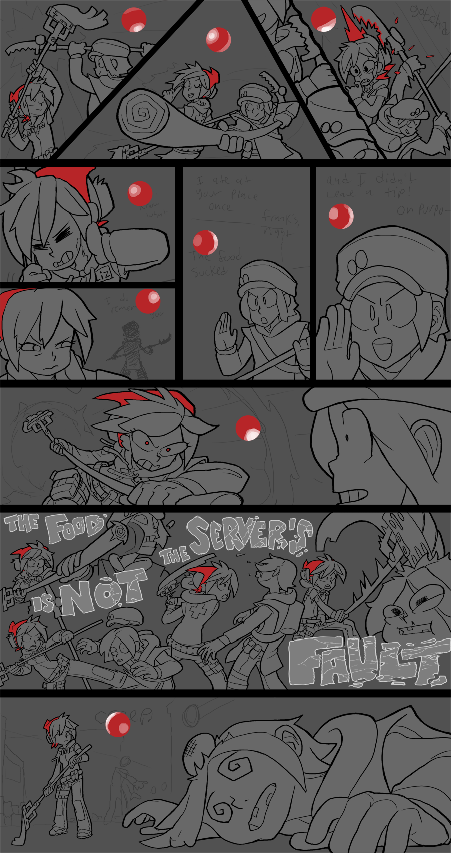
This weekend I had to do some traveling, so this week I just got the inking and flatting for the comic done. This was the hardest, most labor-intensive part of the comic, though, so the rest should be cruising downhill on a rocket sled; I expect to have this page finished for next week's Patreon update. Since the page ended up on this pristine sort of mid-phase inked-but-not-painted stage this week I thought I'd talk about how I structure my comics, to try to make my process as streamlined as possible.
To start out, here is a look at how the layers on any given comic page are structured in my Photoshop files:

I usually don't label them but I thought it would be helpful for the purposes of this week's update to help make sense of what everything actually is. I'll go through them in the order that they're created.
The first thing I do on any page is block out the panel border. I think I mentioned this recently but I think of horizontal panel groups in terms of "paragraphs", so I begin with horizontal lines and subdivide from there. Since my website has a black background I don't include any outer panel edge, so there's no wasted space on a page, the black website background serves as the comic's outer borders. I usually don't mess with panel borders too much, which is why it's at the top of the stack. Everything goes on beneath them and it keeps my panel shapes nice and clean.
Once my panels are blocked in I'll create my base sketch layer. This is what you see when I post my sketch phases on here, this is the rough primordial phase where I'm hacking in my figures to get the page flow just right. This phase usually takes me a while because I spend a lot of time getting camera position and camera movement just right- the gap between panels represents the time between one camera position and another and I always try to give my pages a cinematic flow. One of the rules I use a lot is to frame shots to flow with how a reader's eyes move across the page. Since most peoples' eyes will start in the top left corner and scan to the right and down, in any kind of interaction- either speech or action- you can put an aggressor or initiator on the left side of the panel and the defender or recipient on the right side, this way as the eye scans across the panel you follow the momentum of what's being conveyed in the comic. This is why in earlier pages when I had Lizzie slide-tackle the ponchos she was coming in from the right, it was a surprise attack going against the eye's movement on a page, and the subsequent pages have mostly had her on the left side attacking rightward. All this is plotted out in the sketch phase, and that becomes its own layer.
You'll notice there's a little sublayer next to the base sketch- this is a masking layer. When I get to the outline phase I drop my base sketch layer opacity to 30% and ink on a layer above it. The opacity drop makes it easier to tell my ink lines from my pencils, since even bright colors can have enough intensity to compete visually with black inks. When I finish inking a panel, I go down to the sketch's mask layer and black out the sketch. A mask layer basically makes parts of the layer selectively invisible without actually deleting it, so like if I wanted to doublecheck the sketch I could go onto that layer with a white pencil or just erase the mask and the pencil lines will be restored, but since at the moment I'm done with the sketches I have the character sketch knocked out while retaining the background sketch for later.
Inking on this layer is a bit like bringing the drawing into focus. The sketch is loose and has a lot of energy but I need my inks to be precise and clean, so when I ink a rough patch of sketch I'm kind of condensing all that pencilwork into a curated "average" line, pushed towards where I want it to be. Also, a while ago I adopted the practice of sketching in that red and blue since penciling in greys made it harder to see my inks. My photoshop color swatches look like this:

White, a light grey, a dark grey, a mid-light grey, mid dark grey, super darks, black, my red color (pantone 180C is Dead Winter Red) and background grey. The four white blocks are just spacers but the blue and red are my pencil brushes. I'll primarily sketch in red and if I need to clarify something in a sketch, like it's super rough, I'll go over it again in blue right on top of the sketch and that helps me easily pick what I'm doing out of the rat's nest of pencil scratches.
When my inks are done I'll create my characters layer, which is a layer of flat grey where I block in all the base midtones for the main subjects of a comic page. There's two reasons I do this- the first is because when I want to paint I like to build outward from a midtone value, rather than build up from black or down from white, I can pull shadows out and build highlights up from this base midtone. The second reason is because if I have all my character flats on one layer I can ctrl+click that layer and Photoshop will select all the active pixels, i.e. all my figures, and if I ctrl+H to hide the little marching ants selection outline I can now paint fast and loose on the edges of my figures and none of my paints will go outside where I want them to be. This has become a big efficiency mechanism for me over the years, blocking in a silhouette on its own layer, ctrl+clicking that layer and then going really fast and loose with my paints being restricted to the exact silhouette I plotted. It's a small amount of prepwork that pays off in the long haul of painting a comic as complex as this one.
Once the character silhouettes are plotted then the process picks up in pace tremendously, that's literally the tipping point in workload. Between characters and base sketch I drop in a background layer. This uses the midtone grey at the end of my color swatches, it's a darker midtone than the one I use for characters so the figures themselves pop more in my work process. One of the things you want to do when you build a painting is "neutralize the white", which means get rid of all the intense white context around your main subjects. White is a powerful hot color, you can't choose a color brighter than white, so if you want highlights in your subject to pop you need to get rid of all the intense pure white around the subject so your highlights have some headspace to actually be the brightest points on a page. I'll save dropping the background in for after I paint in my character silhouettes specifically because painting in silhouettes on a bright white background lets me see any little gaps or missed spaces and be sure my flats are edge to edge under my linework. if I did the background first and painted the lighter figures on top afterwards the lack of contrast would make it hard to see these gaps, so in that moment the intensity of the white background is useful, but once that usefulness expires its time to neutralize the white.
Remember when I mentioned how I keep my masked sketch layer on hand for later? After I drop in my background I'll duplicate the base sketch, flatten it and drop the brightness and saturation to make faint grey lines which becomes the bg sketch layer. When I get to painting, which happens directly on the background, this layer is my guide to know where I blocked in my background shapes. I don't mask this layer, I just delete chunks when I finish painting a panel.
After that I'll ctrl+click my character layer, create a layer above that and paint in all my red elements. Depending on who's in the page it's usually Lizzie or Monday, but I put the reds on their own layer up front just so I can paint sloppy underneath them and not have to worry about paintover. That's a theme of my process, is creating these hard edges for specific elements so I don't have to worry about stopping as much. After THAT is done I create another layer between the bg sketch and the characters for light spheres. This is my favorite little element to share, but before I start painting I make little circles, ctrl+click them and blot in white highlights to turn them into rough 3D spheres. This gives me a sense of where my light sources are in that panel so when I go in and paint I know exactly how I want to model my figures; I used to not use these and I would paint and redo sections trying to get the lighting right, but just taking the ~30 seconds to knock out a bunch of light spheres makes the painting process 100x easier since I can be like, okay, the main light source is from the back and reflected light is on this angle, got it.
At this point the page is usually ready to go. For this page in particular, however, I have two extra layers for the big bold text and its outline in the penultimate panel. I want those to be big and bright but kinda rough so I have them separated as their own elements; the outline is just my pencil sketches blackened out and the text is a layer I can ctrl+click to rough paint the interior of. By not having it attached directly to my character or outline layers I can do all the changing and erasing I want without worrying about making unwanted changes to my primary layers. Everything is compartmentalized for maximum speed.
Anyways, that's the big write-up on my comic construction process. Since this page is a lot of action and the background will mostly be whooshy energy shots this thing should be a breeze to knock out the painting for, the hard part was just the planning and prep work. I'll be working on this all through the week so there should be a big progress update, if not an entire comic, ready by this time next week. Thank you for your patience, I'll report back again soon!
Files