Home
Home

 Artists
 Search
 Recent
 Random
 Posts
Posts
 DMs
DMs
 Tags
Tags
 Random
 Importer
 Import
 FAQ
FAQ
 Account
 Register
 Favorites
 Login
Login

Comic Report #49.2 - Ready For Action (Patreon)
Content
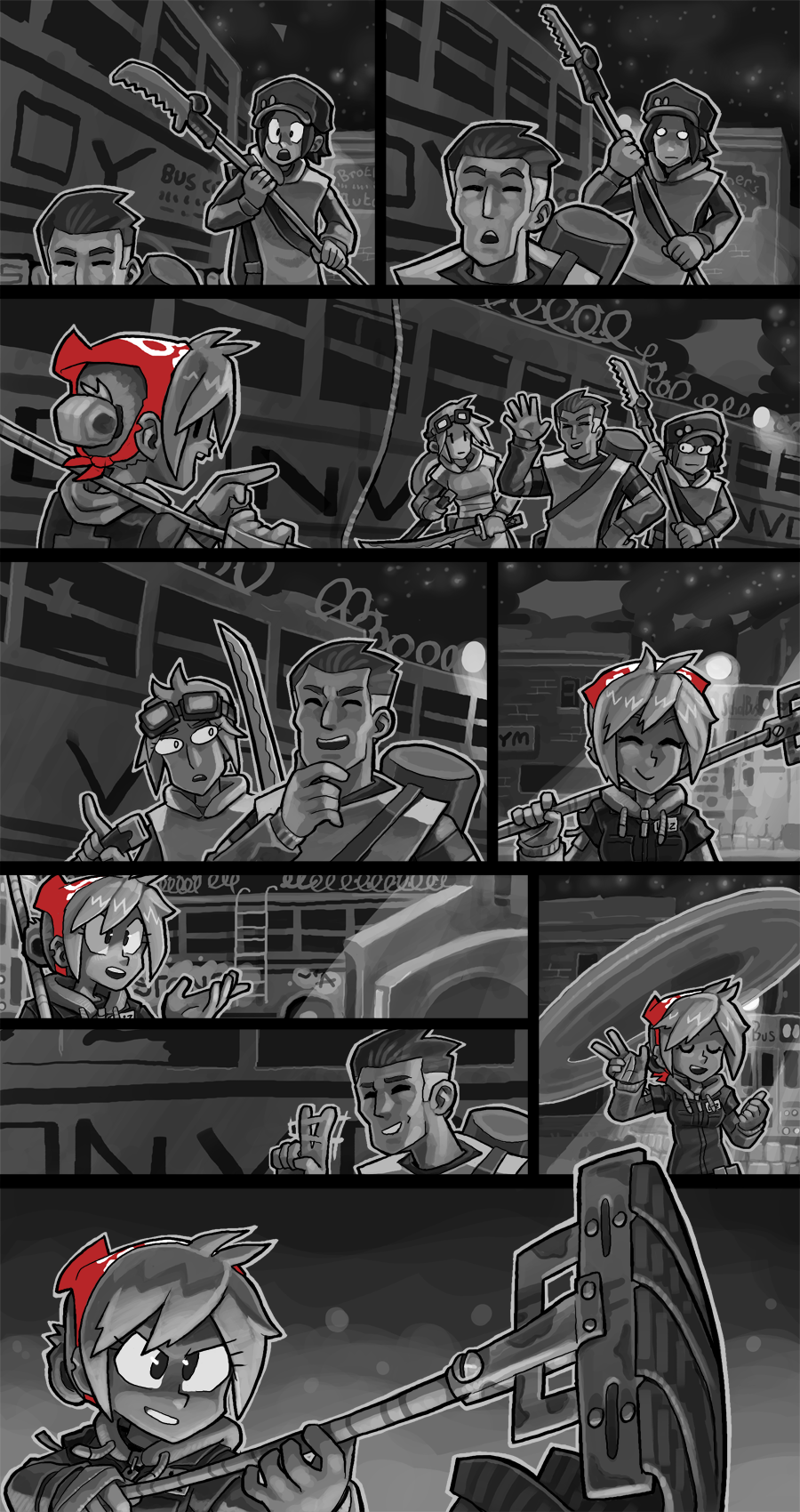
Here is the customary textless version of this page before I do all the letters. Normally after I post these I'll set to work actually writing the dialogue for a page, careful with my word choices to make sure the text fits around the main subjects' art without covering them up too much. I always try to prevent covering up my characters because I think the depth and form from all my painting pops best when it's not obscured by any other layers.
As mentioned on Friday the text for this page is already written, so it's just a matter of me popping over and inking it all in. When I started making this comic I used a free font for all my text, but some time ago I wanted to start hand-lettering my pages, so the entire page would look hand-drawn and there would be no digital-looking elements to it. To maintain the font size and kerning of the prior pages that did use a font, however, I still use that same font at the same size when I type up and position my text boxes. I treat it like a kind of Ames guide, and when I'm satisfied with my text placement I compress the font layers, drop the transparency and hand-letter overtop of them. I don't directly copy the font itself, I have my own technique for hand-drawing letters- one of the details I do enjoy about this method is it lets me distinguish between the capital i that has the crossbars like a sideways H and other capital i's that look like lowercase L's. The crossbar version is exclusively meant for use as the pronoun I, as in "me", and this distinction from sentence-leading capital-I letters is one I prefer to make where I can.
Anyhow, I'm going to jump right back to work to get this page up as soon as possible. I'm a bit behind my "one page every 30ish days" mark I try to keep up but getting it posted within the calendar month is my next-best backup goal. Thank you for your patience with my work, as always. I couldn't do any of this without you.
Files