Home
Home

 Artists
 Search
 Recent
 Random
 Posts
Posts
 DMs
DMs
 Tags
Tags
 Random
 Importer
 Import
 FAQ
FAQ
 Account
 Register
 Favorites
 Login
Login

Comic Report #48 - Dramatic Confrontation (Patreon)
Content
This week I'm back on comic duty for another page. I got some gamedev stuff squared away so I'll be working on the comic until its completion again. Splitting my work time up into two projects has made things slower than I'd like them to be, but I still plan scenes and encounters the same way I always have, so even if I can only get one comic page a month done I have the whole scene planned out in thumbnails so I know the pace I need the comic to move at and what kind of moment each page needs to capture. There's a few fun layout details about this page I'd like to post about so I'm gonna jump right into it.
The main goal of this page is to set up a confrontation between Lizzie and the Yellow Poncho crew, whose conflicting interest I set up on the previous page. I also want to establish Alice and Stacy's position relative to the scene, so when I include them in a fight the reader can figure out where they're coming from. One of the main details here is that since they're high up there's a blind spot where they can't see, and that's how the Yellow Ponchos could sneak along the wall to find the rope to get into Tombstone. This is a point I want to highlight later, but I'll get there eventually.
Whenever I lay out a page I try to be conscious of the panel layout, since I don't want two pages in a row to have the same panel sequence I try to think of creative ways to break up action in a way that's unique. Having a really wide first panel to establish a page with has been really useful in my later comics, since my panel structure is so tall I can fit one shot in at the start and have room to pace the page below it, it's a really convenient shape to start with. I try to be conscious of this, though, and not lean too heavily on starting every page with a wide shot. Since I've been posting just the first panel of my comic when I post an update notice on social media I've built a backlog of crops of first panels, and you can see the trend when you look at them together:

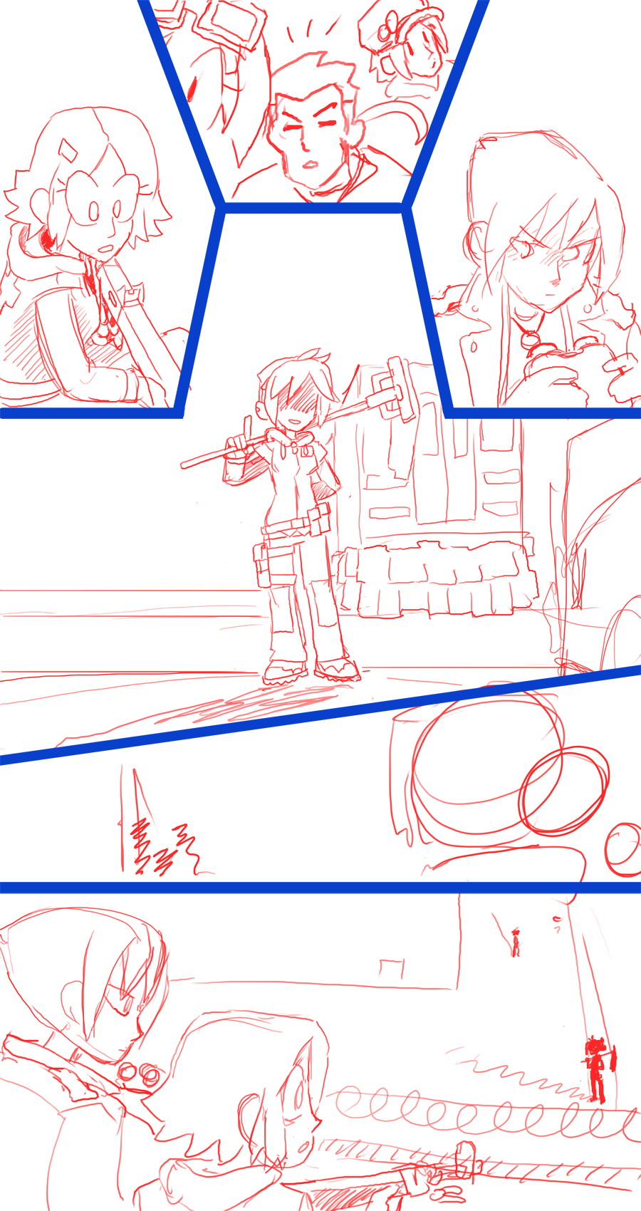
The past few pages I've been using the wide shot so I need to break it up with something different. For this page I'm starting with a really atypical layout, arcing three reaction shots around the top of a larger central shot. This is meant as the followup to Lizzie shouting HEY! to the poncho gang on the previous page, and different characters also in the scene reacting to it. The way the panels are set up like a square arc, the four horizontal panel border lines are all pointing towards Lizzie, so it's like drawing the eye to the center of attention on the page.
The panel below that central shot is the one panel I'm not 100% sure how I want to approach yet. I had thought about if Lizzie is introduced in the shot and the camera zoomed in on her face to deliver a witty punchline, but over the past dozen pages I feel like I've used the close-up eye shot a lot, and I have a need for a close-up face shot in a future page, so I don't want to lean on that shot too much. At the last minute I switched it to a pivoting camera looking over Lizzie's shoulder, before the camera shifts up to Alice and Stacy's position, that way what each character sees can be contrasted against each other. Now that I'm typing that out that makes a lot more sense, and after I post this update I'm going to hop back in the lab and develop that a bit more. That's one thing that really helps me about these Patreon posts, is gathering my thoughts into text to solidify all the floating images that go on in my head.
This page is a fairly simple one, meant more for a single dramatic shot than for a long sequence of action or dialogue, so I expect I should be able to finish and post it in fairly short order. I'll be working exclusively on this comic until it's done, since once I get into a gamedev or comic painting groove it's more efficient to ride the momentum for a while. Thanks for sticking with us, I'll have more to share next week!
Files