Home
Home

 Artists
 Search
 Recent
 Random
 Posts
Posts
 DMs
DMs
 Tags
Tags
 Random
 Importer
 Import
 FAQ
FAQ
 Account
 Register
 Favorites
 Login
Login

Comic Report #47.2 - The New Guys (Patreon)
Content
This week I continued to focus entirely on finishing up the comic. We had a small bit of gamedev progress but it was all coding, I didn't animate any new assets. I did make a lot more progress on this page than I thought I would, so I will post a bit about that!
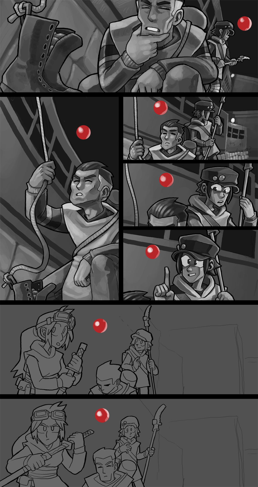
Every now and then when I am in a hurry to get work done quickly- usually when I'm already late- I'll paint in a method where I'll just leave the backgrounds ~80% finalized and then sweep back through at the end to do a fine detail pass all in one go. The scene on this page is mostly shot against the bus wall with no ground detail to worry about so that would mean just blocking in the lighting, getting it pointing towards the main sources and then coming back to paint the CONVOY Bus Co. logos on all the walls. I'm also leaving the sky to do later because that's pretty easy- when I leave the sky one flat color, then when I come back I can use Photoshop's Magic Wand tool to select the area and just paint in all of the starry sky and Milky Way blotching very sloppy and fast without worrying about painting over edges onto other details. A lot of my painting workflow works in this way, where I paint a flat silhouette on its own layer (like all the foreground characters) and then I'll ctrl+click that layer to select it, and ctrl+H to hide the marching ants and then just paint right over what I need, keeping my silhouette pristine while blobbing on my shadows without having to slow down for edge details.
Painting Yellow Ponchos turns out to be easier than I remember, especially in a dark scene like this one. Having this one big coverall item of clothing is very simple to block in lighting on, and the fact that its so bright makes them pop against the background very clearly. I've been trying to make sure their clothing underneath the ponchos are medium to darker values to help the contrast with the lighter poncho appear stronger. The person with the pruning saw has a particular kind of hat I was referencing off the top of my head, it's like a captain's hat, kind of softer and less structured than a baseball cap. When I drew it it was a nice big shape, but now that I have to draw them in close-ups I'm learning how to actually paint all the soft facets of that shape according to the two main light sources in the scene. I'm breaking the curved parts down into more defined facets, like a kind of flattened top half of a d12, to try to make it to read more correctly. Sometimes curves can appear to lose definition, being just infinite shading and blending, so turning a curved line or a curved field into a few flat faces with subtle corners can make a boring shape into an interesting one- this technique works very well on circles and rounded curves as well, try drawing them as a few straight lines instead!
The other week I predicted I should be done with this page by Monday night or Tuesday morning, I think that deadline is still in effect. The last two panels shouldn't take me too much time to paint in, and then I'll have another textless finished page post to share with you. Thank you for being patient, we're almost back on track!
Files