Home
Home

 Artists
 Search
 Recent
 Random
 Posts
Posts
 DMs
DMs
 Tags
Tags
 Random
 Importer
 Import
 FAQ
FAQ
 Account
 Register
 Favorites
 Login
Login

Comic Report #42.2 - A Light In The Dark (Patreon)
Content
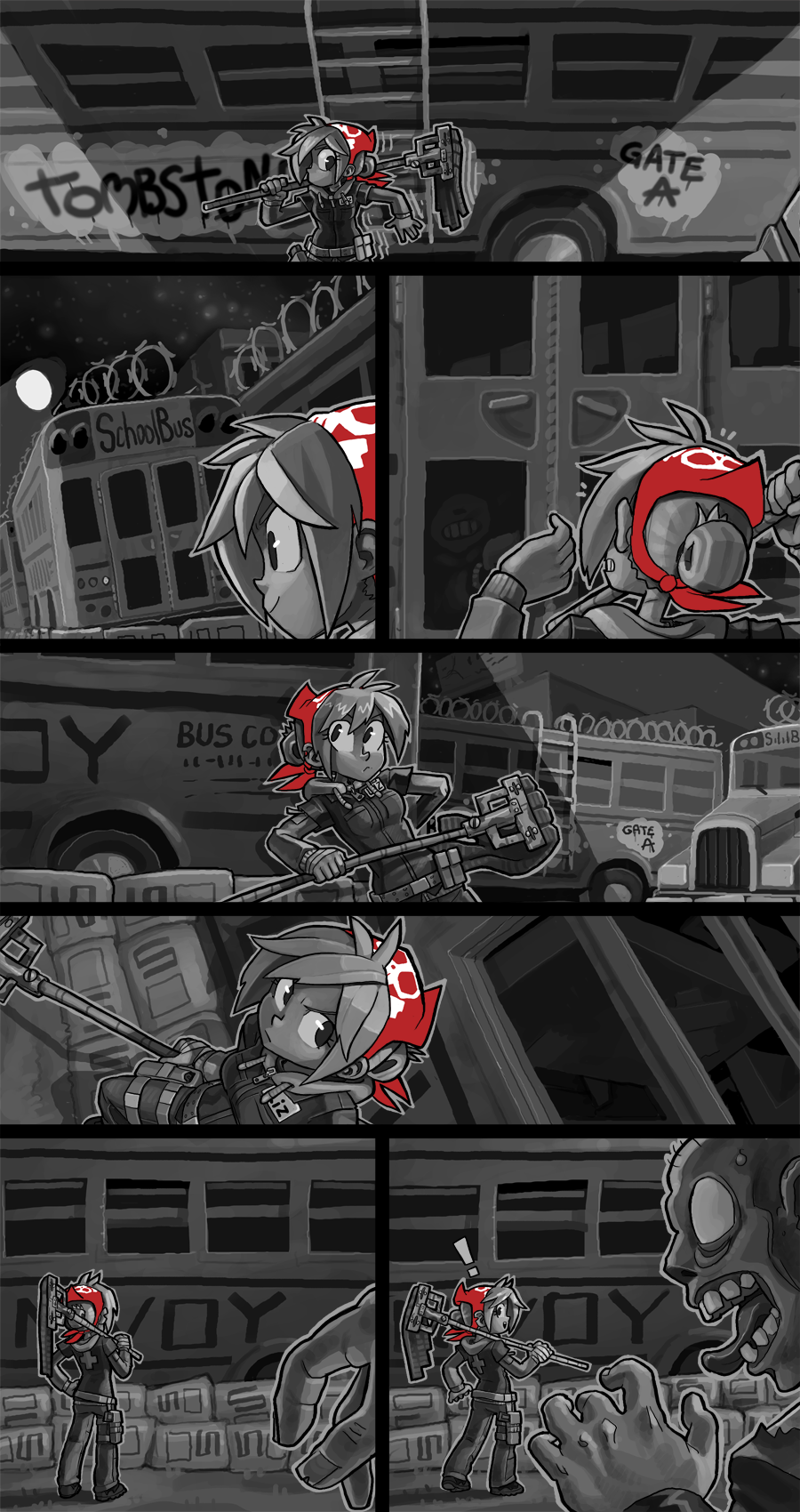
This page is a lot of single fixed lightsource illustration that I love to work on but there is one panel in particular that I think captures something I don't often talk about. When I draw action pages like this I tend to use a lot of Dutch angles, or tilting the camera so what's going on in the panel isn't parallel to the panel borders around them. This achieves two effects- the first is that it makes a shot look more dynamic, which I think is the biggest reason anyone uses Dutch angles. The second reason is my favorite reason, though: it lets me fit more space into a narrower space. I guess a way to visualize it is, if you imagine a square. You draw a vertical line from the top to bottom of the square, it is X units long. But if you draw a line from one corner of a square to the other, it's Y units long, and Y is always longer than X. Panel 5 in this page is a perfect example of this- I wanted to show the open bus window high above Lizzie's head, but I also want to draw her body and the ground below her and not just the top of her head underneath the window, so instead of building the page around the X unit length, I angle it in that wide rectangle and use the Y unit measurement and I can fit a lot more vertical height in a smaller space.
Here, look at this!

When I rotate my canvas to draw better straight lines you can see more of the "height" of the panel on an angle where the ground is more perpendicular to our line of sight. Blacking out the space around it to make a square you can see the "true" size of the shot I fit in the slimmer panel, just by rotating the perspective on an angle to go from corner to corner. It's very effective and I use it all the time to squeeze more depth and space out of my shots, and I thought it would be a fun element to pick out and highlight here tonight.
I'm going to get back to work typing text and lettering my page. Thanks for reading!
Files