Home
Home

 Artists
 Search
 Recent
 Random
 Posts
Posts
 DMs
DMs
 Tags
Tags
 Random
 Importer
 Import
 FAQ
FAQ
 Account
 Register
 Favorites
 Login
Login

Comic Report #39.1 - A Slow Start (Patreon)
Content
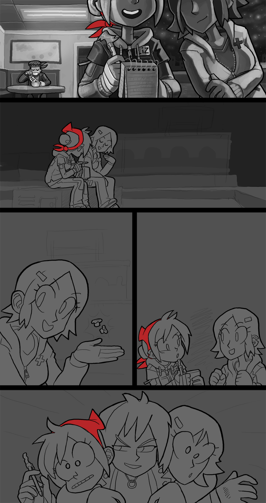
Panel one is my primary means of conveying a transition in time and location, and my main tool for achieving that was using environmental lighting to make the left and right halves of Lizzie in the middle of the panel reflect different kinds of light.
On the left side I have the bright artificial light of the diner interior, and Pat in the background to give context to the kind of lighting on Lizzie's right shoulder. In that half I painted detail and modeling with a softer gradient- there is still clearly-defined light and shadow but the brightness is more spread out within the light fields, and the light value isn't a steep contrast to the dark. Light is rendered in a way that's meant to feel like the light is everywhere, filling the whole space with a nice defined light source over Lizzie's shoulder. It's a bright interior lighting.
In contrast, the right side of the panel was painted with very stark contrast between light and shadow. The environment is cold and vast, the only light sources are the stars in the sky and the occasional floodlight here or there on the other building rooftops. To convey this I made sure to keep the light and shadow regions extremely sharp- this basically means the variation from the brightest to the darkest point within the light area is fairly tight, and the difference between the darkest light and the brightest dark is extremely wide. On Lizzie's face I tried to give her more rim lighting along her cheek line, as opposed to the more full lighting on her interior-shot side. Alice is next to Lizzie as well, and she's painted in the same stark lighting to emphasize the difference between one side and the other, which you can see most readily by looking at each of Lizzie's shirt sleeves. It's a minor thing but I'm really pleased with this panel.
Another detail about night scenes that I've tried to maintain is the way the sky is painted. There's no electricity in the city anymore, or any of the surrounding regions, so when it's night time there is zero light pollution, which means you can see the full galaxy in the sky. Being a black and white comic I can't use colors to convey how beautiful a pristine night sky is, but I have done a bit of research looking up what kinds of shapes are visible at night and try to replicate that with a soft-edge brush and subtle value changes. One problem I have to work around is that my monitor displays photoshop with really rich dark colors, so it's somewhat hard for me to tell 90% grey from 100% black until I can post it on the site and see the final artwork on another monitor. I have to trust that my contrast is about where I need it to be, and then make adjustments as needed in secret after I post the final comic.
I don't have any other extremely-urgent commissions to work on this week so I will be focusing on getting the rest of this page done by this time next week. Thank you for your patience with and support for my work.
Files