Home
Home

 Artists
 Search
 Recent
 Random
 Posts
Posts
 DMs
DMs
 Tags
Tags
 Random
 Importer
 Import
 FAQ
FAQ
 Account
 Register
 Favorites
 Login
Login

Comic Report #38.1 - Meeting Half Way (Patreon)
Content
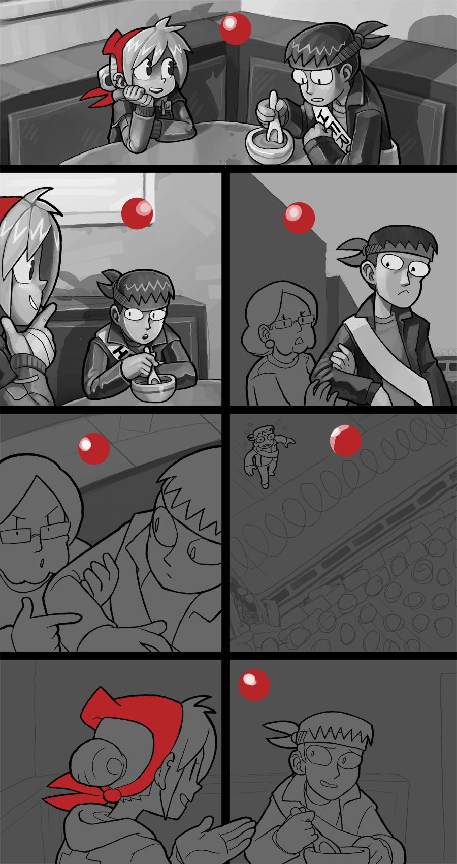
Coming from my last comic report post, I decided to dial back the panel borders for the narrative timehop section. I think it's clear enough on its own that the scene is taking place in the past, and I was just getting cocky trying to pull a fancy layout trick. One minor detail I am going to inflict on myself, however, is the specific location of the shot in panel three. In other scenes I've made sure to draw in specific buildings in specific spots of the background, it's completely unnecessary but I feel like it gives the world a sense of consistency that my brain finds comforting. I have a couple pages earmarked in my archive that I look back to for certain angles in town or in the restaurant or one of the characters' apartments, so I know to put the correct details in the right spots. I know the specific location of the shot, it's on the far end of the main road where the newspaper office is, at the intersection where a right turn leads towards the sheriff's house. There's a couple buildings on the left side of that road which don't really see much use, or that I might have only ever drawn once, and from one angle, so I might be doing some inventing, but either way, I'd like to maintain consistency.
Normally when I post a comic page I try to make sure the panel I was working on is complete before I put it up but sometimes the time just doesn't line up right, and this is one of those times. In panel three you can see a bit of my process in how I build my paintings; I'll start out by trying to define the shape and form of a character using dark shadows, trying to think like I'm giving the characters polygonal facets. This helps me get a sense of what their body is shaped like, what is casting a shadow on what and how the light from the source, indicated by the red circle, describes it. From there I'll paint in gradients within fields to further indicate light sources and blend some of the hard edges between facets to create a sense of roundness where I need to. I've learned over the years to try and give flesh a softer contrast than clothing- I used to paint facial shadows very dark and stark, but if I lighten them up and let them blend together more they give the sense that the character's body is more organic than the clothes on their back. You can see a bit of this in Pat's face in that panel compared to his coat, I still like hard well-defined shapes but letting it blend and be soft does a lot more work than trying to be too literal with my lighting. Skin is slightly translucent so light diffuses within it, this is why painting it differently works.
As mentioned before, I'll be working on this page and hopefully have it up for next week. I'm in a comic groove so now that I have my momentum I'm going to carry it all the way to the end. Thanks for your patience and support for my work!
Files