Home
Home

 Artists
 Search
 Recent
 Random
 Posts
Posts
 DMs
DMs
 Tags
Tags
 Random
 Importer
 Import
 FAQ
FAQ
 Account
 Register
 Favorites
 Login
Login

Fightr WIP 1 (Patreon)
Content

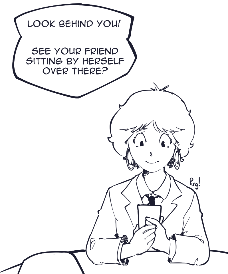
Let's see how this works on patreon. Since it's a webtoon, it's extremely vertical, and chopping it up into pages will ruin the effect of scrolling at your own pace. I recommend right clicking the image and opening it in a new tab, then you can read it more easily.
https://cdn.discordapp.com/attachments/230288344658083840/1128874058688254044/fighterwip.png
here's a direct link just in case. It's only a small excerpt from one of the episodes. Uncolored but I plan on coloring every episode with basic fills, and minimal shading unless a panel needs it for comedic effect or action. I mainly want to know if the flow is readable for people who don't know anything about webtoons (like me).
edit: alright patreon shows the entire damn image without resizing or anything, I'm putting it in the textbox.
Files