Home
Home

 Artists
 Search
 Recent
 Random
 Posts
Posts
 DMs
DMs
 Tags
Tags
 Random
 Importer
 Import
 FAQ
FAQ
 Account
 Register
 Favorites
 Login
Login

Making of Prompto: Handmade Patches and Painting (Patreon)
Content
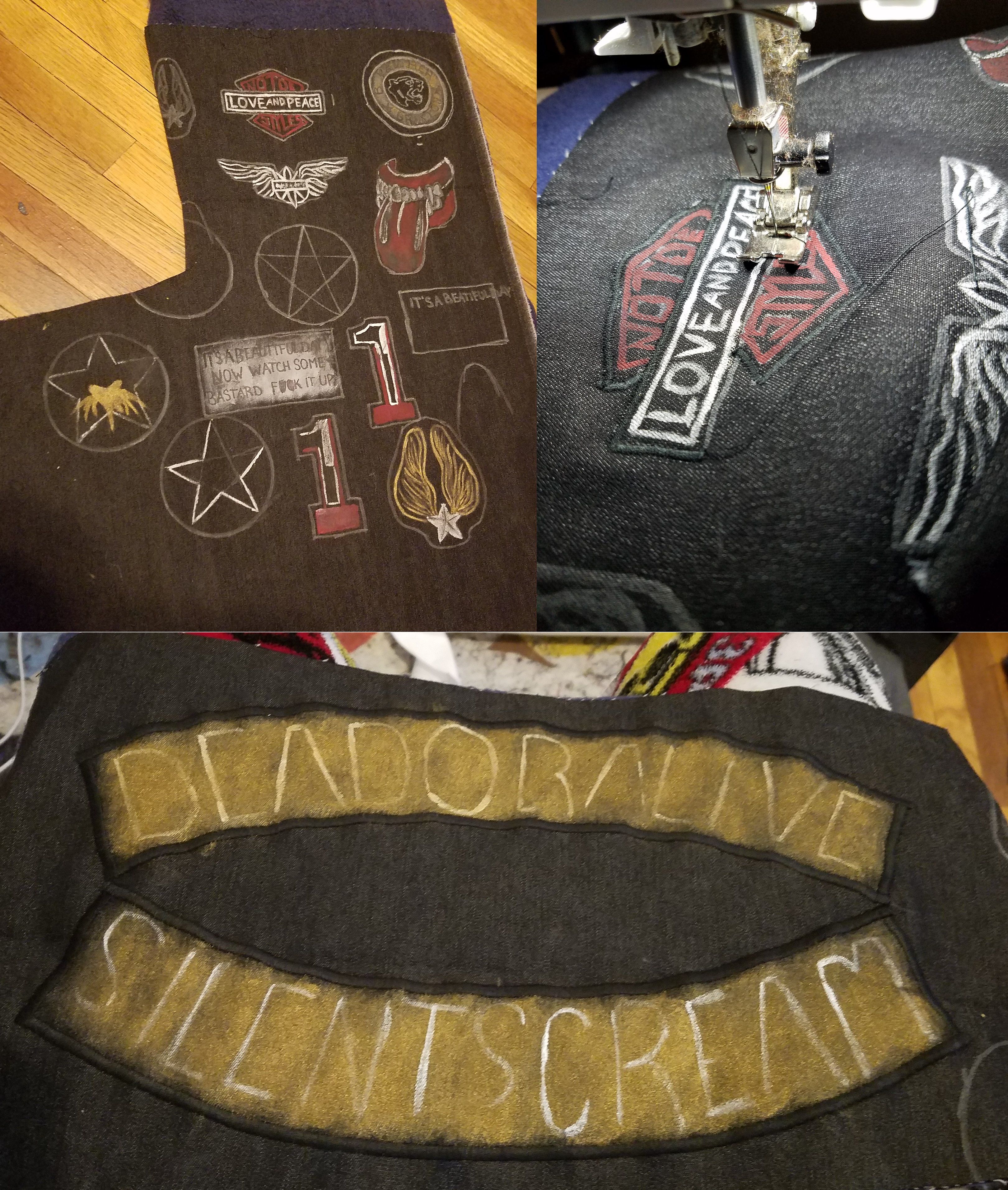
This was my favorite part of Prompto! The patches! Maybe it's because I love detail so much, or maybe because it was a unique use of my sewing skills =3
I have an embroidery machine but never learned how to use it, so I made my ownpatches without it (plus designing all these patterns with software is really not my expertise!)! Starting with a scrap piece of thick denim from Joann's, I started out drawing and painting the patches with, at first, a Sharpie paint pen, and then acrylic paint after to create fake 'threads'. I felt the metallic silver and gold created the most realistic look to 3-dimensional patches, so I mostly worked with silver, gold, and red!
The next part involved some tedious sewing skills! Simply putting my sewing machine on a very tight zig zag stitch, I outlined each patch with a satin stitch and any edges on the patch that any extra stitches that would make it lookmore realistic as a patch! Mostly with black thread, but I did do some red whereever necessary!
The 'Dead or Alive' and 'Silent Scream' patches on the back were done in the same way, making the shape of each letter with the satin stitch!
I wouldn't consider this hard work, just tedious. I can go very fast due to all of my skills in appliqueing patches on for a living with Rarity's Boutique, but if taken slow, it would get the same effect!
The last thing I did for Prompto, other than a million bajillion rivets on the vest, was paint!! The Jeans were stretch jeans that lacked dimension (plus Prompto's tend to be darker), so I dry brushed on black around all the edged and seams to create dimension in the pants. In general, with FFXV, there's lots of contrast, so the lights are very light and the darks are very dark, so I created the same dimension in the clothing as much as I could!
for the T-shirt, I used acrylic paint to create the lines! First I freehanded the design with a white Sharpie paint pen, and then went over it with a thin paint brush and a paint made of silver, white, and a touch of black. I noticed that Prompto's shirt pattern design tended to, once again, have a lot of contrast depending on light or dark, so that's why I added the silver, since that effect could be achieved with a little shine :)

Files