Home
Home

 Artists
 Search
 Recent
 Random
 Posts
Posts
 DMs
DMs
 Tags
Tags
 Random
 Importer
 Import
 FAQ
FAQ
 Account
 Register
 Favorites
 Login
Login

Warm Enough Yet? - Process (Patreon)
Content
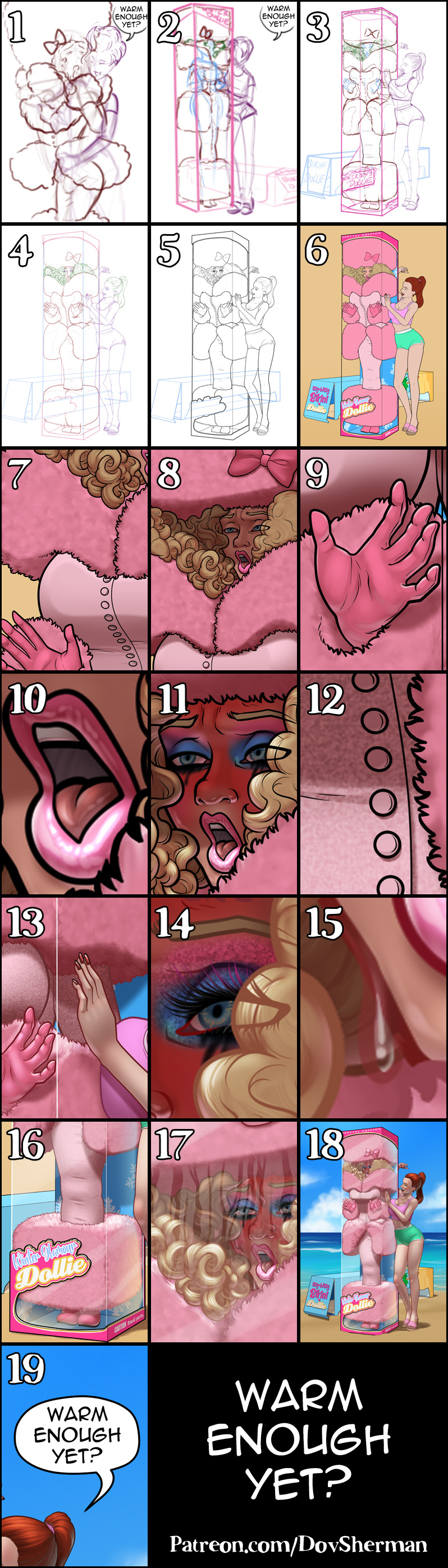
1. Thumbnail. I started with a very basic thumbnail sketch to try out the concept.
2. I put this one off for a while because I felt like the original sketch was missing something. It needed more. Eventually I tried to combine it with an idea I had been toying with for a doll-in-box picture where the box was too narrow for the outfit, something that would let me play with fluffy clothing squashed against a boxy shape, like in my "Clean Box" picture.
3. Rough sketch. I sketch out the final layout and poses. I used Clip Studio's 3D models and perspective rulers as references and roughed in the general shapes for the clothing and props. Using the models often leads to making adjustments to arrangement, poses, and framing because I find out that something about the original sketch doesn't actually work in 3D.
4. Final sketch. I use separate layers in multiple folders for the various props and the character which makes it easier to plan, especially when so many of the parts overlap. If you look closely, you can see that I draw some parts that I know will be completely hidden behind others, particularly the basic body shape, to make sure it will all make sense together. Keeping them on separate layers also makes it easier to shift the positions of individual features when final details on foreground features might change the layout needs.
5. Inking. I scale the canvas up to four times the size and use a variable-width inking brush for the character and a constant-width brush for hard things on vector layers. I use lots of different layers for different parts, which makes it easier to overdraw and erase as needed. Planning for the line coloring later, I try to use a different vector layer for each part that would be differently colored as linework such as one for the character's skin, one for everything that will have black linework, etc.
6. Color blocking. I set the folder containing all the different inked vector layers as the reference layer. Then I made new raster layers underneath and started filling in the flat colors. Sometimes I used a round pen, sometimes the color fill bucket, usually with the fill set to follow only the reference layer, stopping at the middle of a vector. I also hand-painted simple designs for the art on the doll boxes and added simple text layers for the labelling.
7. Form shading. I create a desaturate brown solid color layer (linear burn) and start painting in the basic form shading. In general, I start shading each section by color block, starting with the shading layered filled at 50%, then I use hard brushes at 75% to added some basic shade and highlight, then deepen it with 100% shade and highlight, adding detail with watercolor brushes and using blur and blending to soften the shading where needed. For the hair, I used color burn for richer shading and start with an airbrush to establish the overall form, then use watercolor brushes to add some extra detail, first with a basic watercolor brush to define the form and then with a textured brush to get the hint of individual hairs. For parts pressed against the glass, I made some soft-edged selections and used level adjustment on the shading so that shades would be in a narrower range around 75% brightness on the front and around 50% brightness on the side.
8. Cast shadows. I make another brown solid color layer set to linear burn and start painting in the cast shadows with soft brush, using a smaller brush in places where the object casting the shadow is closer to the thing the shadow is on.
9. Backlight. For the secondary lights, I used a pale desaturate color layer away from the light source and a white layer toward the light source, both set to screen. Then I paint with a soft airbrush or a watercolor brush (when I want it to be more textured) on opposite sides of shiny objects. The forelight is used only on the shiniest parts. When I combine it with the form shading, backlighting really makes the characters pop. I don't use any backlight on non-reflective objects. On the hair, I used the watercolor brush to streak in the shape of the hairs and then used an airbrush, selection-masked to the shading, to add softer backlight, then a textured watercolor brush for detail.
10. Shiny. For the glossiest parts, I used light watercolor brushes to paint reflections for both primary and reflected light sources, then I used a strong watercolor brush for the specular highlights (or a variable round hard brush when I want the highlight extra strong), using a thumb tool to smudge for detail. For the shine on the hair, I started with thin strokes with a soft watercolor brush, then use an airbrush to add a soft glow to groups of streaks, and finally use a soft round brush to erase a few streaks in the middle of each group. After painting all the shine, I use the cast shadow layer to make a selection and delete the shine from anywhere covered by shadow.
11. For the natural blush, I add in a raster layer and airbrush red just on the skin for the cheeks and places where bone is near the surface of the skin. I used the same method for the make-up.
12. I added a noise texture to the wool coat and to the eyeshadow, both set to overlay, placed above the shading layers for greater contrast.
13. Colored linework. Since the linework is still all vectors in Clip Studio, I simply selected the vectors and changed their color to whatever colored linework I needed, sampling from each section and then shifting the color to be more saturate and dark, more or less depending on how hard or soft I want each thing to feel. The hardest things I keep black. Then I collapsed all of the linework into raster layers, locked the pixel transparency, and used an eraser to fix up any places where different color linework crossed over each other.
14. Eyelashes are done with a simple raster layer painted with a black variable-width pen. Then I lock the pixel transparency for that layer and use a soft pen to paint in grey streaks for texture and then soften the look with a few strokes of a black soft airbrush. I also recolor the lashes and eye linework to match the hair linework where it is obscured by the hair.
15. For the sweat, I started with colored lines just a little bit lighter than the linework for the surface it is on and filled them with low-opacity white. Then I added some cast shadow, then secondary lights in reverse direction for the rest of the scene, then white specular highlights with a hard brush.
16. I added simple semi-transparent white layers for the glass, placed between the linework for the outside of the box and the inside. It's actually above all of the color and shading layers but, as long as it is behind the linework layers for the outside, it still looks like it's just covering the inside. I also painted some simple airbrushed environment reflections on the glass, then erased it where the body of the woman would block it.
17. For a steamed-up effect on the glass, I started with a simple soft edged solid white shape, then used a rough scatter brush to add some variety around the bottom edge, then applied a gaussian blur. Then I used a variable-width eraser to paint out streaks where drops of condensation would have run down the glass. I painted a couple of drops of water. Then I lowered the opacity of the condensation.
18. I did a simple speed paint of a beach backdrop, using mostly gradients for the base layers of sky, water, and sand, then added some variation and detail with airbrush and pencil. I used my cloud brush in two colors, darker as the base then locking the transparency and switching to white for depth contrast. I added a noise layer in perspective for the sand, then I masked out some parts of the characters on the bottom edges and added sand linework to make it look like the characters are pressing into the sand.
19. I added a word balloon for context. I prefer drawing my own curve balloon so it has fewer points and is easier to edit.
Files