Home
Home

 Artists
 Search
 Recent
 Random
 Posts
Posts
 DMs
DMs
 Tags
Tags
 Random
 Importer
 Import
 FAQ
FAQ
 Account
 Register
 Favorites
 Login
Login

Bouncing Bunny Bimbo - Process (Patreon)
Content
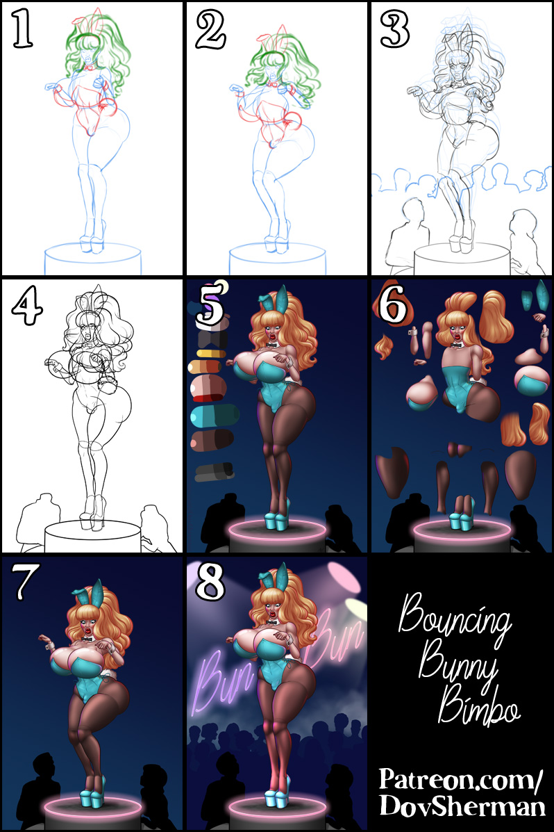
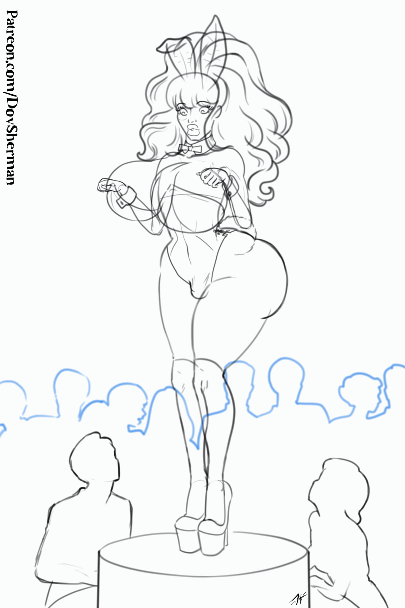
1. I started with a rough sketch to work out the initial key pose and outfit. I used Clip Studio's 3D models to set up the scene.
2. After adjusting the pose of the 3D model, I used that to transform the parts from the first sketch for the second key pose.
3. To test out the animation (and refresh my memory of the tools), I built an animation using just the sketch parts. Most of the sketch animation is done by breaking the sketch into separate pieces, converting them to image materials (which are kind of like sprites, you can rotate and scale them without pixel degradation), and then animating them using keyframe motion. You can see the result of this step in the sketch animation posted here. Some parts, like the torso, are only moved between two points. Other parts, like the thighs, are rotated with non-proportional scaling applied to create a foreshortening effect. And some parts, like the boobs and the hair, get lots of stretch and squash applied to their movement to make the motion more organic. For everything moving as a secondary motion (hair, boobs, arms, etc), I repeated the keyframes for twice the number of frames in the animation so that I could then slide their timelines later to varying degrees, creating delayed secondary movement.
4. Inking. I use a variable-width inking brush for the character and a constant-width brush for hard things on vector layers. I use lots of different layers for different parts, which makes it easier to overdraw and erase as needed. Planning for the line coloring later, I try to use a different vector layer for each part that would be differently colored as linework such as one for the character's skin, one for everything that will have black linework, etc. Since this will be animated, I used even more layer separation than usual, using a separate folder for each part that I have decided will become an animation sprite.
5. For the color and shading, I can't use my usual methods because I need much more direct control of the colors and shades so that the edges of different parts will match up, especially since some of the parts will have soft, faded edges in place to hide the join between parts. So I started by creating a palette of base colors, then applying two levels of shade to each color. Then I painted using the palette instead of my usual methods of shading with masks.
6. Once all of the parts were painted, I separated them and rotated some of the parts to get them into vertical alignment so that I can apply non-proportional scaling when needed. Since I used vectors for the linework, I can get away this small amount of rotation. The vectors stay crisp and the small amount of pixel degradation in the shading is less noticeable. I then converted all of the parts to image material layers so that I can animated them like sprites.
7. Then I animated them the same way as I did in the test animation. One extra effect here is that, for some of the parts, like the legs and arms, I actually painted two versions of them. Using the same linework and base color, I painted them as if the light sources are at two different angles. Then, when I animate them, I can fade between the two versions to create the effect of the shading changing as each part moves in relation to the light. I also added a small amount of frame-to-frame hand-painted animation for the tip of the ear and the ribbon ties as the hips.
8. Finally, I added in the backdrop, applying layer effects to text for the signage, some simple solid colored lights, stamped silhouettes for the crowd, and some light cloud brush to add contrast.
Files