Home
Home

 Artists
 Search
 Recent
 Random
 Posts
Posts
 DMs
DMs
 Tags
Tags
 Random
 Importer
 Import
 FAQ
FAQ
 Account
 Register
 Favorites
 Login
Login

Cartoon Queen - Process (Patreon)
Content
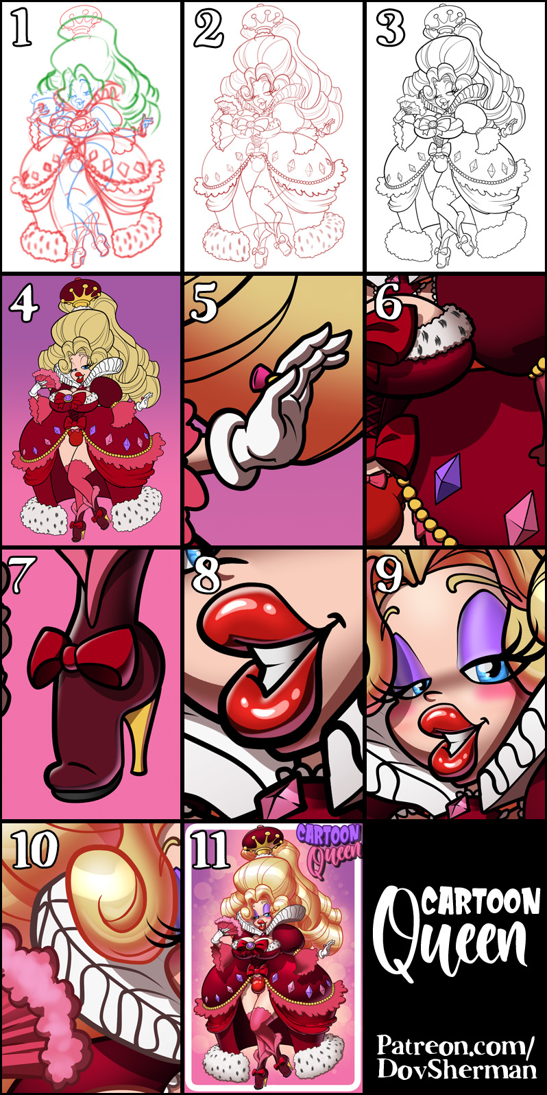
1. Rough sketch. I sketch out the layout and pose.
2. Final sketch. I use separate layers in multiple folders for the various props and the character which makes it easier to plan, especially when so many of the parts overlap. If you look closely, you can see that I draw some parts that I know will be completely hidden behind others, particularly the basic body shape, to make sure it will all make sense together. Keeping them on separate layers also makes it easier to shift the positions of individual features when final details on foreground features might change the layout needs.
3. Inking. I scale the canvas up to four times the size and use a variable-width inking brush for the character and a constant-width brush for hard things on vector layers. I use lots of different layers for different parts, which makes it easier to overdraw and erase as needed. Planning for the line coloring later, I try to use a different vector layer for each part that would be differently colored as linework such as one for the character's skin, one for everything that will have black linework, etc. Because I wanted this to look cartoony, I used lines that are twice as thick as I usually use.
4. Color blocking. I set the folder containing all the different inked vector layers as the reference layer. Then I made new raster layers underneath and started filling in the flat colors. Sometimes I used a round pen, sometimes the color fill bucket, usually with the fill set to follow only the reference layer, stopping at the middle of a vector. I also used a rough pen to paint in the spots on the fur trim.
5. Form shading. I create a desaturate brown solid color layer (linear burn) and start painting in the basic form shading. For a cartoony look, I used a combination of hard pen for cel shading and an airbrush to soften it.
6. Cast shadows. I make another brown solid color layer set to linear burn and start painting in the cast shadows with soft brush, using a smaller brush in places where the object casting the shadow is closer to the thing the shadow is on.
7. Backlight. For the secondary lights, I used a pale desaturate color layer away from the light source and a white layer toward the light source, both set to screen. Then I paint with a soft airbrush or a watercolor brush (when I want it to be more textured) on opposite sides of shiny objects. The forelight is used only on the shiniest parts. When I combine it with the form shading, backlighting really makes the characters pop. I don't use any backlight on non-reflective objects. On the hair, I used the watercolor brush to streak in the shape of the hairs and then used an airbrush, selection-masked to the shading, to add softer backlight.
8. Shiny. For the glossiest parts, I used light watercolor brushes to paint reflections for both primary and reflected light sources, then I used a pen for the specular highlights. For the shine on the hair, I used a basic watercolor brush on an add(glow) layer. to make it extra glossy. After painting all the shine, I use the cast shadow layer to make a selection and delete the shine from anywhere covered by shadow.
9. For the natural blush, I add in a raster layer and airbrush red just on the skin for the cheeks and places where bone is near the surface of the skin. I used the same method for the make-up.
10. Colored linework. Since the linework is still all vectors in Clip Studio, I simply selected the vectors and changed their color to whatever colored linework I needed, sampling from each section and then shifting the color to be more saturate and dark, more or less depending on how hard or soft I want each thing to feel. The hardest things I keep black. Then I collapsed all of the linework into raster layers, locked the pixel transparency, and used an eraser to fix up any places where different color linework crossed over each other. By using the same blending mode for both form and cast shading, I wind up with darker linework but I can avoid having to hand-shade the linework which is a big time-saver.
11. I added a simple graphic frame, used a scatter brush of spots and an airbrush to add a glow behind the character, then added some basic text.
Files