Home
Home

 Artists
 Search
 Recent
 Random
 Posts
Posts
 DMs
DMs
 Tags
Tags
 Random
 Importer
 Import
 FAQ
FAQ
 Account
 Register
 Favorites
 Login
Login

The Trimming of the Tree - Process (Patreon)
Content
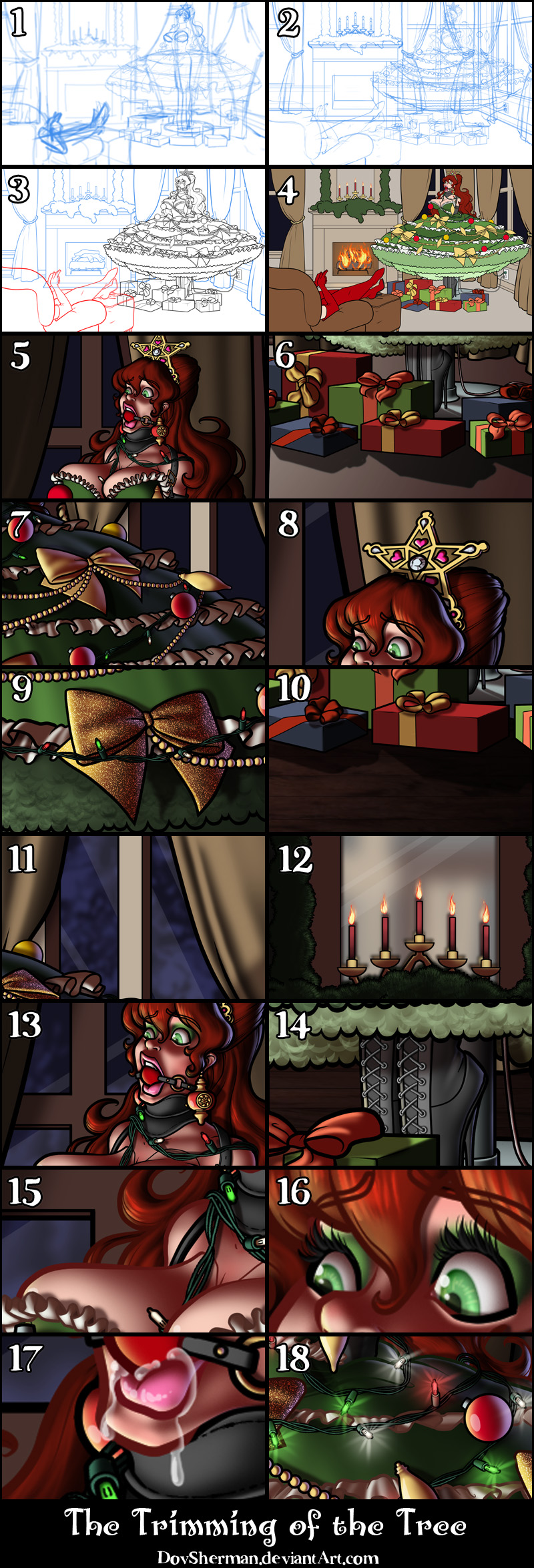
2. Final sketch. Now I go back and do a more detailed sketch, working out the the body, clothing, and hair. I used a perspective ruler to line up the floor and walls.
3. Inking. I use a variable-width inking brush for the characters and a constant-width brush for hard things (the buckles) on vector layers. I use lots of different layers for different parts, which makes it easier to overdraw and erase as needed. I also went ahead of inked the shape for the eyelashes because the brush stablization in Manga Studio makes it a lot easier than doing it in Photoshop later. I exported the inks in multiple layers for the tree, the background, and the character and chair in the foreground.
4. Color blocking. In Photoshop, I convert the imported lines to a folder with a mask and put a solid black layer in the folder. (CTRL-click RGB in the Channels tab, invert the selection, create a mask from the selection.) This will come in handy later when I color the linework. Then I create another folder and start creating the basic color blocking.
5. Form shading. I create a dark brown solid color layer (linear burn) and start painting in the basic form shading with a soft airbrush. Except for the hair, which gets its own dark brown layer but with linear burn blending for more richness. I also use a smudge tool on the hair and various creases in clothing and skin to create detail.
6. Cast shadows. I make a new dark brown layer set to multiply and start painting in the cast shadows with soft brush, using a smaller brush in places where the object casting the shadow is closer to the thing the shadow is on.
7. Backlight. The backlight here is cast by the blue moonlight outside and the orange of the fireplace on each side of the window display. When I combined it with the form shading, backlighting really makes the characters pop. I used both a soft brush (for the shiniest parts like the buckle and lips) and a soft airbrush (for everything else). I don't use any backlight on non-reflective objects. When it's done right, it should look like real lighting from a different angle. And again, smudge the edge of creases and hairs.
8. Shiny. I used a solid white layer at for basic shine on lips, ornaments, eyes, etc, and solid white set to overlay (which makes a richer shine) for the hair shine. Painting the hairshine, I use a variable width sharp brush, then go over it with an airbrush to give it a little glow. After painting all the shine, I use the cast shadow layer to make a selection and delete the shine from anywhere covered by shadow.
9. Glitter texture. For the glitter on the bows, I created a grey layer and applied lots of gaussian noise to it. Then I trimmed a small section and scaled it up so that the pixels would be bigger. I set it to overlay and masked it to match the shape of the bows. Then I adjusted curves on the layer until it had the right feel.
10. Floor. I added a wood texture to the floor by making a big rectangle of wood texture and then using distort to match the perspective of the floor. I sliced it into stripes and flipped every other one horizontally.
11. Outside the window. I used a lighter blue with a solid variable-width brush to sketch in a rough doodle of snow on trees in moonlight. Then I blurred it to create a sense of distance and hide the lack of detail.
12. Mirror. I used a similar method with the mirror, filling in a few vague shapes, using colors sampled from the scene, then blurring it heavily.
13. Skin effects. For the blush, I add in a light red layer, airbrushing just on the same area as the skin for the joints and face. I use the same technique for the eyeshadow.
14. Laces. I stamped some grey doughnut circles onto a new layer for the grommets, then applied a bevel and outer glow (black, multiply). Then I did the same thing with a simple round brush on a new layer for the laces, using folder masks to hide the laces where the go behind other objects.
15. Colored linework. Going back to the linework folder, I started adding new solid color layers, using the mask to paint the color of the linework. Since the new layers are inside a folder with a mask defining the linework, I don't have to be very precise when coloring the lines. I always add new color layers below the ones I already did so that I can be sloppy in the areas that are already covered by colored linework. Everything soft gets colored linework. Hard objects stay black.
16. Eyelashes. Eyelashes are done with a folder containing a solid grey layer and a solid black layer. Using the lashes I made earlier with a variable width brush, I add a few thin streaks on the grey layer mask to add depth to the lashes and soften the look with a few strokes of a soft airbrush.
17. For the drool, I used a white layer with the fill turned down just a little and add a layer effect with white inner glow set to 100%. After, I add a new white layer to paint in the shiny highlights.
18. Lights. I added a colored sparkle and a some glow to each little light.
Files