Home
Home

 Artists
 Search
 Recent
 Random
 Posts
Posts
 DMs
DMs
 Tags
Tags
 Random
 Importer
 Import
 FAQ
FAQ
 Account
 Register
 Favorites
 Login
Login

Zapzapzapzapzap - Process (Patreon)
Published:
2016-10-14 17:49:41
Imported:
2024-08
Content
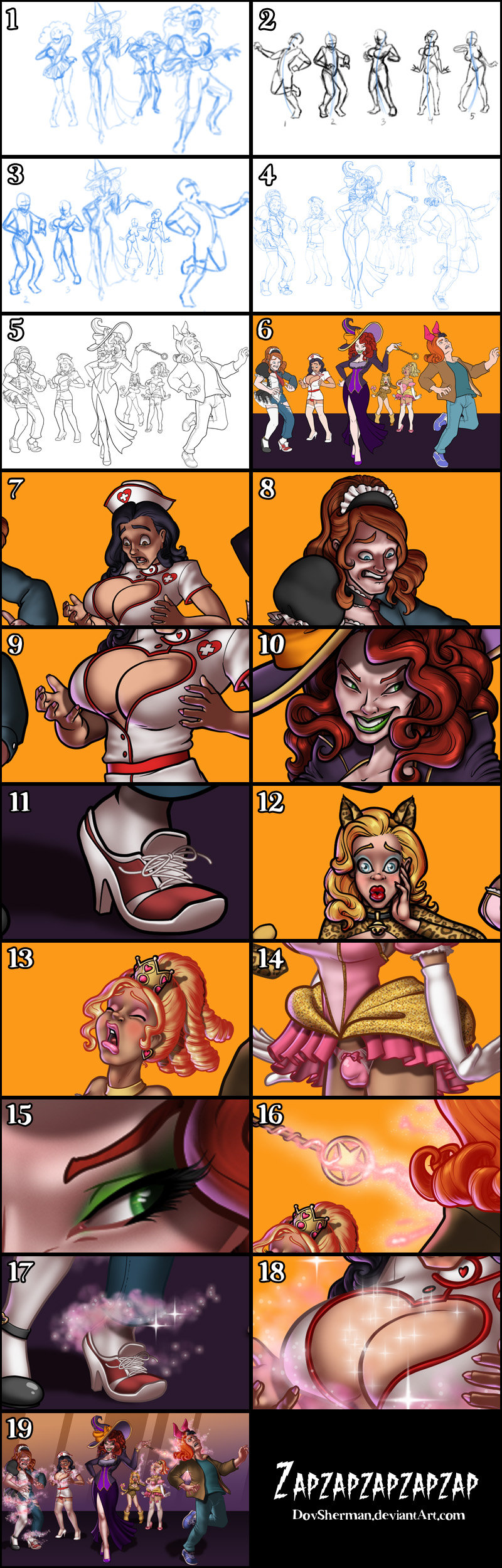
1. In Manga Studio, I start with a very rough thumbnail sketch with big fat pencils. The fat pencils force me to keep the sketch loose without getting too caught up in the details. This sketch was based on a suggestion during a sketch livestream.
2. Thinking about this concept, I thought it was a good opportunity to try a twist on the usual transformation sequence. Instead of five frames of the same transformation, I wanted to try showing five transformations, all at different steps. So you get the same sense of sequence but all in one moment. So my next step was to draw five basic poses for the five steps in this transformation. For now, I just drew them all at the same size.
3. I placed my new poses into the scene, scaling them back for perspective so that the transformees are further along in the transformation the further back they are.
4. Final sketch. Now I go back and do a more detailed sketch, working out the the body, clothing, and props. This is the longest step in the process because it is when I research the outfits, try out different hairstyles and expressions, and fine tune every lock of hair. To make it a little easier, I drew the wand vertically and then rotated it into place. I find this works well with anything that has a very regular, symmetrical shape.
5. Inking. I use a variable-width inking brush for the characters and a constant-width brush for hard things on vector layers. I use lots of different layers for different parts, which makes it easier to overdraw and erase as needed. I also went ahead of inked the shape for the eyelashes because the brush stablization in Manga Studio makes it a lot easier than doing it in Photoshop later.
6. In Photoshop, I convert the imported lines to a folder with a mask and put a solid black layer in the folder. (CTRL-click RGB in the Channels tab, invert the selection, create a mask from the selection.) This will come in handy later when I color the linework. Then I create another folder and start creating the basic color blocking. I like to do all my color blocking by making a folder and then filling it with different solid color layers for each section of color, whch makes it easy to change a color later. This is a very fussy way to do it and it's probably much simpler to just fill a single raster layer with flat colors.
7. Form shading. I create a brown solid color layer (linear burn) and start painting in the basic form shading with a soft airbrush. Except for the hair and feathers, which gets their own brown layer but with linear burn blending for more richness. I'm planning to place magical special effects in various places on each character so the light is coming from that magic spell.
8. Cast shadows. I make a new dark brown layer set to multiply and start painting in the cast shadows with soft brush, using a smaller brush in places where the object casting the shadow is closer to the thing the shadow is on.
9. Backlight. I used a purple layer for backlight, set to screen. When I combine it with the form shading and cast shadows, backlighting really makes the characters pop. I used both a soft brush (for the shiniest parts like the lips) and a soft airbrush (for everything else). I don't use any backlight on non-reflective objects. On the hair, I use a smudge tool to streak the backlight so that it suggests strands of hair. When it's done right, it should look like real lighting from a different angle.
10. Shiny. I used a solid white layer at for basic shine on lips, eyes, and other basic shiny things and solid white set to overlay (which makes a richer shine) for the hair shine. Painting the hairshine, I use a variable width sharp brush, then go over it with an airbrush to give it a little glow. After painting all the shine, I use the cast shadow layer to make a selection and delete the shine from anywhere covered by shadow.
11. Laces. For the shoelaces, I used a few layers of white with an inner glow (set to the same color I will use for linework on the shoes, normal blend). Since laces are so consistent in size, it's quicker and easier than drawing laces by hand in the inking stage and them having to color them by hand later.
12. For the blush, I add in a light red layer, airbrushing just on the same area as the skin for the cheeks and other cheeks. I use the same method to add color for the eyeshadow and cheek circles.
13. Colored linework. Going back to the linework folder, I started adding new solid color layers, using the mask to paint the color of the linework. Since the new layers are inside a folder with a mask defining the linework, I don't have to be very precise when coloring the lines. I always add new color layers below the ones I already did so that I can be sloppy in the areas that are already covered by colored linework.
14. For the glittery effect on the Princess outfit, I created a grey layer and added lots of gaussian noise to it. Then I grabbed a small piece of it, scaled it up, pushed the levels for higher contrast, and set it to vivid light blend, masking it to match the shape of the gold sections of the Princess dress.
15. Eyelashes are done with a folder containing a solid grey layer and a solid black layer. Using the lashes I made earlier with a variable width brush, I add a few thin streaks on the grey layer mask to add depth to the lashes and soften the look with a few strokes of a soft airbrush.
16. Magic wand blast. For the magic shooting out of the magic wand, I started with a pink layer, painted with a soft airbrush. I tried to create a feel of corruscating energy on the wand and then a splatter effect as the spell hits the most recent target. I added a very soft pink outer glow effect to this layer. Next I added a white layer and used an airbrush to give the pink layer a more intense white core. Last, I used a speckled brush with lots of scatter to add sparks to the magic.
17. For the magic spell itself, I started with my cloud brush in a pink layer. I used separate layers for the places where it wind in front or behind the characters. I added a little inner glow to the glows and then added a pattern overlay effect with a blurry, wavy greyscale texture set to overlay, which gives the cloud some nice variation in color intensity. Then I used another speckle brush with much more spacing, in a white layer, to add some floating spots around the clouds and added an outer glow to make them wispy. Then I added another white layer and stamped in a few floating plus-shaped sparkles here and there.
18. I added extra plus-shaped sparkles, smaller but with a big outer glow, to areas that I wanted to emphasize were being affected by the magic spells.
19. Finally, I added some gradients and abstract shapes to the background.
Files