Home
Home

 Artists
 Search
 Recent
 Random
 Posts
Posts
 DMs
DMs
 Tags
Tags
 Random
 Importer
 Import
 FAQ
FAQ
 Account
 Register
 Favorites
 Login
Login

Tip Your Waitress - Process (Patreon)
Published:
2016-09-16 17:14:49
Imported:
2024-08
Content
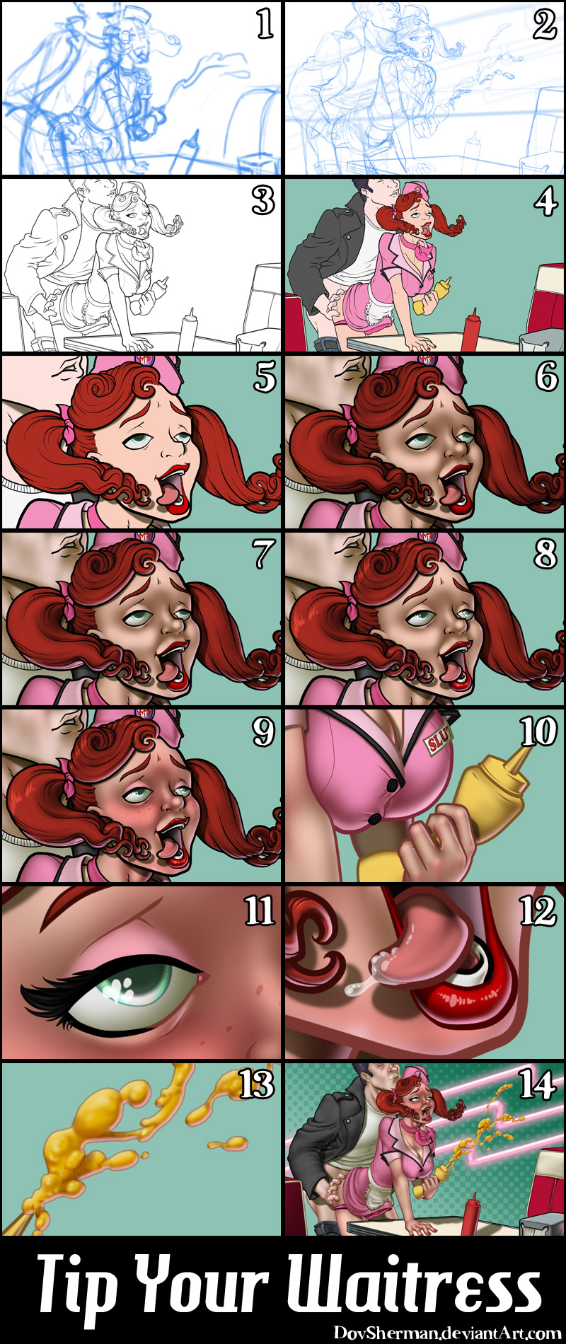
1. In Manga Studio, I start with a very rough thumbnail sketch with big fat pencils. The fat pencils force me to keep the sketch loose without getting too caught up in the details. This sketch was based on a suggestion during a sketch livestream.
2. Final sketch. Now I go back and do a more detailed sketch, working out the the body, clothing, and props. This was a good time to fix the proportions, make sure the legs are the same length, and so on. I used perspective rulers to align the booth and table.
3. Inking. I use a variable-width inking brush for the characters and a constant-width brush for hard things on vector layers. I use lots of different layers for different parts, which makes it easier to overdraw and erase as needed. I also went ahead of inked the shape for the eyelashes because the brush stablization in Manga Studio makes it a lot easier than doing it in Photoshop later.
4. In Photoshop, I convert the imported lines to a folder with a mask and put a solid black layer in the folder. (CTRL-click RGB in the Channels tab, invert the selection, create a mask from the selection.) This will come in handy later when I color the linework. Then I create another folder and start creating the basic color blocking. I like to do all my color blocking by making a folder and then filling it with different solid color layers for each section of color, whch makes it easy to change a color later. This is a very fussy way to do it and it's probably much simpler to just fill a single raser layer with flat colors.
5. Cast shadows. I started with the cast shadows first since they tend to be simple but bold and can help me remember how the lights are supposed to fall when I work on the other parts of shading. I make a new dark teal layer (teal to match the background color) set to multiply and start painting in the cast shadows with soft brush, using a smaller brush in places where the object casting the shadow is closer to the thing the shadow is on.
6. Form shading. I create a dark teal solid color layer (linear burn) and start painting in the basic form shading with a soft airbrush. Except for the hair, which gets its own dark teal layer but with linear burn blending for more richness.
7. Backlight. A pink solid color layer (screen). When I combined it with the form shading, backlighting really makes the characters pop. I used both a soft brush (for the shiniest parts like the lips) and a soft airbrush (for everything else). I don't use any backlight on non-reflective objects. On the hair, I use a smudge tool to streak the backlight so that it suggests strands of hair. When it's done right, it should look like real lighting from a different angle.
8. Shiny. I used a solid white layer at for basic shine on lips, eyes, and other basic shiny things and solid white set to overlay (which makes a richer shine) for the hair shine. Painting the hairshine, I use a variable width sharp brush, then go over it with an airbrush to give it a little glow. After painting all the shine, I use the cast shadow layer to make a selection and delete the shine from anywhere covered by shadow.
9. For the blush, I add in a light red layer, airbrushing just on the same area as the skin for the cheeks and other cheeks. I use the same method to add color for the eyeshadow.
10. Colored linework. Going back to the linework folder, I started adding new solid color layers, using the mask to paint the color of the linework. Since the new layers are inside a folder with a mask defining the linework, I don't have to be very precise when coloring the lines. I always add new color layers below the ones I already did so that I can be sloppy in the areas that are already covered by colored linework.
11. Eyelashes are done with a folder containing a solid grey layer and a solid black layer. Using the lashes I made earlier with a variable width brush, I add a few thin streaks on the grey layer mask to add depth to the lashes and soften the look with a few strokes of a soft airbrush.
12. For the drool, I used a white layer with the fill turned down just a little and add a layer effect with white inner glow set to 100%. Then I use the mask to hide the edge where it touches skin. After, I add a new white layer to paint in the shiny highlights.
13. The mustard uses several effects. First I started with a solid yellow layer and painted in the basic shape. Then I added an inner glow AND an outer glow, both in normal blend with a dark yellow to add thin, soft line around it. I also added a bevel effect with white and dark yellow just to get a basic roundness to it. Alone, it is starting to look like mustard but only like mustard if it is splattered on a flat surface. Now I added new dark yellow layer set to multiple and use it to paint in more detailed form shading. Then I add a new white layer to paint in a few soft highlights hear and there. Finally, I added a pink backlight to it since liquidy mustard is sure to pick up some reflected ligfht.
14. For the backdrop, I added a simple gradient and then used the halftone filter to turn it into dots which I scaled up so that they would be nice and big and graphic. I added a few pink zig-zigs to a new layer then added some bevel and a strong outer glow to make them look like neon.
Files