Home
Home

 Artists
 Search
 Recent
 Random
 Posts
Posts
 DMs
DMs
 Tags
Tags
 Random
 Importer
 Import
 FAQ
FAQ
 Account
 Register
 Favorites
 Login
Login

No Dawdling - Process (Patreon)
Content
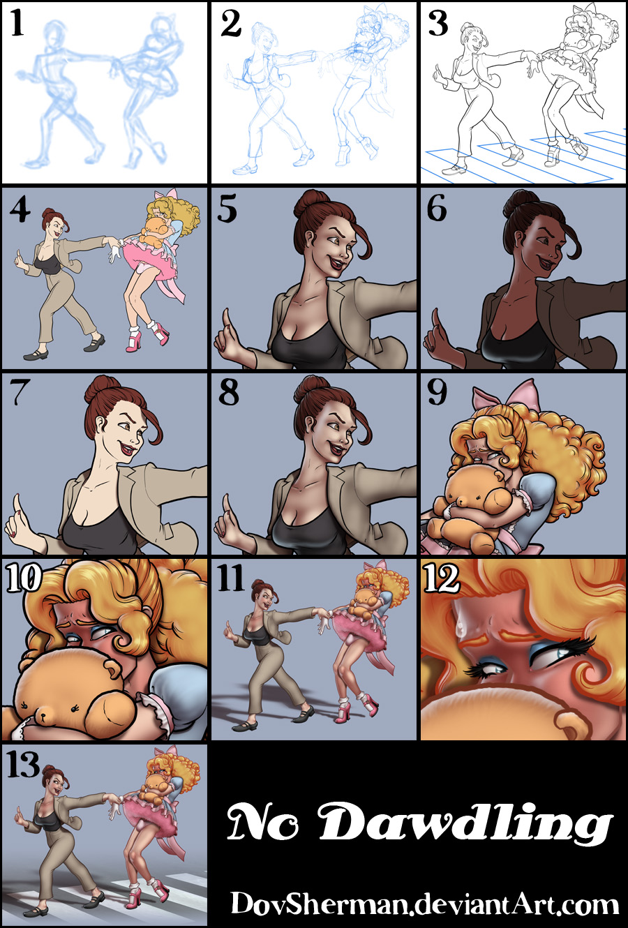
1. In Manga Studio, I start with a very rough sketch with big fat pencils. The fat pencils force me to keep the sketch loose without getting too caught up in the details.
2. Final sketch. Now I go back and do a more detailed sketch, working out the the body, clothing, hair, and props.
3. Inking. I use a variable-width inking brush for the characters and a constant-width brush for hard things (the buckles, etc) on vector layers. I use lots of different layers for different parts, which makes it easier to overdraw and erase as needed. For the rope, I used the rope brush I made from my own linework a while back. I also went ahead of inked the shape for the eyelashes because the brush stablization in Manga Studio makes it a lot easier than doing it in Photoshop later. I used a perspective ruler to map out the crosswalk lines. I exported the inks in three layers.
4. In Photoshop, I convert the imported lines to a folder with a mask and put a solid black layer in the folder. (CTRL-click RGB in the Channels tab, invert the selection, create a mask from the selection.) This will come in handy later when I color the linework. Then I create another folder and start creating the basic color blocking.
5. Form shading. I create a dark brown solid color layer (linear burn) and start painting in the basic form shading with a soft airbrush. Except for the hair, which gets its own dark brown layer but with linear burn blending for more richness. I also use a smudge tool on the hair and various creases in clothing and skin to create detail.
6. Backlight. A very desaturate pale blue, almost white, solid color layer (screen). When I combined it with the form shading, backlighting really makes the characters pop. I used both a soft brush (for the shiniest parts like the buckle and lips) and a soft airbrush (for everything else). I don't use any backlight on non-reflective objects like the flowers and border. When it's done right, it should look like real lighting from a different angle. And again, smudge the edge of creases and hairs.
7. Cast shadows. I make a new dark brown layer set to multiply and start painting in the cast shadows with soft brush, using a smaller brush in places where the object casting the shadow is closer to the thing the shadow is on.
8. Put them together and it's looking good!
9. Shiny. I used a solid white layer at for basic shine on lips, bows, and shoes, another solid white for shine in the eyes, and solid white set to overlay (which makes a richer shine) for the hair shine. Painting the hairshine, I use a variable width sharp brush, then go over it with an airbrush to give it a little glow.
10. For the blush, I add in a light red layer, airbrushing just on the same area as the skin for the joints and face. I use the same technique for the eyeshadow.
11. Colored linework. Going back to the linework folder, I started adding new solid color layers, using the mask to paint the color of the linework. Since the new layers are inside a folder with a mask defining the linework, I don't have to be very precise when coloring the lines. I always add new color layers below the ones I already did so that I can be sloppy in the areas that are already covered by colored linework. Everything soft gets colored linework. Hard objects in the foreground stay black.
12. Eyelashes are done with a folder containing a solid grey layer and a solid black layer. Using the lashes I made earlier with a variable width brush, I add a few thin streaks on the grey layer mask to add depth to the lashes and soften the look with a few strokes of a soft airbrush. For the drool, I used a white layer with the fill turned down just a little and add a layer effect with white inner glow set to 100%. Then I use a variable width brush in the mask to soften the edge where it touches skin. After, I add a new white layer to paint in the shiny highlights.
13. For the street, I made a simple blue-gray pattern of vertical streaks, applied a grungy texture, then distorted it to match the perspective of the crosswalk lines. The lines themselves are simply filled in as solid white and then made a little transparent so that they pick up some of the texture of the street. Then I put the backdrop in a folder and apply a mask with a simple gradient.
Files