Home
Home

 Artists
 Search
 Recent
 Random
 Posts
Posts
 DMs
DMs
 Tags
Tags
 Random
 Importer
 Import
 FAQ
FAQ
 Account
 Register
 Favorites
 Login
Login

The Bridal Switcheroo - Process (Patreon)
Content
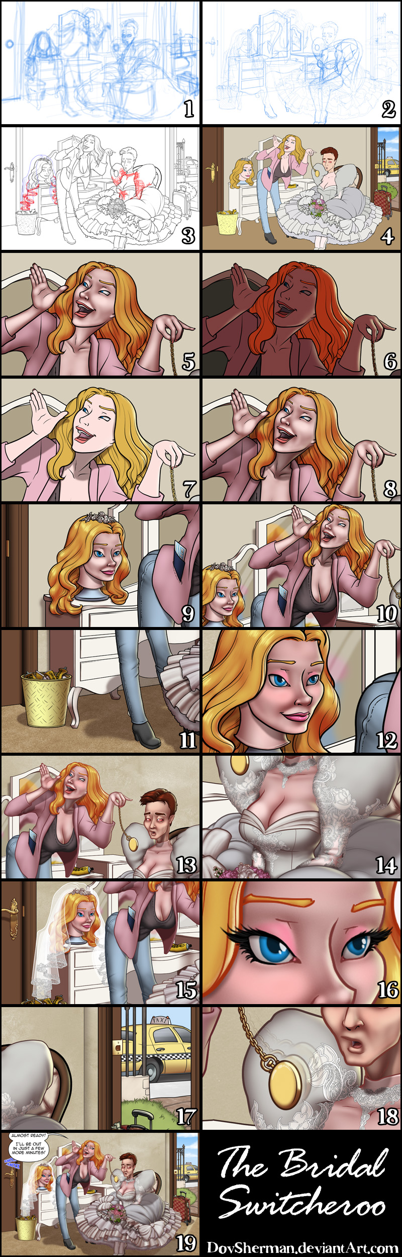
1. In Manga Studio, I start with a very rough sketch with big fat pencils. The fat pencils force me to keep the sketch loose without getting too caught up in the details. I started with just the basic naked figures.
2. Final sketch. Now I go back and do a more detailed sketch, working out the clothing and hair, ropes, and props.
3. Inking. I use a variable-width inking brush for the characters and a constant-width brush for hard things (the paddle, belt buckle, etc) on vector layers. I use lots of different layers for different parts, which makes it easier to overdraw and erase as needed. I exported the lace detailing as separate layers.
4. In Photoshop, I convert the imported lines to a folder with a mask and put a solid black layer in the folder. (CTRL-click RGB in the Channels tab, invert the selection, create a mask from the selection.) This will come in handy later when I color the linework. Then I create another folder and start creating the basic color blocking. I also added some text to the tubes of Glue Brand Glue and a simple pattern of designer-style logos to the luggage.
5. Form shading. I create a dark brown solid color layer (linear burn) and start painting in the basic form shading with a soft airbrush. Except for the hair, which gets its own dark brown layer but with linear burn blending for more richness. I also use a smudge tool on the hair and various creases in clothing and skin to create detail.
6. Backlight. A desaturate pale yellow solid color layer (screen). When I combined it with the form shading, backlighting really makes the characters pop. I used both a soft brush and a soft airbrush. When it's done right, it should look like real lighting from a different angle. In this case, it's meant to suggest the light coming in from the open back door. And again, smudge the edge of creases and hairs.
7. Cast shadows. I make a new dark brown layer set to multiply and start painting in the cast shadows with soft brush, using a smaller brush in places where the object casting the shadow is closer to the thing the shadow is on.
8. Put them together and it's looking good!
9. Shiny. Now add in the shinies. I used a solid white layer at for basic shine on lips, another solid white for shine in the eyes, and solid white set to overlay (which makes a richer shine) for the hair shine. Painting the hairshine, I use a variable width sharp brush, then go over it with an airbrush to give it a little glow.
10. It's not a mirror if there's no reflection. To give the mirror a feeling of depth, I paint in a reflection with a very soft brush, sampled from things in the foreground. I also add some straight line glass shiny streaks.
11. Texture. The carpet, walls, sidewalk, and pathway each get their own texture. A carpety texture for the floor and grungy textures for the rest. I make each on by creating a new solid layer with a pattern on it, then rasterizing it, applying distortion to match the perspective and angle, then setting the texture layer to overlay blend mode.
12. For the blush, I add in a light red layer, airbrushing just on the same area as the skin for the joints and face. I use the same technique for the eyeshadow and spanking soreness.
13. Colored linework. Going back to the linework folder, I started adding new solid color layers, using the mask to paint the color of the linework. Since the new layers are inside a folder with a mask defining the linework, I don't have to be very precise when coloring the lines. I always add new color layers below the ones I already did so that I can be sloppy in the areas that are already covered by colored linework.
14. Lace detail. For the lace detail linework, I set a layer style with color overlay set to white and an outer glow set it dark grey set to multiply. Then I add a white fill layer below it and paint in the areas inside the lace. Then I carefully duplicate the shading on the sleevs and bodice for just the lace.
15. Veil. I apply the same layer style from the lace detail to the lace on the veil. Then I add a bunch of transparent white layers in between and behind for the layers of veil.
16. Eyelashes are done with a folder containing a solid grey layer and a solid black layer. I use a variable width brush to paint in lashes on the folder mask. Then I paint in a few thin streaks on the grey layer mask to add depth to the lashes.
17. The outside always looks extra bright when seen from inside on a clear day so I added an adjustment layer pushed the levels brighter for just the are outside the door.
18. To create motion, I copied just the pocketwatch, then rotated it a little, erased part of with a soft eraser, and lower the opacity. Then I made a duplicate of that, rotated it more, and lowered the opacity even more.
19. Text. Finally, I add the word balloons (vector shapes with a stroke layer effect) and text plus some simple sound effects and I'm done!
Files