Home
Home

 Artists
 Search
 Recent
 Random
 Posts
Posts
 DMs
DMs
 Tags
Tags
 Random
 Importer
 Import
 FAQ
FAQ
 Account
 Register
 Favorites
 Login
Login

Hypno Mommy Domme - Process (Patreon)
Content
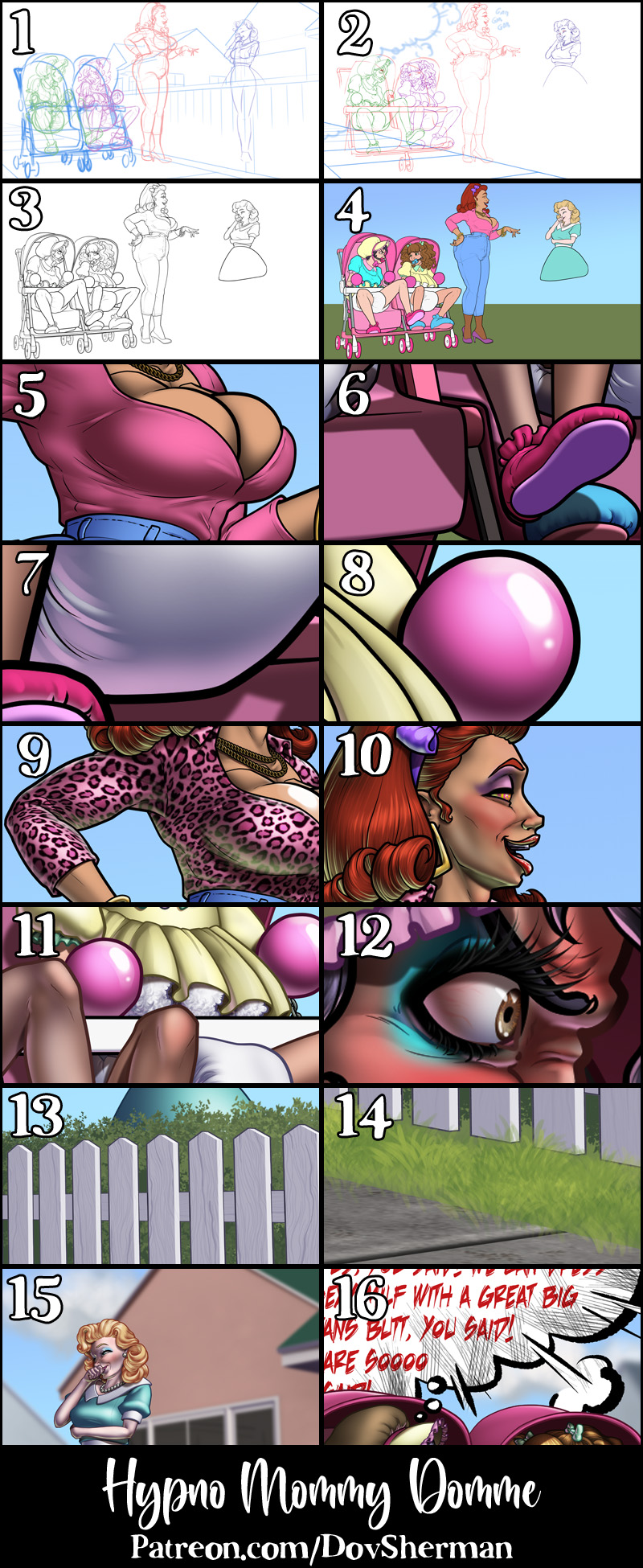
1. Rough sketch. I start by sketching out the layout and poses. I used Clip Studio's 3D models and perspective rulers as references and roughed in the general shapes for the clothing and props. I used a downloaded model of a one-seat stroller and sketched around it but I built my own pacifier and suburban house models.
2. Final sketch. I use separate layers in multiple folders for the various props and the character which makes it easier to plan, especially when so many of the parts overlap. If you look closely, you can see that I draw some parts that I know will be completely hidden behind others, particularly the basic body shape, to make sure it will all make sense together. Keeping them on separate layers also makes it easier to shift the positions of individual features when final details on foreground features might change the layout needs.
3. Inking. I scale the canvas up to four times the size and use a variable-width inking brush for the character and a constant-width brush for hard things on vector layers. I use lots of different layers for different parts, which makes it easier to overdraw and erase as needed. Planning for the line coloring later, I try to use a different vector layer for each part that would be differently colored as linework such as one for the character's skin, one for everything that will have black linework, etc.
4. Color blocking. I set the folder containing all the different inked vector layers as the reference layer. Then I made new raster layers underneath and started filling in the flat colors. Sometimes I used a round pen, sometimes the color fill bucket, usually with the fill set to follow only the reference layer, stopping at the middle of a vector.
5. Form shading. I create a desaturate blue solid color layer (linear burn) and start painting in the basic form shading. For a painterly look on the clothing, I roughed in a very loose sense of form with an airbrush then added all the shading detail using only a watercolor brush. For the more chiseled parts, I used a different shading technique - starting with a hard brush to make something like cel shading, then using watercolor brushes to add midtones, then using the blur tool to smooth the shading out where appropriate and go back to the watercolor brush where I want sharper details. I also added a pale yellow layer set to screen to airbrush in some soft highlights in key places. For the hair, I used color burn for richer shading and start with a general, soft watercolor brush to get lay in some stronger hairs for a sense of texture, then use an airbrush to establish the overall form, then use a fingertip smudge or watercolor brushes to add some extra detail.
6. Cast shadows. I make a desaturate brown layer set to multiply and start painting in the cast shadows with soft brush, using a smaller brush in places where the object casting the shadow is closer to the thing the shadow is on.
7. Backlight. For the secondary lights, I used a pale desaturate color layer away from the light source and a white layer toward the light source, both set to screen. Then I paint with a soft airbrush or a watercolor brush (when I want it to be more textured) on opposite sides of shiny objects. The forelight is used only on the shiniest parts, mainly the decorations. When I combine it with the form shading, backlighting really makes the characters pop. I don't use any backlight on non-reflective objects. On the hair, I used the watercolor brush to streak in the shape of the hairs and then used an airbrush, selection-masked to the shading, to add softer backlight.
8. Shiny. For the glossiest parts, I used light watercolor brushes to paint reflections for both primary and reflected light sources, then I used a strong watercolor brush for the specular highlights (or a variable round hard brush when I want the highlight extra strong), using a thumb tool to smudge for detail. For the shine on the hair, I started with thin strokes with a soft watercolor brush, then use an airbrush to add a soft glow to groups of streaks, and finally use a soft round brush to erase a few streaks in the middle of each group. After painting all the shine, I use the cast shadow layer to make a selection and delete the shine from anywhere covered by shadow.
9. I added a leopard pattern to the blouse, using mesh distortion to match the shape and perspective.
10. For the natural blush, I add in a raster layer and airbrush red just on the skin for the cheeks and places where bone is near the surface of the skin. I used the same method for the make-up.
11. Colored linework. Since the linework is still all vectors in Clip Studio, I simply selected the vectors and changed their color to whatever colored linework I needed, sampling from each section and then shifting the color to be more saturate and dark, more or less depending on how hard or soft I want each thing to feel. The hardest things I keep black. Then I collapsed all of the linework into raster layers, locked the pixel transparency, and used an eraser to fix up any places where different color linework crossed over each other or a multiply brush where the shadows were deep enough to require darker linework.
12. Eyelashes are done with a simple raster layer painted with a black variable-width pen. Then I lock the pixel transparency for that layer and use a soft pen to paint in grey streaks for texture and then soften the look with a few strokes of a black soft airbrush. I airbrushed some color onto the tips to make it the lashes extra fancy.
13. To keep the backdrops quick, I started with a 3D model of a picket fence, rasterized it, then converted it to a shading layer using my blue shading color over a white layer in a shape extracted from the rasterized model. Then I made a second rasterized version with outline turned on and lighting turned off in the model, then adjusted the levels until I had just the linework, giving me a simple linework layer which I cleaned up by hand, filling in any missing lines. Then I added my woodgrain texture, distorted it to match the perspective, and masked it to the slats of the fence. Behind the fence, I painted a simple shrubbery, starting with a solid green block, then adding detail by using my foliage scatter brush in varying sizes and shades of green.
14. I added a concrete texture, combined with a grungy texture at a different scale, distorted in perspective to match the sidewalk. Then I painted some edges between sidewalk blocks. Finally, I added some grass tufts on either side, using my grass tuft scatter brush in varying sizes and shades of green, making sure to obscure the base of the fence post.
15. I painted in some very simple clouds in the sky, using my cloud brush and two shades of light blue-grey. I rasterized my models of suburban houses and converted them to shading layers. Then I handpainted the color blocks, using a watercolor brush to add some vague detail in the windows, applied a faint texture to the walls, then rasterized the houses and applied a heavy blur to make them feel further away.
16. To add context and hide the part of the backdrop that I didn't draw, I added a huge thought balloon on the left side of the picture, using a very scratchy line style for the edges, then painting in a fade to black with a cross-hatching brush. Below the fade, I added red text, shifting to slightly smaller font size with each line to suggest that the thought just keeps going and going. Using the same sratchy brush, I hand-painted some fury smoke puffs and flashes along the edge of the thought balloon. Then I added some simepl "gab gab gab" text near Mommy.
Files