Home
Home

 Artists
 Search
 Recent
 Random
 Posts
Posts
 DMs
DMs
 Tags
Tags
 Random
 Importer
 Import
 FAQ
FAQ
 Account
 Register
 Favorites
 Login
Login

The Happy Housewife - Process (Patreon)
Content
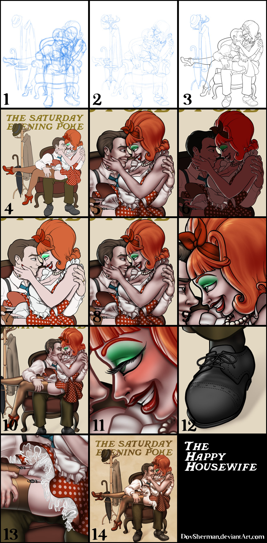
2. Final sketch. Now I go back and do a more detailed sketch, working out the clothing, hair, and a environmental details.
3. Inking. I use a variable-width inking brush for the characters and a constant-width brush for hard things (the hatrack and pearls) on vector layers. I use lots of different layers for different parts, which makes it easier to overdraw and erase as needed. I don't ink the crinoline or shoelaces because I plan to draw those with a different process later.
4. In Photoshop, I convert the imported lines to a folder with a mask and put a solid black layer in the folder. (CTRL-click RGB in the Channels tab, invert the selection, create a mask from the selection.) This will come in handy later when I color the linework. Then I create another folder and start creating the basic color blocking. I'm inking the hatrack in the background separately so that I can work on its color and shading individually as well. This is also when I dropped in the text for the magazine title using a font that I cobbled together just now.
5. Form shading. I create a dark brown solid color layer (linear burn) and start painting in the basic form shading with a soft airbrush. Except for the hair, which gets its own dark brown layer but with linear burn blending for more richness. I also use a smudge tool on the hair and various creases in clothing and skin to create detail.
6. Backlight. A desaturate pale blue almost white solid color layer (screen). When I combined it with the form shading, backlighting really makes the characters pop. I used both a soft brush and a soft airbrush. When it's done right, it should look like real lighting from a different angle. And again, smudge the edge of creases and hairs.
7. Cast shadows. I make a new dark brown, nearly black layer set to multiply and start painting in the cast shadows with soft brush, using a smaller brush in places where the object casting the shadow is closer to the thing the shadow is on. Since I'm trying to reference Norman Rockwell's painting style, I kept the shadows on the floor very, very minimal.
8. Put them together and it's looking good!
9. Shiny. Now add in the shinies. I used a solid white layer at for basic shine on lips and breastforms (to make them look more artificial), another solid white for shine in the eyes, and solid white set to overlay (which makes a richer shine) for the hair shine. Painting the hairshine, I use a variable width sharp brush, then go over it with an airbrush to give it a little glow. The hose also gets it's own shine layer of white set to overlay for that warm glow, painted with a very soft brush because the knitted texture of hosiery creates a more diffused shine.
10. Colored linework. Going back to the linework folder, I started adding new solid color layers, using the mask to paint the color of the linework. Since the new layers are inside a folder with a mask defining the linework, I don't have to be very precise when coloring the lines. I always add new color layers below the ones I already did so that I can be sloppy in the areas that are already covered by colored linework.
11. Eyelashes and blush. Eyelashes are done with a folder containing a solid grey layer and a solid black layer. I use a variable width brush to paint in lashes on the folder mask. Then I paint in a few thin streaks on the grey layer mask to add depth to the lashes. For the blush, I add in a light red layer, airbrushing just on the same area as the skin for the joints and face.
12. Shoelaces. This part is very simple layer effects and masking. I make a color layer matching the shoe, draw in part of a shoelace, then apply an inner glow effect (black, set to multiply) for the linework and a drop shadow effect. Then I just do is again on a few more layers for other parts of the shoelace to overlap and pop them into folders with masks when I need to hide part of a shoelace where it goes inside the throat line of the shoe.
13. Crinoline. Another really simple technique. First I make a solid white layer and use a hard variable-width brush to doodle in the edged of the crinoline and apply a slight inner glow (grey set to multiply) for linework. Then I make another white layer with a lower opacity and fill in the area between the edge and where it disappears under the skirt. Then I make a third white layer with low opacity, use the previous white layer to make a selection, and airbush soft streaks of white inside that selection along the tops and bottoms of the folds. Then I do all of that again for a second layer of crinoline.
14. Final adjustments. Lastly, I add a few adjustment layers: curves (to push the lightest areas toward light just a little bit), color balance (to push the light toward yellow and dark toward blue). Then I add a layer of blotchy watercolor texture (I made this a while back by slopping one color of watercolor paint all over a piece of paper and then scanning it) over the entire picture, set to overlay and low opacity, to give the whole thing a painted feel. And I'm done!
Files