Home
Home

 Artists
 Search
 Recent
 Random
 Posts
Posts
 DMs
DMs
 Tags
Tags
 Random
 Importer
 Import
 FAQ
FAQ
 Account
 Register
 Favorites
 Login
Login

Be Mine - Process (Patreon)
Content
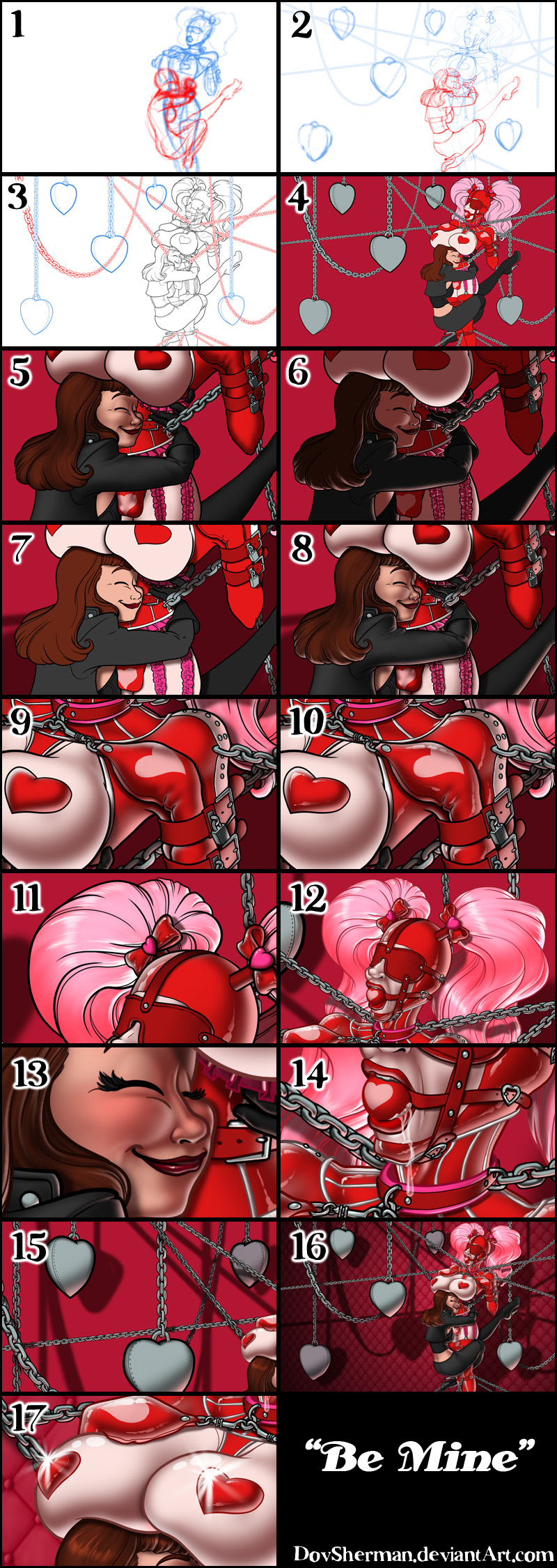
2. Final sketch. Now I go back and do a more detailed sketch, working out the clothing, hair, and background decorations.
3. Inking. I use a variable-width inking brush for the characters and a constant-width brush for hard things (the metal parts) on vector layers. I use lots of different layers for different parts, which makes it easier to overdraw and erase as needed. For the chains, I use the chain brush I made from my own drawing a while back. When I export the linework, I keep the various chain layers separate so I can edit them more easily.
4. In Photoshop, I convert the imported lines to a folder with a mask and put a solid black layer in the folder. (CTRL-click RGB in the Channels tab, invert the selection, create a mask from the selection.) This will come in handy later when I color the linework. Then I create another folder and start creating the basic color blocking.
5. Form shading. I create a dark brown solid color layer (linear burn) and start painting in the basic form shading with a soft airbrush. Except for the hair, which gets its own dark brown layer but with linear burn blending for more richness. I also use a smudge tool on the hair and various creases in clothing and skin to create detail.
6. Backlight. A bright pale red solid color layer (screen) to fit the red environment. I turned one of the form shading layers back on, temporarily disabling the mask (shift-click on the mask), to make it easier to see where I'm painting. It doesn't look like much by itself but, when it's combined with the form shading, it really makes the characters pop. I used both a soft brush and a soft airbrush. When it's done right, it should look like real lighting from a different angle. And again, smudge the edge of creases and hairs. I didn't use backlight on the latex because that will be done separately for a special look.
7. Turning off the form shading, I make a new dark brown layer set to multiply and start painting in the cast shadows with soft brush, using a smaller brush in places where the object casting the shadow is closer to the thing the shadow is on.
8. Combine them all and ta-dah! Looking good!
9. Latex Shine comes in to general steps. First I add backlight on both sides, red for the right-bottom and white for the left-top.
10. Latex Shininess means two specular streaks, drawn with a variable-width brush, again red on the right and white on the left, then slightly softened on the inner edges with a soft eraser.
11. Shiny. Now add in the shinies. I used a solid white layer at for basic shine on lips and breastforms (to make them look more artificial) as well as strong, wobbly streaks of shine on the metalwork, another solid white for shine in the eyes, and solid white set to overlay (which makes a richer shine) for the hair shine. Painting the hairshine, I use a variable width sharp brush, then go over it with an airbrush to give it a little glow.
12. Colored linework. Going back to the linework folder, I started adding new solid color layers, using the mask to paint the color of the linework. Since the new layers are inside a folder with a mask defining the linework, I don't have to be very precise when coloring the lines. I always add new color layers below the ones I already did so that I can be sloppy in the areas that are already covered by colored linework.
13. Eyelashes and blush. Eyelashes are done with a folder containing a solid grey layer and a solid black layer. I use a variable width brush to paint in lashes on the folder mask. Then I paint in a few thin streaks on the grey layer mask to add depth to the lashes. For the blush, I add in a light red layer, airbrushing just on the same area as the skin for the joints and face.
14. Drool. For the drool, I used a white layer with the fill turned down and add a layer effect with white inner glow set to 100%. Then I use a variable width brush in the mask to paint in the shape of the drool. After, I add a new white layer to paint in the shiny highlights on the drool.
15. Adjustment. To make the various levels of chains pop forward or back more, I add some adjustment layers to make the chains darker and lower contrast on the parts that are further back.
16. Backdrop. I need some texture in the backdrop so I dropped in a diamond padding pattern I made a while back for a texture for a 3D model. I collapse the pattern layer and distort it a little to add some perspective. Then drop a soft black gradient over the backdrop.
17. Finally, I add a few white sparkles just for fun and I'm done!
Files