Home
Home

 Artists
 Search
 Recent
 Random
 Posts
Posts
 DMs
DMs
 Tags
Tags
 Random
 Importer
 Import
 FAQ
FAQ
 Account
 Register
 Favorites
 Login
Login

Playing Cupid - Process (Patreon)
Content
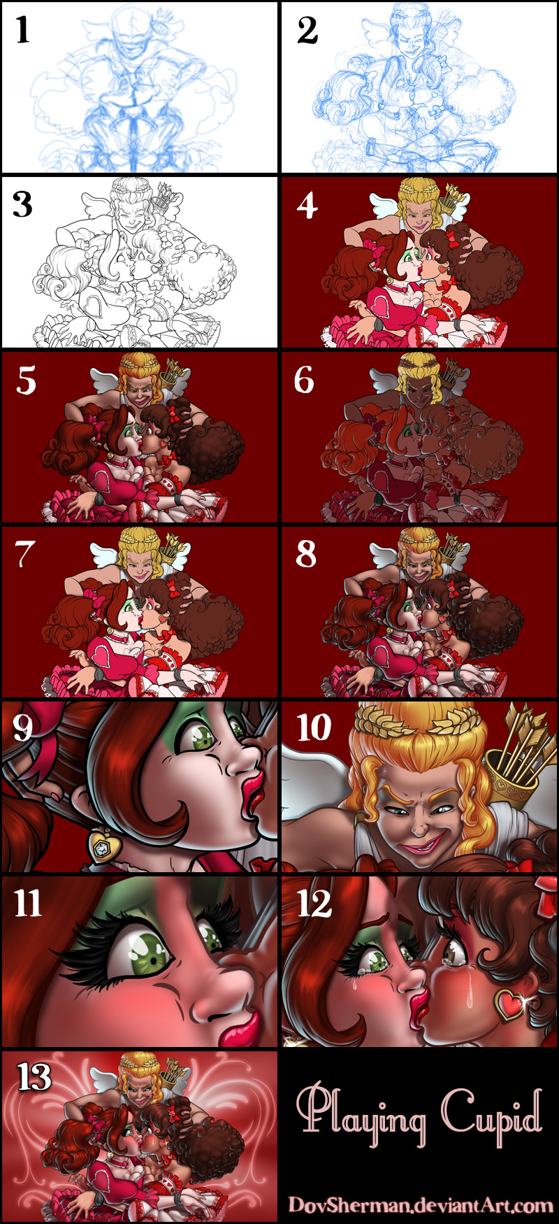
2. Final sketch. Now I go back and do a more detailed sketch, working out the clothing and hair. I also moved a few things, adjusting the shoulders and arms, so that it has more variation instead of being perfectly symmetrical.
3. Inking. I use a variable-width inking brush for the characters and a constant-width brush for hard things (the quiver and arrow shafts) on vector layers. I use lots of different layers for different parts, which makes it easier to overdraw and erase as needed.
4. In Photoshop, I convert the imported lines to a folder with a mask and put a solid black layer in the folder. (CTRL-click RGB in the Channels tab, invert the selection, create a mask from the selection.) This will come in handy later when I color the linework. Then I create another folder and start creating the basic color blocking.
5. Form shading. I create a dark brown solid color layer (linear burn) and start painting in the basic form shading with a soft airbrush. Except for the hair, which gets its own dark brown layer but with color burn blending for more richness. I also use a smudge tool on the hair and various creases in clothing and skin to create detail. I chose a light source that is strongly to one side for a more dramatic effect.
6. Backlight. A bright pale blue solid color layer (screen) for contrast with all the red.This time, I kept the form shading layers turned on so I could keep the backlight aligned with the shapes defined by the form shading, which got complicated in some areas. I'm turning the form shading off here just so you can see the backlight easier.
7. For cast shadows, I make a new dark brown layer set to multiply and start painting in the shadows with soft brush, using a smaller brush in places where the object casting the shadow is closer to the thing the shadow is on.
8. Combine them all and ta-dah! Looking good!
9. Shiny. Now add in the shinies. I used a solid white layer at for basic shine on lips and breastforms (to make them look more artificial) as well as strong, wobbly streaks of shine on the metalwork, another solid white for shine in the eyes, and solid white set to overlay (which makes a richer shine) for the hair shine. Painting the hairshine, I use a variable width sharp brush, then go over it with an airbrush to give it a little glow.
10. Colored linework. Going back to the linework folder, I started adding new solid color layers, using the mask to paint the color of the linework. Since the new layers are inside a folder with a mask defining the linework, I don't have to be very precise when coloring the lines. I always add new color layers below the ones I already did so that I can be sloppy in the areas that are already covered by colored linework.
11. Lashes and blush. I add in a light red layer for blush, airbrushing just on in the same area as the skin. Blush goes on joints and face. Eyelashes are done with a folder containing a solid grey layer and a solid black layer. I use a variable width brush to paint in lashes on the folder mask. I'm trying a thicker, more feathery look for the lashes. Then I paint in a few thin streaks on the grey layer mask to add depth to the lashes.
12. Tears and sparkle. For the tears, I used a white layer with the fill turned down and add a layer effect with white inner glow set to 100%. Then I use a variable width brush in the mask to paint in the shape of the tears. After, I add a new white layer to paint in the shiny highlights. Then I add a new white layer and drop a few sparkles on the jewelry.
13. Background. A symmetrical pattern of loopy fleury designs that I made using the symmetrical ruler in Manga Studio. Add a little glow and I'm done!
Files