Home
Home

 Artists
 Search
 Recent
 Random
 Posts
Posts
 DMs
DMs
 Tags
Tags
 Random
 Importer
 Import
 FAQ
FAQ
 Account
 Register
 Favorites
 Login
Login

Christmas Twee - Process (Patreon)
Content
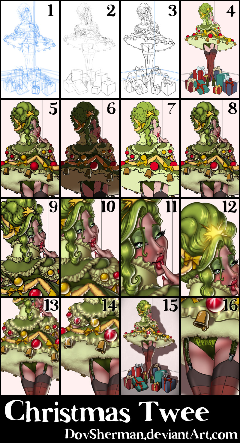
2. Final sketch. Now I go back and do a more detailed sketch, working out the face, hairstyles, clothing, and other details.
3. Inking. I use a variable-width inking brush for the characters and a constant-width brush for hard things (the background and ornaments) on vector layers. I use lots of different layers for different parts, which makes it easier to overdraw and erase as needed.
4. In Photoshop, I convert the imported lines to a folder with a mask and put a solid black layer in the folder. (CTRL-click RGB in the Channels tab, invert the selection, create a mask from the selection.) This will come in handy later when I color the linework. Then I create another folder and start creating the basic color blocking.
5. Form shading. I create a dark brown solid color layer (linear burn) and start painting in the basic form shading with a soft airbrush. Except for the hair, which gets its own dark brown layer but with color burn blending for more richness. After shading the fur, I go back and use a smudging brush to smudge up the shading on the fur to create a sense of little fur hairs.
6. Backlight. A bright pale beige solid color layer (screen) (same color as the background). I turned one of the form shading layers back on, temporarily disabling the mask (shift-click on the mask), to make it easier to see where I'm painting. It doesn't look like much by itself but, when it's combined with the form shading, it really makes the characters pop. I used both a soft brush and a soft airbrush. When it's done right, it should look like real lighting from a different angle. And, again, smudge the fur backlight.
7. Turning off the form shading, I make a new dark brown layer set to multiply and start painting in the cast shadows with soft brush, using a smaller brush in places where the object casting the shadow is closer to the thing the shadow is on. Then I smudge the fur shade.
8. Combine them all and ta-dah! Looking good!
9. Shiny. Now add in the shinies. I used a solid white layer at for basic shine on lips and breastforms (to make them look more artificial), another solid white for shine in the eyes, and solid white set to overlay (which makes a richer shine) for the hair shine. Painting the hairshine, I use a variable width sharp brush, then go over it with an airbrush to give it a little glow.
10. Colored linework. Going back to the linework folder, I started adding new solid color layers, using the mask to paint the color of the linework. Since the new layers are inside a folder with a mask defining the linework, I don't have to be very precise when coloring the lines. I always add new color layers below the ones I already did so that I can be sloppy in the areas that are already covered by colored linework.
11. Character details. I add in a light red layer for blush, airbrushing just on in the same area as the skin. Blush goes on joints and face. Eyelashes are done with a folder containing a solid grey layer and a solid black layer. I use a variable width brush to paint in lashes on the folder mask. Then I paint in a few thin streaks on the grey layer mask to add depth to the lashes.
12. Star Glow. On a bright yellow layer set to screen, I carefull airbush in a heavy glow all over the star and then soft reflections of that glow at key places on the hair and face.
13. Christmas tree lights. The tree lights are just a new layer of bright yellow with some blurry tilted oval shapes. Then I add a heavy outer glow layer effect.
14. Sparkle. With my sparkle stamp brush, I drop in a few sparkles around the scene. Just a few. Too many and it looks fake. Not everything shiny picks up a sparkle at the same moment.
15. Background. The background gets a soft grey on the floor and a soft round gradient to draw attention to the character. I also add a very, very faint texture to the walls. It should be light enough to be unnoticeable unless you know to look for it.
16. Text. Finally, I add the word "Prissy" to Prissy's panties. To get the text to follow the shape of Prissy's buttocks, I used the mesh transformation in Manga Studio. Then I brought it back to Photoshop and stuck it into the color blocking section, masked to match the mask for the panties.
Files