Home
Home

 Artists
 Search
 Recent
 Random
 Posts
Posts
 DMs
DMs
 Tags
Tags
 Random
 Importer
 Import
 FAQ
FAQ
 Account
 Register
 Favorites
 Login
Login

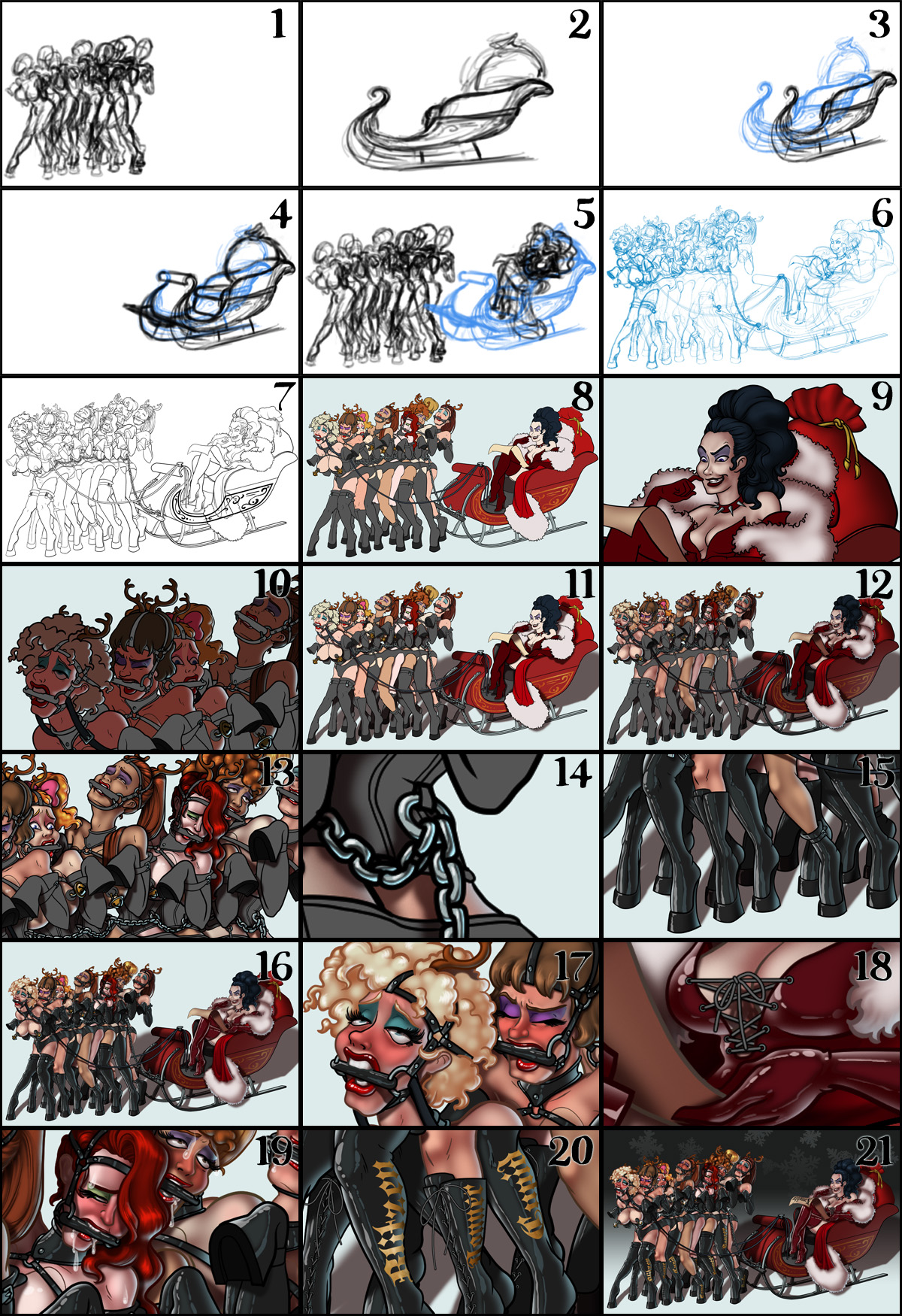
Reindeer Games - Process (Patreon)
Content
2. The sleigh. Since the sleigh is fairly boxy, I'm using a simple trick to draw it with perspective. I start by drawing it in flat view from the side.
3. Next I copy the the flat view twice and distort the copies, squeezing up the back end of both and cheating out the front of the smaller, farther side. The idea is to distort each of the copies so that the edges of the transform controls form the sides of a box approximating the shape of the sleigh.
4. Using the two copies, I can now fill in the parts that connect them, completing a 3D appearance.
5. Now that I have the sleigh, I can sketch in the mistress.
6. Final sketch. Now I go back and do a more detailed sketch, working out all the faces, hairstyles, clothing, and other details.
7. Inking. I use a variable-width inking brush for the characters and a constant-width brush for hard things (chains, sleigh, jingle bells, etc) on vector layers. I use lots of different layers for different parts, which makes it easier to overdraw and erase as needed.
8. In Photoshop, I convert the imported lines to a folder with a mask and put a solid black layer in the folder. (CTRL-click RGB in the Channels tab, invert the selection, create a mask from the selection.) This will come in handy later when I color the linework. Then I create another folder and start creating the basic color blocking.
9. Form shading. I create a dark brown solid color layer (linear burn) and start painting in the basic form shading with a soft airbrush. Except for the hair, which gets its own dark brown layer but with color burn blending for more richness. After shading the fur, I go back and use a smudging brush to smudge up the shading on the fur to create a sense of little fur hairs.
10. Backlight. A bright pale blue solid color layer (screen). I turned one of the form shading layers back on, temporarily disabling the mask (shift-click on the mask), to make it easier to see where I'm painting. It doesn't look like much by itself but, when it's combined with the form shading, it really makes the characters pop. I used both a soft brush and a soft airbrush. When it's done right, it should look like real lighting from a different angle. And, again, smudge the fur backlight.
11. Turning off the form shading, I make a new dark brown layer set to multiply and start painting in the cast shadows with soft brush, using a smaller brush in places where the object casting the shadow is closer to the thing the shadow is on. Then I smudge the fur shade.
12. Combine them all and ta-dah! Looking good!
13. Shiny. Now add in the shinies. I used a solid white layer at for basic shine on lips and breastforms (to make them look more artificial), another solid white for shine in the eyes, and solid white set to overlay (which makes a richer shine) for the hair shine. Painting the hairshine, I use a variable width sharp brush, then go over it with an airbrush to give it a little glow.
14. The metalwork. Super-shiny chome-like metal gets a special treatment because it reacts to light differently than other surfaces. First I paint in the backlight very strong because it's so reflective. Then I use a hard brush to paint in the form shading, adding a little wobble to the edge. Chrome reflects like a mirror so the hard edge with wobble of the form shadow creates the impression that it is reflecting the things around it. Finally, I paint in some bright white shine.
15. Latex gets another special treatment. First, double backlights - a blue one on the right and a white one on the left. Next, a cel-shaded but soft-edged core of slightly lighter grey, close to the middle but more to the left, toward the primary light source. Then double-specular shiny streaks, blue on the right and white on the left. Finally, I grabbed a copy of the cast shadows and used them to mask out parts of the latex shine since a thing can't be shiny if it's in shadow. Afterward, I adjusted the contrast of it all down a little bit so that the complexity of the latex shine wouldn't overpower the linework.
16. Colored linework. Going back to the linework folder, I started adding new solid color layers, using the mask to paint the color of the linework. Since the new layers are inside a folder with a mask defining the linework, I don't have to be very precise when coloring the lines. I always add new color layers below the ones I already did so that I can be sloppy in the areas that are already covered by colored linework.
17. Character details. I add in a light red layer for blush, airbrushing just on in the same area as the skin. Blush goes on joints, palms, and face. Eyelashes are done with a folder containing a solid grey layer and a solid black layer. I use a variable width brush to paint in lashes on the folder mask. Then I paint in a few thin streaks on the grey layer mask to add depth to the lashes. This is also a good time to point out how big I made the pupils here. Heavily dilated, blurry pupils are a good way to show arousal.
18. Lacing. I didn't ink the lacing because the linework would be too small and fiddly. Instead, I made a simple donut-shaped brush and used it to stamp the grommets on in a new layer. Then I added a very thin black inner glow to the grommets so that they would appear to have thin linework. I did the same on additional layers with a simple hard brush to make the laces. Then I went back and added cast shadows onto things the laces would cast shadows onto.
19. Sweat and Slobber. I simplified my sweat/slobber special effect. I used a white layer with the fill turned down and add a layer effect with white inner glow set to 100%. Then I use a variable width brush in the mask to paint in the shape of the slobber. After, I add a new white layer to paint in the shiny highlights on the slobber. Finally, I put that layer inside a folder and a mask to the folder. Then I use a soft brush to erase the edges of the liquid where it touching the skin near the top and a hard brush to erase where the slobber falls behind objects (like the bite gags or other characters). You have to do it on the folder mask because, if you did it on the slobber layer mask, the glow wouldn't fade out properly.
20. Names. To get the names to follow the shape of the legs, I used the mesh transformation in Manga Studio. Then I brought it back to Photoshop and turned the transformed names gold, added some shading, and added a rough texture set to soft light to give it some realism.
21. Background. I add a simple gradient to the background. Then add in a few white snowflakes that I made with the symmetry ruler in Manga Studio. And I'm done!
Files