Home
Home

 Artists
 Search
 Recent
 Random
 Posts
Posts
 DMs
DMs
 Tags
Tags
 Random
 Importer
 Import
 FAQ
FAQ
 Account
 Register
 Favorites
 Login
Login

Sunning in the Pool - Process (Patreon)
Content
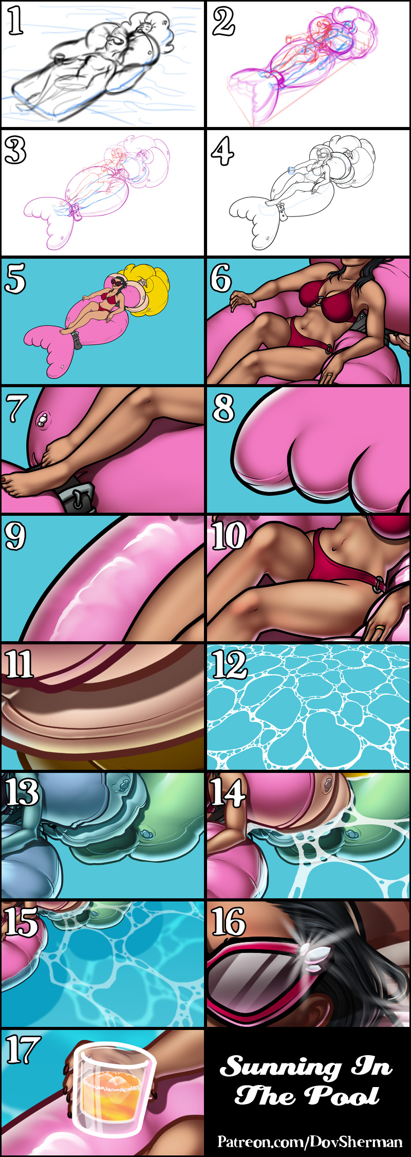
1. In Clip Studio, I draw rough thumbnail to get the basic concept down.
2. Rough sketch. I make a more formal sketch to work out the layout, pose, and proportions. I start getting some of the details roughed out. I used perspective rulers to draw a box to help me plan out the perspective of the floatie suit and the alignment of the sunbather.
3. Final sketch. I sketch the fine details for the character. I use separate layers in multiple folders for the various props and the character which makes it easier to plan, especially when so many of the parts overlap. If you look closely, you can see that I draw some parts that I know will be completely hidden behind others, particularly the basic body shape, to make sure it will all make sense together. Keeping them on separate layers also makes it easier to shift the positions of individual features when final details on foreground features might change the layout needs.
4. Inking. I scale the canvas up to four times the size and use a variable-width inking brush for the character and a constant-width brush for hard things on vector layers. I use lots of different layers for different parts, which makes it easier to overdraw and erase as needed. Planning for the line coloring later, I try to use a different vector layer for each part that would be differently colored as linework such as one each for the character's skin, one for everything that will have black linework, etc. I even extended or closed the linework to go well beyond the point at which I plan the opaque water to conceal it. I also inked the decorative stripes on the outfit although I will later convert those to parts of the color blocking instead of using them as linework.
5. Color blocking. I set the folder containing all the different inked vector layers as the reference layer. Then I made new raster layers underneath and started filling in the flat colors. Sometimes I used a round pen, sometimes the collor fill bucket, usually with the fill set to follow only the reference layer, stopping at the middle of a vector.
6. Form shading. I create a dark brown solid color layer (linear burn) and start painting in the basic form shading with a soft airbrush. I always start with shading at full and then use the airbush set to clear to paint away the shading, painting with light. For the hair, I used color burn for richer shading and start with a general, soft airbrush for the overall shape, then used a variable-width soft airbrush to smudge detail into the shadows, picking up the shape of the hairs. I also added a pale yellow layer set to screen to airbrush in some soft highlights in key places.
7. Cast shadows. I make a new brown layer set to multiply and start painting in the cast shadows with soft brush, using a smaller brush in places where the object casting the shadow is closer to the thing the shadow is on.
8. Backlight. On a new fill layer set to screen, I used a desaturate solid color painted with a soft airbrush in the mask. When I combine it with the form shading, backlighting really makes the characters pop. I don't use any backlight on non-reflective objects. For some objects, I only use a backlight on shadowed side. For the most reflective objects, I add a forelight on the primary light side as well. On the hair, I used the fingertip tool to streak in the shape of the hairs.
9. Shiny. I used a solid white layer for the primary shine and painted spots and streaks using a hard variable-width brush. For the latex, I also added a white layer, set to overlay, to add colorful glistening highlights and a softer highlight to one side of the specular highlight, using a smudge tool to streak the highlights along creases. For the shine on the hair, I started with thin strokes with a variable-width brush, then use a smude tool to add detail and softness to the tips, then use an airbrush to add a soft glow to groups of streaks, then use an airbrush to fade the tops and bottoms of streak groups, and finally use a soft round brush to erase a few streaks in the middle of each group. After painting all the shine, I use the cast shadow layer to make a selection and delete the shine from anywhere covered by shadow.
10. For the natural blush, I add in a raster layer and airbrush red just on the skin for the cheeks and places where bone is near the surface of the skin.
11. Colored linework. Since the linework is still all vectors in Clip Studio, I simply selected the vectors and changed their color to whatever colored linework I needed, sampling from each section and then shifting the color to be more saturate and dark, more or less depending on how hard or soft I want each thing to feel. The hardest things I keep black. Then I collapsed all of the linework into raster layers, locked the pixel transparency, and used an eraser to fix up any places where different color linework crossed over each other or a multiply brush where the shadows were deep enough to require darker linework.
12. My first step in making pool water is to make a solid a layer of white and then use a round brush to erase out lots of blobby shapes, both large and small. Then I used distortion to match the perspective of the surface of the water.
13. I exported both the white water layer and a copy of the full character on a transparent baclground then switched over to Photoshop. I gave the white layer a black background, then blurred it a bit. I saved that out to use as a distortion map which I then applied to the combined character image to create a wavy version of the characters. I then brought that wavy version back into Clip Studio and used a Hue brush to shift the wavy layer 70% of the way to the hue of the water.
14. I placed the wavy image above my blue background and my white water layer above that (turning down the opacity a little). Then I added a mask to my character and masked out the bottom of the character where it would be below the waterline, allowing the wavy version of the character to show through. Then I painted in some additional water patterns on the white water layer along the waterline.
15. I copied the waterline layer and made a darker blue shadow shape by copying the shape of characters with the magic wand. I distorted both to match the perspective of the floor of the pool. Then I applied heavy blur to new water layer and set it to overlay.
16. I stamped a few extra sparkles around the scene for fun.
17. For the drink, I added a simple white transparent layer for the glass itself and a yellow transparent layer for the liquid. Then I locked the pixel opacity of the liquid and added a few strokes of red and used the thumb smudger to streak it around. Next, I added a layer with some white speckles around the surface of the liquid. I threw in a couple of simple white shapes, touched up with an airbrush eraser, to make the ice. I finished up by adding some very simple form shading, shine, and backlight, all set to semi-transparency.
Files