Home
Home

 Artists
 Search
 Recent
 Random
 Posts
Posts
 DMs
DMs
 Tags
Tags
 Random
 Importer
 Import
 FAQ
FAQ
 Account
 Register
 Favorites
 Login
Login

Poledancer - Process (Patreon)
Content
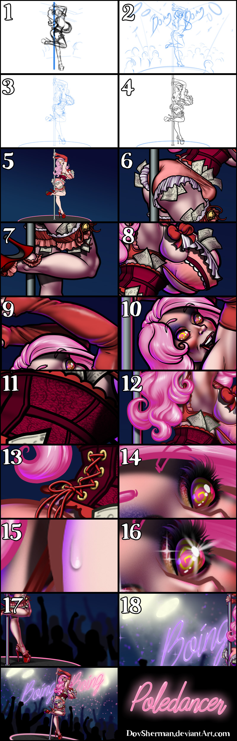
2. Next, a more formal sketch to work out the layout, pose, and proportions. I used perspective rulers for the convention building.
3. Final sketch. I sketch the character in full detail.
4. Inking. I use a variable-width inking brush for the character and a constant-width brush for hard things on vector layers. I use lots of different layers for different parts, which makes it easier to overdraw and erase as needed. I also went ahead and inked the shape for the eyelashes because the brush stablization in Manga Studio makes it a lot easier than doing it in Photoshop later.
5. In Photoshop, I convert the imported lines to a folder with a mask and put a solid black layer in the folder. (CTRL-click RGB in the Channels tab, invert the selection, create a mask from the selection.) This will come in handy later when I color the linework. Then I create another folder and start creating the basic color blocking. I like to do all my color blocking by making a folder and then filling it with different solid color layers for each section of color, whch makes it easy to change a color later. This is a very fussy way to do it and it's probably much simpler to just fill a single raster layer with flat colors.
6. Form shading. I create a dark purple solid color layer (linear burn) and start painting in the basic form shading with a soft airbrush. I always start with shading at full and then use the airbush to paint away the shading, painting with light. For the hair, I used color burn for richer shading and start with a general, soft airbrush for the overall shape, then used a variable-width soft airbrush to smudge detail into the shadows, picking up the shape of the hairs.
7. Cast shadows. I make a new purple layer set to multiply and start painting in the cast shadows with soft brush, using a smaller brush in places where the object casting the shadow is closer to the thing the shadow is on.
8. Backlight. I used a desaturate solid color layers (hard light blend mode so it will really glare) painted with a soft airbrush. When I combine it with the form shading, backlighting really makes the characters pop. I don't use any backlight on non-reflective objects.
9. Shiny. I used a solid white layer for the primary shine and painted spots and streaks using a hard variable-width brush. After painting all the shine, I use the cast shadow layer to make a selection and delete the shine from anywhere covered by shadow. For the shine on the hair, I started with thin strokes with a variable-width brush, then use a smude tool to add detail and softness to the tips, then use an airbrush to add a soft glow to groups of streaks, then use an airbrush to fade the tops and bottoms of streak groups, and finally use a soft round brush to erase a few streaks in the middle of each group.
10. For the blush, I add in a light red layer, airbrushing just on the same area as the skin for the cheeks and places where bone is near the surface of the skin. I use the same approach for the make-up. I also added a layer of greyscale noise, set to overlay, masked to the eyeshadow to give it a glittery look.
11. Texture. I made a layer with a pattern of brocade and lace, flattened it, then mesh transformed it to match the shape of the corset. I also added a noise texture to the stage, using distortion to match the perspective.
12. Colored linework. Going back to the linework folder, I started adding new solid color layers, using the mask to paint the color of the linework. Since the new layers are inside a folder with a mask defining the linework, I don't have to be very precise when coloring the lines. I always add new color layers below the ones I already did so that I can be sloppy in the areas that are already covered by colored linework. I like to keep using black lines on the hardest objects to give it a contrast with softer objects.
13. Laces. I drew some gold doughnut circles onto a new layer for the grommets, then applied a bevel and outer glow (black, multiply). Then I did the same thing with a simple round brush on a new layer for the red laces, using folder masks to hide the laces where the go behind other objects.
14. Eyelashes are done with a folder containing a solid grey layer and a solid black layer. Using the lashes I made earlier with a variable width brush, I add a few thin streaks on the grey layer mask to add depth to the lashes and soften the look with a few strokes of a soft airbrush. Since the backlight is so strong, I also airbrushed in both colors of backlight to the lashes.
15. For the sweat, I used a white layer with the fill turned down just a little and add a layer effect with white inner glow set to 100%, a bevel effect set so that the highlight as on the bottom, and a subtle drop shadow. Then I use the mask to soften the edge where it touches the skin. After, I add a new white layer to paint in the shiny highlights.
16. I stamped a few white sparkles in key places for excitement.
17. For the crowd, I drew twelve simple silhouettes of people and placed them into three rows, scaling each row down a little more than the last. I made the first row black and the last row a color close the backdrop (with the middle row a color in between), so that the crowd would seem to fade out with distance. I also applied a gaussian blur to each layer of the crowd, blurring more with distance.
18. For the backdrop, I added so many effects. First, I added in some text for the name of the strip club, applying layer effects to make it look like neon (bevel, colored stroke, outer glow and inner glow going from colored to white in the center for a glassy look). Then I added in some spotlights by painting some very pale yellow, blurry ovals, then airbrushing a general glow around them in the same color. For the shafts of light from the spotlights, I used a soft brush, then erased the lower extends with a gradient so that they would fade out, and added a layer effect pattern overlay with a cloud pattern to give them a smoky feel. Then I added layers of stamps with confetti in colors similar to the signage, and added a soft blur to them. Finally, I stamped in some sparkles in the same colors.
19. Finally, to give the whole thing a little more excitement, I collapsed the whole image, then cropped it with a partial rotation to give a more active feel.
Files