Home
Home

 Artists
 Search
 Recent
 Random
 Posts
Posts
 DMs
DMs
 Tags
Tags
 Random
 Importer
 Import
 FAQ
FAQ
 Account
 Register
 Favorites
 Login
Login

Too Hot Down South - Process (Patreon)
Content
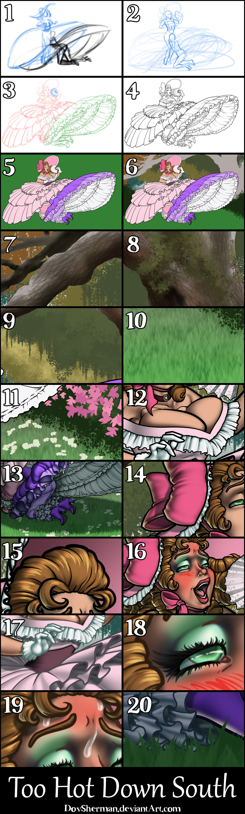
2. Next, I did a rough sketch, getting the figures and pose settled and roughing in the general shape of the gowns.
3. Next I did a more final sketch to work out all the details.
4. Inking. I use a variable-width inking brush for the character and a constant-width brush for hard things on vector layers. I used my own brushes for the chains. I use lots of different layers for different parts, which makes it easier to overdraw and erase as needed. I also went ahead of inked the shape for the eyelashes because the brush stablization in Manga Studio makes it a lot easier than doing it in Photoshop later. I exported the inking for the characters and eyelashes on separate layers.
5. In Photoshop, I convert the imported lines to a folder with a mask and put a solid black layer in the folder. (CTRL-click RGB in the Channels tab, invert the selection, create a mask from the selection.) This will come in handy later when I color the linework. Then I create another folder and start creating the basic color blocking. I like to do all my color blocking by making a folder and then filling it with different solid color layers for each section of color, whch makes it easy to change a color later. This is a very fussy way to do it and it's probably much simpler to just fill a single raster layer with flat colors. For the backdrop, I used the polygonal lasso tool to rough in the ground, sidewalk, and houses. Then I made made a repeating pattern of 100 picket fence posts, then distorted it to match the perspective and added a darker edge for depth. Then I used my leaf and grass brushes to fill in solid blocks for the grass, trees, and bushes.
6. For the backdrop, I started with solid blocks of color, sampled from a photo of a southern garden. For the tree trunk, I used a standard variable width circle brush. For the distant trees, I started with my basic foliage brush, which is a three impressionistic clusters of leaves, radiating out from the center of the brush, with scatter, rotation, and scale variance. Then I made a new hanging moss brush, just one cluster of moss, with varaition in scatter, scale, and roundness, and used it along the bottom edges of the tree shapes.
7. I added detail to the tree trunk with a simple bark texturing brush, made from a photo of bark, then brushed along in the direction of the tree. I also added a layer of form shading to give it some shape.
8. Next, I added moss by using my foliage brush really small in a dark green, then going over it again in light green after adding opacity variance to the brush.
9. Sticking the opacity variance foliage brush, I added a second contrasting lighter shade to each of the layers of silhouette trees in the distance.
10. For the grass, I used a little grass brush (a single blade of grass, faded out at the bottom) to add texture to the ground.
11. For the flowers, I used two types of brushes. For the pink flowers, I drew three flower shapes, arranged in a triangle, facing outward, and made a brush with rotation, scatter, and scale variance, set to vary between foreground and background color. Then I brushed them onto the bushes with two shades of pink. For the wildflowers, I made a brush with a single, simple flower, set to low scatter, low rotation, low scale variance, set to a count of 5 with variance and wide spacing so that the flowers would form small clusters, set to vary between foreground and background color. Then I brushed them onto the bushes with two shades of very pale yellow, almost white. Honestly, I thought this was going to be a simple, quick picture but I got really carried away with the backdrop.
12. Form shading. I create a dark blue-green solid color layer (linear burn) and start painting in the basic form shading with a soft airbrush. For the hair, I used color burn for richer shading and I used a variable-width soft airbrush to smudge detail into the shadows, picking up the shape of the hairs.
13. Cast shadows. I make a new dark blue-green layer (and a blue one for the interior) set to multiply and start painting in the cast shadows with soft brush, using a smaller brush in places where the object casting the shadow is closer to the thing the shadow is on. I made a second, slightly lighter shadow layer for the really big shadows cast by the raised hoop skirts. For the shadow cast on the ground, I painted it with a simple soft brush, then used my grass brush to erase the closest edge and add to the furthest edge, so that the shadow would reflect the shape of the grass.
14. Backlight. I used two desaturate solid color layers (screen blend mode) painted with a soft airbrush. When I combine it with the form shading, backlighting really makes the characters pop. I don't use any backlight on non-reflective objects.
15. Shiny. I used a solid white layer for the primary shine and painted spots and streaks using a hard variable-width brush. After painting all the shine, I use the cast shadow layer to make a selection and delete the shine from anywhere covered by shadow. For the shine on the hair, I started with thin strokes with a variable-width brush, then use a smude tool to add detail and softness to the tips, then use an airbrush to add a soft glow to groups of streaks, then use an airbrush to fade the tops and bottoms of streak groups, and finally use a soft round brush to erase a few streaks in the middle of each group.
16. For the blush, I add in a light red layer, airbrushing just on the same area as the skin for the cheeks and other cheeks. I use the same method to add color for the eyeshadow. I also added some scribbly blush lines to show extra-blushy arousal.
17. Colored linework. Going back to the linework folder, I started adding new solid color layers, using the mask to paint the color of the linework. Since the new layers are inside a folder with a mask defining the linework, I don't have to be very precise when coloring the lines. I always add new color layers below the ones I already did so that I can be sloppy in the areas that are already covered by colored linework. I like to keep using black lines on the hardest objects to give it a contrast with softer objects. Since some areas are in deeper shadow, I used a second, darker shade of linework in those areas.
18. Eyelashes are done with a folder containing a solid grey layer and a solid black layer. Using the lashes I made earlier with a variable width brush, I add a few thin streaks on the grey layer mask to add depth to the lashes and soften the look with a few strokes of a soft airbrush.
19. For the drool and sweat, I used a white layer with the fill turned down just a little and add a layer effect with white inner glow set to 100%. Then I use the mask to soften the edge where it touches the skin. After, I add a new white layer to paint in the shiny highlights.
20. To make the characters look more connected to their environment, I needed to the grass to appear in front of them, where they touch the ground. I copied the backdrop, moved the copy in front of the entire scene, then added an empty mask and painted in some solid grass shapes on the mask, along the bottom edges of the characters where appropriate.
Files