Home
Home

 Artists
 Search
 Recent
 Random
 Posts
Posts
 DMs
DMs
 Tags
Tags
 Random
 Importer
 Import
 FAQ
FAQ
 Account
 Register
 Favorites
 Login
Login

Superbowl Party Bet - Process (Patreon)
Content
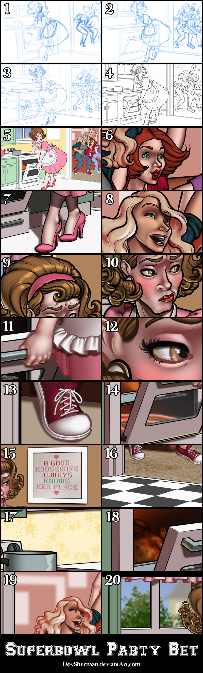
2. Next I did a more formal sketch, working out the poses and proportions, roughing out some ideas for the clothing. I used a 2-point perspective rulers to check the layout of the room.
3. For the final sketch, I worked out all the details of the clothing, hair, and props, reusing the same perspective ruler for the many straight edges in the kitchen.
4. Inking. I use a variable-width inking brush for the character and a constant-width brush for hard things on vector layers. I used my own brushes for the various types of fur. I use lots of different layers for different parts, which makes it easier to overdraw and erase as needed. I also went ahead of inked the shape for the eyelashes because the brush stablization in Manga Studio makes it a lot easier than doing it in Photoshop later. I exported the inking for the characters, lashes, and background shapes on separate layers.
5. In Photoshop, I convert the imported lines to a folder with a mask and put a solid black layer in the folder. (CTRL-click RGB in the Channels tab, invert the selection, create a mask from the selection.) This will come in handy later when I color the linework. Then I create another folder and start creating the basic color blocking. I like to do all my color blocking by making a folder and then filling it with different solid color layers for each section of color, whch makes it easy to change a color later. This is a very fussy way to do it and it's probably much simpler to just fill a single raster layer with flat colors.
6. Form shading. I create a dark brown solid color layer (linear burn) and start painting in the basic form shading with a soft airbrush. For the hair, I used color burn for richer shading and I used a variable-width soft airbrush to smudge detail into the shadows, picking up the shape of the hairs.
7. Cast shadows. I make a new dark brown layer (and a blue one for the interior) set to multiply and start painting in the cast shadows with soft brush, using a smaller brush in places where the object casting the shadow is closer to the thing the shadow is on.
8. Backlight. I used a desaturate solid color layer (screen blend mode) painted with a soft airbrush. When I combine it with the form shading, backlighting really makes the characters pop. I don't use any backlight on non-reflective objects. I used different colors in the kitchen and the living room. I also added a second forelight to the characters in the living for glare from the implied TV.
9. Shiny. I used a solid white layer for the primary shine and painted spots and streaks using a hard variable-width brush. After painting all the shine, I use the cast shadow layer to make a selection and delete the shine from anywhere covered by shadow. For the shine on the hair, I started with thin strokes with a variable-width brush, then use a smude tool to add detail and softness to the tips, then use an airbrush to add a soft glow to groups of streaks, then use an airbrush to fade the tops and bottoms of streak groups, and finally use a soft round brush to erase a few streaks in the middle of each group.
10. For the blush, I add in a light red layer, airbrushing just on the same area as the skin for the cheeks and other cheeks. I use the same method to add color for the eyeshadow.
11. Colored linework. Going back to the linework folder, I started adding new solid color layers, using the mask to paint the color of the linework. Since the new layers are inside a folder with a mask defining the linework, I don't have to be very precise when coloring the lines. I always add new color layers below the ones I already did so that I can be sloppy in the areas that are already covered by colored linework. I like to keep using black lines on the hardest objects to give it a contrast with softer objects.
12. Eyelashes are done with a folder containing a solid grey layer and a solid black layer. Using the lashes I made earlier with a variable width brush, I add a few thin streaks on the grey layer mask to add depth to the lashes and soften the look with a few strokes of a soft airbrush.
13. Laces. I used simple round brush to draw grey circles on a new layer for the grommets, then applied a bevel and outer glow (black, multiply). Then I did the same thing with a simple round brush on a new white layer for the laces.
14. Inside the oven, I added a simple orange shape for the heating element, then added bevel and outer glow effects. (Very similar to how I render neon.)
15. I used a simple canvas pattern and an embroidery font to make the cross stitch sign on the wall. The phrase is slightly paraphrased from 1955 handbook for house wives.
16. I added a carpet texture to the floor in the living room and a simple checkerboard in the kitchen, using distortion on the textures to match the perspective of the ground.
17. I needed a 1950s style wallpaper so I went to a new file and made some retro shapes to create a black and white pattern. Then I applied that pattern to the walls in the kitchen, using distortion to match the perspective and trying different blend modes until I found one that looked good with the color of the walls.
18. I used three colors of brown, oranges, and yellow with a grungy brush to give the surface of the turkey a little texture.
19. I filled in the vague shapes in the background of the living room and added gaussian blur to create distance and suggest more detail.
20. Beyond the window, I used my tree banch brush to create a simple tree shape using two shades of green on one layer. On a second layer, I made some simple geometric shapes in the rough shape of another house. I used gaussian blur on each layer, heavier on the house, to create distance.
Files