Home
Home

 Artists
 Search
 Recent
 Random
 Posts
Posts
 DMs
DMs
 Tags
Tags
 Random
 Importer
 Import
 FAQ
FAQ
 Account
 Register
 Favorites
 Login
Login

Sissy Asylum - Process (Patreon)
Content
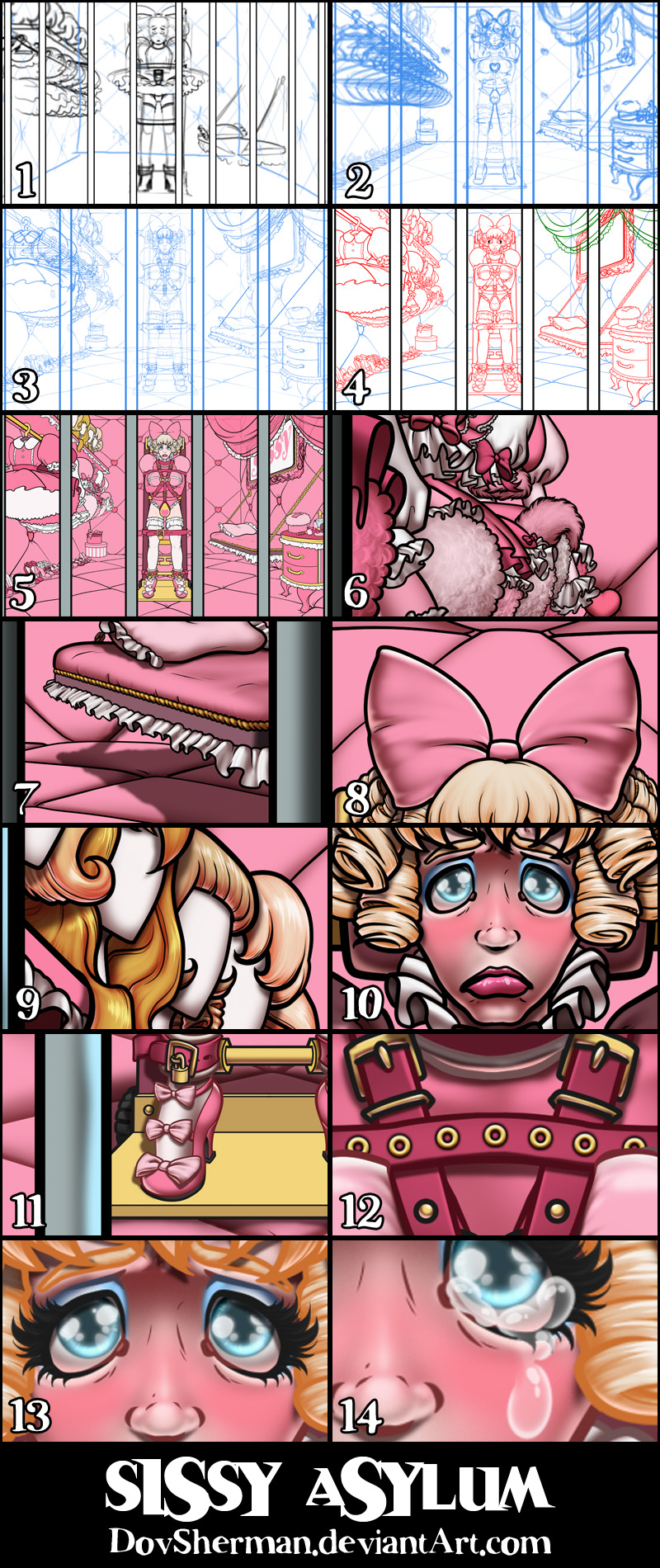
2. Next I did a more formal rough sketch, using perspective rulers to rough out the room layout and more accurate proportions. I also tried various sizes and spacing for the bars until I found a rhythm that worked well.
3. Then I refined the sketch, filling in all the details and props.
4. Inking. I use a variable-width inking brush for the character and a constant-width brush for hard things on vector layers. I used my own chain brush the chains. I use lots of different layers for different parts, which makes it easier to overdraw and erase as needed. I also went ahead of inked the shape for the eyelashes because the brush stablization in Manga Studio makes it a lot easier than doing it in Photoshop later. I exported the inking for the scene/character, backdrop, drapes, and lashes on separate layers.
5. In Photoshop, I convert the imported lines to a folder with a mask and put a solid black layer in the folder. (CTRL-click RGB in the Channels tab, invert the selection, create a mask from the selection.) This will come in handy later when I color the linework. Then I create another folder and start creating the basic color blocking. I like to do all my color blocking by making a folder and then filling it with different solid color layers for each section of color, whch makes it easy to change a color later. This is a very fussy way to do it and it's probably much simpler to just fill a single raster layer with flat colors.
6. Form shading. I create a dark brown solid color layer (linear burn) and start painting in the basic form shading with a soft airbrush. For the hair, I used color burn for richer shading and I used a variable-width soft airbrush to smudge detail into the shadows, picking up the shape of the hairs. For the fur, I blob in very rough, sketchy, soft shading with lots of variation in brighter parts, then use a smudge tool to create all the individual tufts, always drawn towards the outer edge, always working starting from the outer edge first so that tufts in the middle come last. I used bue instead of brown for the form shading on the bars in the near foreground, to create more contrast.
7. Cast shadows. I make a new dark brown layer set to multiply and start painting in the cast shadows with soft brush, using a smaller brush in places where the object casting the shadow is closer to the thing the shadow is on.
8. Backlight. I used a desaturate solid color layer (screen blend mode) painted with a soft airbrush. When I combine it with the form shading, backlighting really makes the characters pop. I don't use any backlight on non-reflective objects. I also added a second highlight on the top edges for the shiniest parts.
9. Shiny. I used a solid white layer for the primary shine and painted spots and streaks using a hard variable-width brush. After painting all the shine, I use the cast shadow layer to make a selection and delete the shine from anywhere covered by shadow. For the shine on the hair, I started with thin strokes with a variable-width brush, then use a smude tool to add detail and softness to the tips, then use an airbrush to add a soft glow to groups of streaks, then use an airbrush to fade the tops and bottoms of streak groups, and finally use a soft round brush to erase a few streaks in the middle of each group.
10. For the blush, I add in a light red layer, airbrushing just on the same area as the skin for the cheeks and other cheeks. I use the same method to add color for the eyeshadow.
11. Colored linework. Going back to the linework folder, I started adding new solid color layers, using the mask to paint the color of the linework. Since the new layers are inside a folder with a mask defining the linework, I don't have to be very precise when coloring the lines. I always add new color layers below the ones I already did so that I can be sloppy in the areas that are already covered by colored linework. I like to keep using black lines on the hardest objects to give it a contrast with softer objects. To create more contrast with the bars in the near foreground, I used pure black on the bars and a slightly lighter off-black for hard objects in the rest of the scene.
12. Extra Grommets. I stamped some gold doughnut circles onto a new layer for the grommets, then applied a bevel and outer glow (black, multiply).
13. Eyelashes are done with a folder containing a solid grey layer and a solid black layer. Using the lashes I made earlier with a variable width brush, I add a few thin streaks on the grey layer mask to add depth to the lashes and soften the look with a few strokes of a soft airbrush.
14. For the tears, I used a white layer with the fill turned down just a little and add a layer effect with white inner glow set to 100%. Then I use the mask to soften the edge where it touches the skin. After, I add a new white layer to paint in the shiny highlights.
Files