Home
Home

 Artists
 Search
 Recent
 Random
 Posts
Posts
 DMs
DMs
 Tags
Tags
 Random
 Importer
 Import
 FAQ
FAQ
 Account
 Register
 Favorites
 Login
Login

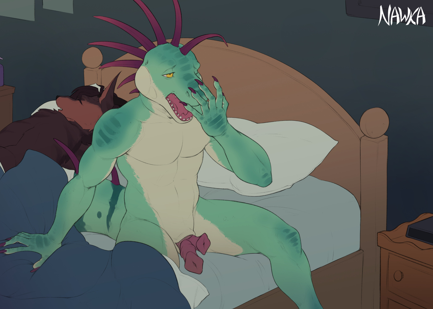
Waking Up (Flats SD) (Patreon)
Content
Flats of this pair.
Also alongside this is just a general mention to those of you who are also artists to remember that exact reference flats are not always meant to be the illustration's flats, whether exact brightness or exact hue and value. In this case the *actual* flats for Hector would be significantly brighter but out of place with the rest of the overall (at least currently) anticipated end-goal.

This rule actually does apply even within comics or animation, even though typically they're meant to be more consistent. Sometimes if there's an intended lighting/setting, you need to be able to bend them. The only actual part that matters is the relativity of the values and hues. Best way to understand that is even if you color pick something under different lighting, you'll see that the absolute colors can be substantially different, but your brain is built to look at how they're different from the colors around them and still know that something that may objectively be gray from color picked perspective is subjectively red once the lighting, or lack thereof is accounted for.
Don't make yourself have to fight harder to make something look a certain way out of some need to use exact reference flats. In a certain manner of speaking: It's not about *being* correct, it's about *feeling* correct.
Files