Home
Home

 Artists
 Search
 Recent
 Random
 Posts
Posts
 DMs
DMs
 Tags
Tags
 Random
 Importer
 Import
 FAQ
FAQ
 Account
 Register
 Favorites
 Login
Login

X1999 - Page Deconstruction (Patreon)
Content
I recently finished reading X (which used to be called X1999 and I call it that for clarity /:) ). It was really satisfying to finish a whole entire manga series for the first time in my life, even if it was a little frustrating to discover that the damn thing didn't actually have a canon ending (!?!?)
Despite this, it was ~3600 pages of grimdark that I absolutely loved reading.
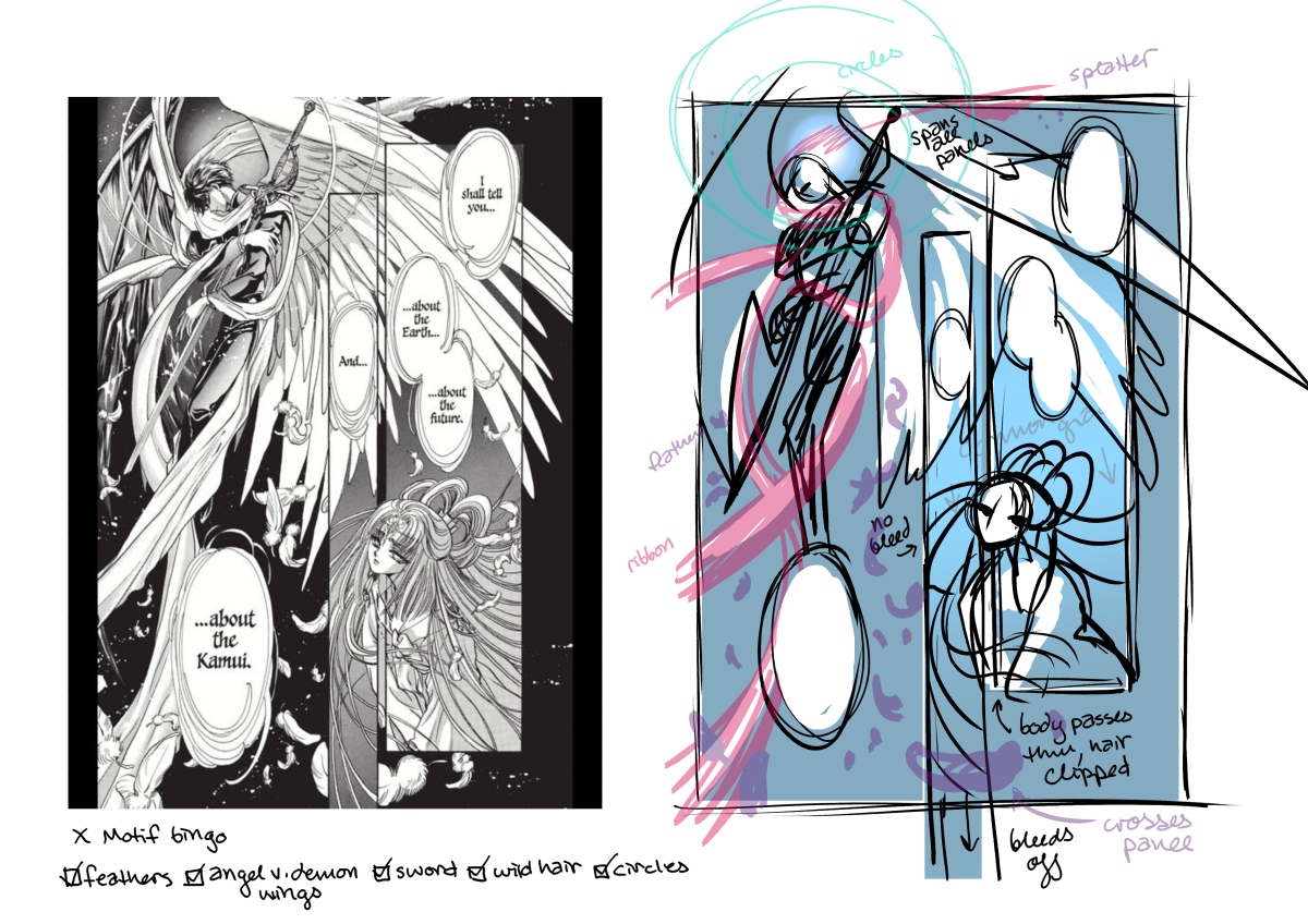
One of the things that I loved about it was the ultra-poetic layouts (and often two-page spreads) that were just so stunningly beautiful to look at. Every couple of pages there would be a spread like this, where the whole thing was just dripping in metaphoric imagery that would transcend all the panelling. The panels and bubbles seemed just to be there to guide you through the sparse text of the page. It was pure emotion and it really drew me in.
I decided it would be interesting to try and recreate one of these pages with all of its layered effects. The top image is the "pencil" breakdown, you can see how I identify which elements clip where (it's really interesting to me how Princess Hinoto herself breaks the panels, but her hair is clipped).

Here's the "ink" player. I kept it pretty rough in this reconstruction because perfectly reproducing the inks wasn't the "point" for me. but it's still interesting to observe how delicate a lot of the lines are here.
This work was first published in 1992. For reference... this is what Photoshop looked like in 1992.

At this stage of the Manga industry, these pages were largely hand-constructed. All of these inks would have been done traditionally. There is evidence of some rudimentary photoshop being used in this work (big gears used as a motif and some city scenes look like photo manipulations), but it's miles apart from what Clip Studio can do these days. For this reason, the panel boxes were probably drawn in at this stage with a ruler, and the feathers were probably all drawn in at this stage also.

Here are the panels and bubbles (reminder that this is read left to right). I love how harmoniously all of these elements are balanced on the page.

Some detail on the inks. Again, I'm being kinda sloppy haha.

Here are the "spot blacks" for the page. Areas of solid black that would have been put down with ink. Hair is always rendered so beautifully in CLAMP work, I'd love to do a study just on CLAMP hair to be honest. This one was kind of quick.

These are the the areas of "primary tone". So another thing that I want to emphasize here is -- again -- today I can put this down super easily in Clip Studio with a filter. Probably at this point these tones were laid down by hand, using Deleter Screentone.

All of these tiny details were cut out with an x-acto knife.

Here's layers 2 and 3 of the tones. It's interesting that on close inspection, the background behind Kamui isn't perfectly black, it's just very dark. Both of these tones are giant gradients. And... again... the feathers would have been done on the layer of inks so someone painstakingly cut out all of those feathers... by hand... with an x-acto knife.

Here are those feathers, finally. I am being sloppy again haha, but it's interesting to find them all on the page. Very easy to add nice colour-coded layers in Clip. If I were constructing this myself I'd be able to fuss about with the lasso tool and place every feather with precision. CLAMP had their pencils, and with inks it was set!

The last effect is the splatter, which may have been done with white ink and a toothbrush, or some kind of gouache or white-out. I also added the circles at this stage, it's possible that these perfect circles were put in with that early version of photoshop I mentioned. But maybe not!
It's really interesting to break this down into steps. I really wanted to study how these effects were layered up. It's mindblowing to me that the only real "trick" to this layout is "be very very good". Like I mentioned before the books are full of intricate, layered layouts like this. I hope I can get to study more of them because I am really just so inspired by CLAMP's work and aesthetic in this series.
I love it so much that the second I finished the digital editions I had bought, I decided this was one series I really wanted to have in print, so I set about trying to collect it.

I decided that even though it never properly ended, it doesn't really matter since the plot was pretty convoluted anyway.... I really love this edition with the BIG X and the same-same-but-different colours. As you can see I collected it so hard that I wound up with two copies of volume 1. I realized that these were printed back in 2011 and a bunch of places that I called were actually no-stocking me or cancelling my order... so I let two orders come through just to make sure I got at least one... ¯\_(ツ)_/¯(It's a pandemic so I have a tendency to hyperfixate on things...)
A friend suggested that I could drop my extra Book1 at a little free library here which I thought was a great idea...! Until I realized that this book maybe has too many decapitations to suit a cute public space like that 😂 I don't know what the limit on decapitations is for polite society.
So! If any of you are interested in a copy of X volume 1, tell me why you think you would enjoy this series :) CW............ decapitations. (Blood, death, destruction, end of the world!!)
Files