Home
Home

 Artists
 Search
 Recent
 Random
 Posts
Posts
 DMs
DMs
 Tags
Tags
 Random
 Importer
 Import
 FAQ
FAQ
 Account
 Register
 Favorites
 Login
Login

On Brand (Patreon)
Content
This is a bit "inside baseball"... but that's what this tier signed up for! For the past year or so I've been thinking very deeply about where I'd like to go with my brand as a cartoonist. Branding is a complicated thing, very much about channeling what people feel when they think about your work.
In essence, it's about narrowing down what makes your own work yours, and what makes it exciting, and then refining and building on those ideas. Until now I've been in a "divergent" mode... going wide and exploring a lot of DIFFERENT things that I like about my own work. It may have seemed like my work was bouncing around in a lot of different directions, that was all part of the exploration.
Recently I decided to take a pass at "converging" based on what I've learned. I have a few ideas, but nothing that I want to commit to yet. I need to run a few more experiments :)
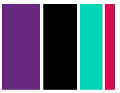
The first thing I did was come up with a "brand mood board". In other words, spending a lot of time surfing Pinterest ;)

None of these pieces are mine, but each of them evokes something that I find very compelling and resonates with me very strongly. It's based on these images that I came up with the colour pallete up top. I think it still needs a few tweaks, but I'm going to mess around with it for awhile and see how it feels.
What do you think? Is this a "jammy" looking board? Is it pretty out there? What do you notice that you recognize? What do you notice that surprises you? I was definitely surprised when I finished this board and took a step back :0
Files