Home
Home

 Artists
 Search
 Recent
 Random
 Posts
Posts
 DMs
DMs
 Tags
Tags
 Random
 Importer
 Import
 FAQ
FAQ
 Account
 Register
 Favorites
 Login
Login

UI improvement for choices (0.3.7 preview) (Patreon)
Published:
2022-09-24 09:22:26
Edited:
2022-09-24 09:22:43
Imported:
2022-09
Content
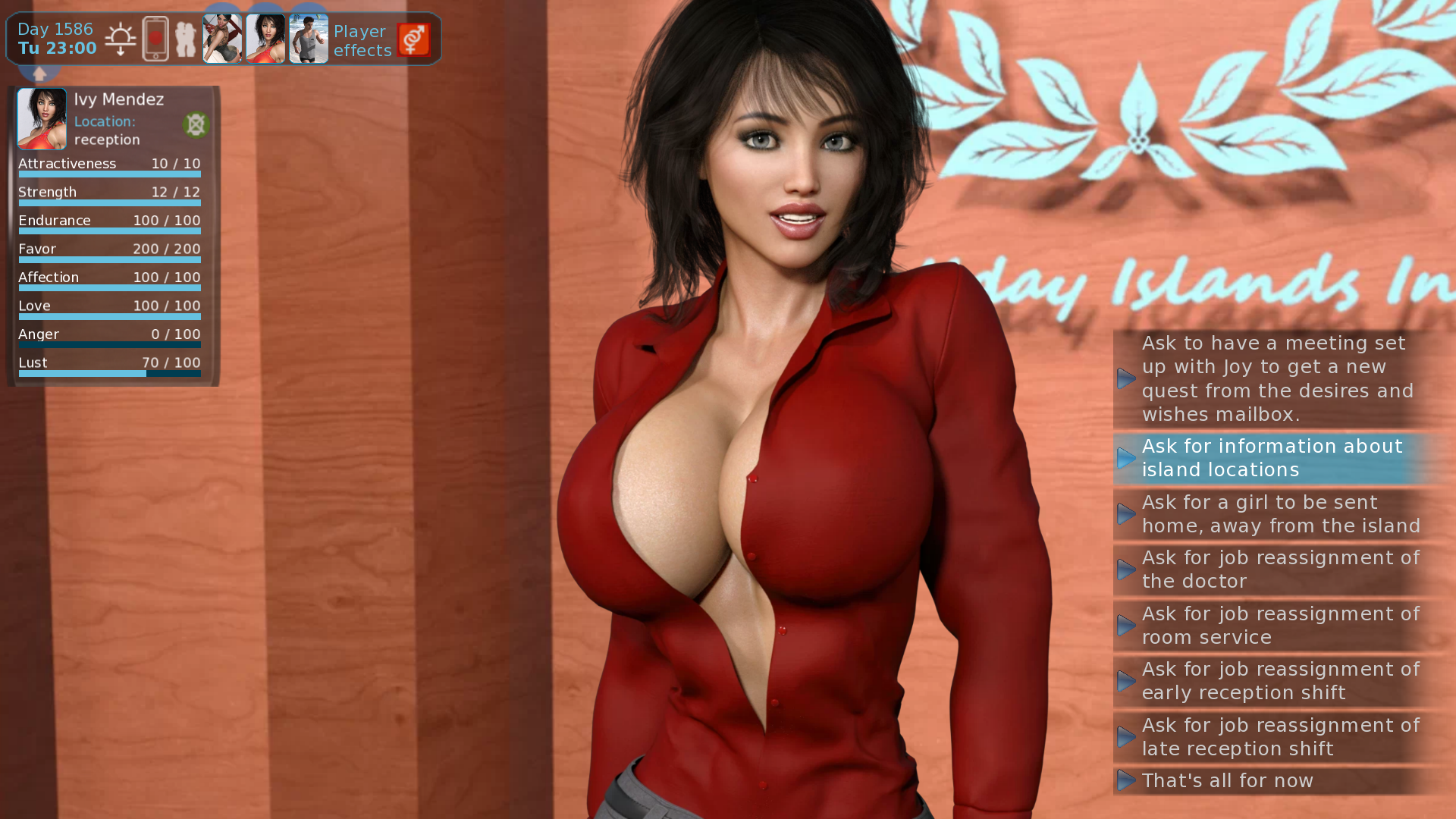
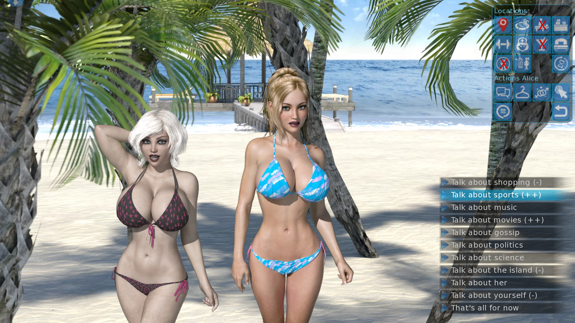
Hello everyone,
have you ever been annoyed that whenever choices came up on the screen, they where right in the middle of it, blocking the view?
This will be fixed with 0.3.7.
The choices are moved to the right side of the screen and are made nicer overal and also smaller and less interfering.
I still have to test it on my phone to see if everything is still readable and the desired choice can be selected without accidentially selecting the one above or below.
For the PC, I'm really happy with it already.
I hope you like the small improvement.
Take care, Darkhound
Files