Home
Home

 Artists
 Search
 Recent
 Random
 Posts
Posts
 DMs
DMs
 Tags
Tags
 Random
 Importer
 Import
 FAQ
FAQ
 Account
 Register
 Favorites
 Login
Login

UI improvement (Patreon)
Published:
2019-01-21 14:36:10
Edited:
2019-01-21 14:36:33
Imported:
2021-06
Content
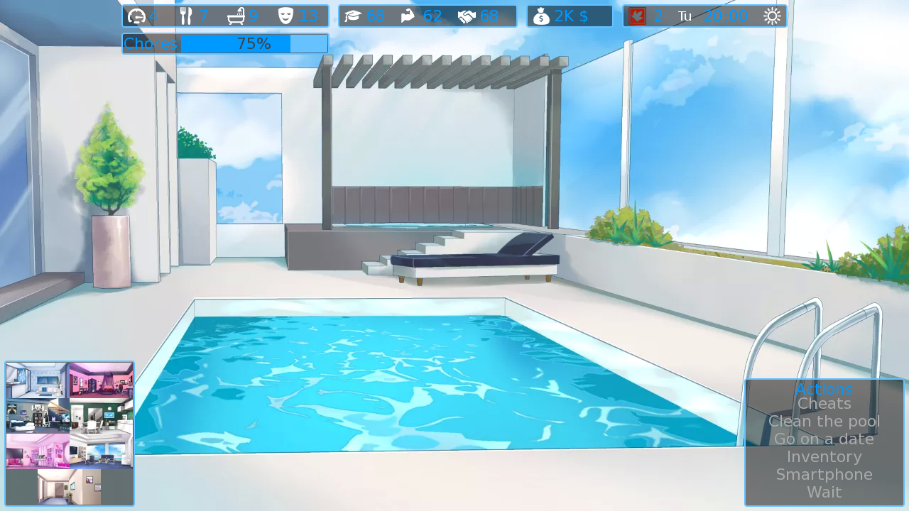
Hi guys,
I know that the UI is a little bit boring right now because it's mostly text.
I am working on improving it so I changed the text for images on the room selection menu.
What do you think ?
Andrealphus
Files