Home Artists Posts Import Register

Content

I sent out Bubbles yesterday and was happy with it. But, I'd also like to get your take on different styles and also explain some things about them.

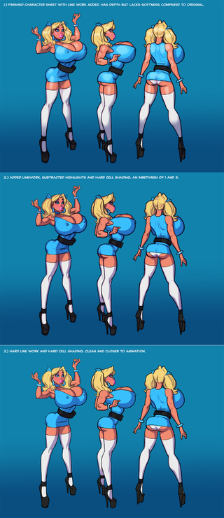
The original I sent out lacked line work. The lack of line work makes the character softer and warmer. Distinctions between elements are handled with crisp coloring and hard edges accompanied by subtle shading.  Line work is also tedious in my opinion. Unless it requires it, essentially tracing your work only adds time and tedium to creating. There are trade offs in creating art. It's possible to over work each separate element and end up with a muddy mess. Too much line work with too much shading and highlights can create a disaster visually. 


Example 1: simply added line work. It certainly defines the character more but it feels less colorful with them and makes the character harder. 


Example 2: A blend between a cell shading technique and the original with added line work. It's not much of a change. It also lacks soft highlights because they tend to clash with cell shading. 


Example 3: This is very close to the look of an animation which makes sense when doing a character that originated in animation. It's clean and simple and would be easy to repeat and has the added bonus of being fast. This style is not something I'm especially familiar with. The visual simplicity of cell shading betrays the actual difficulty in doing it well. 


Another technique not presented here is coloring the line work to soften edges that are normally present with pure black lines. I'm considering going back to it as it's something familiar. 


Let me know what you think of the variations and if you'd like me to explain any elements in creating this pinup.

Files

Comments

Anonymous

I'll have a Original, 1, 2 and 3 to go please! All jokes aside however I think all 4 look great, but my favorite would be #1. Needless to say love the effort your putting in explaining the different styles and techniques you utilize. All the best!

Anonymous

Personally I'm more partial to the 1st option. But I strongly believe you should do what you're most comfortable doing.

Hammertyme

Fuck yah I love exploring with Pit!

Mainly Used for Walking

I prefer the definition of 1, the others come across as a little flat. They're cleaner, but don't "pop"

Anonymous

The first is my personal favorite, although between these three I don't feel strongly one way or the other. I do like the line work over the original though, I must say; I feel like the lack of line work is bordering on blurry for me (I've felt this way on a lot of the newer-style work).

Anonymous

I really like #1 and the shininess of the character in that version, I think it adds to the fuckdoll aspect of things in general, not just this character's case. But I also believe you should do the one you're most comfortable with.

Anonymous

Number 1 for sure. Thats the classic Pit style I am accustomed to. I did enjoy the style of the original tho.

Anonymous

For me, example one looks the best (the different shades of blue on her ass and tits gives a better sense of depth and 3D) yet it involves more work, so whilst my fave style I would be torn if you utilising that style delayed the frequency of updates. There is zero wrong with the other images, as mentioned by others it does look more like the original cartoon style Whatever you produce is epic dude, I have faith you'll create masterpiece after masterpiece

Hammertyme

I think they all look great. The 3rd style seems like it would be ideal for comics, since you state it's quicker. I think it looks terrific and quite fitting for BBG since PPG was originally cell shaded.

Anonymous

I think example 1 looks the best, its beautiful

Anonymous

#1 is the best, sure. But when it comes to stuff like this, I think 2 and 3 are great as well. I think you could save style#1 for those shots that you really want to stand out. Especially when you are talking time and work. It all comes down to output for me. Seeing at the other 2 are so close in quality it'll be great whichever you use. Do whichever will keep you from burning out and keep you interested. That is most important!

Anonymous

I think it's good to mix things up and take different projects in different directions. Variety is the spice of life. I am a big fan of added line work however, I think it adds a lot. I appreciate the way it defines the shapes and contains the character. I can picture the coloring lines technique which you mention, I think that's a really nice method of softening edges.

Anonymous

1 & 3 are preferable. The middle one makes the styles clash a bit too much and it is in the unfortunate situation of looking too unfinished

MichaelS

Okay, I compared the 3 to the original and here are my thoughts: I personally prefer style 1. I think the linework makes the whole thing 'Pop'. It is closer to the way you used to do things that was so amazing (IMO). The original version was much softer and more 'paintery' but also kind of 'fuzzy' or 'muddled' in places (such as hands). I understand where you were trying to go, and it is WAY better than anything i can do, but it is not as pleasing to me as #1. I also think #3 is a nice compromise on time vs output vs quality. Most likely my opinions are because I prefer art such as Terry Dodson, Adam Hughes, etc. and your lined art is along those lines more than the 'softer' one. But then I am also a Tim Vigil fan and so linework is rocking cool to me. (I also thought Jaxtraw was quite talented when he thinks he sucks so bad he quit drawing). So what do I know? :)

MrSaladMonday

Number 1 works best in my opinion. It helps the character stand out and be more 3 dimensional without going overboard. It also look a lot like the style you first employed that drew people to you in the first place.

Anonymous

number 1 because of the shine! nothing more too it IMO

Anonymous

#1 has best depth. Perfect for those lovely proportions! ;)

CWilliams

I rather like #2 and #3, but the idea of coloring the line work sounds like a good option if you'd like to explore it. Another artist I support here on Patreon, Jared Lindquist, always colors the line art in his work and it has a wonderful cartoony feel because of it. Of course he also does the coloring in Illustrator, so I'm not sure whether the process is easier that way or not.

Anonymous

Number 3 is my choice.

qwerpyblah

Number 1 looks best, but use whatever style you feel works best for you, heck the only thing that seemed off about the version from yesterday was the way the hands looked, and that's relatively minor

Dave

I like #1 most as well. I noticed in the PSD, that you had a layer with the facial linework done (layer 29), but opted not to turn it on for the finished product. Now, that said, you should be true to yourself and style and not to us unwashed masses. Everyone is going to have different tastes. Art by committee just seems... I dunno. Besides, I also like the softer look too.

John Doe

Dude they all look amazing. I guess 1 or 3 are the best, but thats really just splitting hairs. I like the extra detail of 1, but I also really like the animation look of 3. I guess that makes 2 a good compromise haha. Personally, whichever one can get you to put out more content quicker would be my preference because it all looks awesome and I want just a ton of pages of comics hahaha. I will say that I think all 3 of these look better than the original. I'd be happy with any of them. If I had to pick one though I'd go with 3. I like the animation look of it.

Anonymous

I'm gonna have to say #1. Mainly because I'm a sucker for the light reflecting off the skin and I don't quite see that with 2 and 3. But honestly I'm just glad to be getting anything at all from you. Do what you think is best.

Explosive Plastic

Damn! Way to break it down. This is awesome. I'd have to vote for style #2 overall, though I love the added linework in all of 'em. More experimenting in the third style would be tight, too. Especially for things like that Popeye comic, etc. Thanks again, dude, you're seriously talented.

RabiesTL

I like the finished ink lines on number 3. The clean animated style is very appealing. Runner up would be number 1.

Anonymous

My favorite would be #1 but #3 would be a very close second.

Anonymous

I think I personally enjoy the in-between area of 1 and 3 that 2 provides. So I'd have to say I really enjoy the second.

Anonymous

I like example 1 best of these 3. And I probably slightly prefer 1 to the original. But I think that's just because, from being a fan of yours for so long, 1 is more of what I'm accustomed to expect when looking at your work. With that said, I actually really enjoy your new style without the line work. The only downside being that small details in the hands, feet, and face don't seem to show up as much.(I guess that's why some people think it doesn't look as finished, I don't know) But the new style is great in showing off the curves of her body. I know everyone is staring at her tits and ass, and with the hard lines it makes the size of her tits really pop. But if you look at the original with your new style and take at look at her arms, you can really see a more natural look as far the contours of her body. Anyways, I would gladly pay for any of these styles as I think they all look great! And I think it's awesome that you took the time to show us the difference between styles and value our opinion. But in the end,....Draw the shit the way you want to! I think the most important thing is that you stay motivated and in a creative mindset. And doing work that is tedious will most certainly drain both your motivation and creativity. Stay Awesome!

Kvothe

Definitely number 1 from the 3. I like the fact that you can see the lightsource as a shallow reflection on the character in addition to the shading. It makes it seem more alive and gives it more depth. Number 3 would be my number 2 as I like the interaction of the colors far more than in 2. Can't wait to see your next character sheets and the comics! Oh the comics!

Dave

I'd be down with some experimentation to. That's kinda what being a patron is all about, in the original sense of the word. If you wanna experiment around some to better find your "voice," I'm all for it.

C.K. Holder-Interracial Erotica

i like the one you posted better than any of these. but of these three, i like #1 the most. the shine from the light is crucial for me. the original post didn't have the black outline and that's more realistic, as most objects also don't have black lines. i've liked every style you've progressed through, and though i don't think i'm totally done with some of the past styles, like i loved how you were doing hunt, and the example of the princess leia pin up, i'm totally down to see you do what you most feel like doing. especially if you think you might kind of go back and forth a bit between you're newer style and whatever you feel familiar with. you're the artist. but again, i like the bubbles character sheet you put out much more than any of these three examples.

Anonymous

#1 is my favorite among these due to the magnetic like attraction the shine creates. When I discovered your work what made me want to see more was the shine.

Anonymous

1 or 3 but all are great!

Tazmatwo

First I have to say I'll take your art however you do it, as this is like saying, "Hey God", you made it wrong. I prefer #1, as she looks more...volumes, with the gradual highlights. I find the shadows in #2 a little hash because they are less gradual...and animation look...I'm salivating at the thought.

Anonymous

I guess 1 is my favorite. However, I want you to be able to get work done and release more content. So, I would go with whatever is easier usually.

Anonymous

Number one is awesome however, just as said your artwork is phenomenal and whichever you you feel is easier and faster to put out; go with that. i personally like your most recent style without the line work. I can only assume that without the line work it's a lot faster to produce.

HyrulianWarrior

I like number one because of the definition to it. It comes of as more detailed. But I also really like number 3 because it is softer and more cartoon like.

buzdlove

Like many admirers and patrons of your work, I tend to like the style you exhibited in frame #1 of the Bubbles character sheet. Much has been said and I am not sure I have much to contribute on this subject, but I'll give it a whirl.....

buzdlove

First I have to get out of the habit of hitting "Return" until I'm really finished my comment, when writing on the Patreon site.

ImpoCreative

I personally prefer it if there is at least a base layer of linework around the finer details of your drawings. The hands especially express a lot more personality once the fingers are more defined. I think this is especially true in your style where the hands are so dainty looking to begin with. Where I do find #1 to be superior, I understand that you have to be cost effective with your time as well. For this piece alone, even if you're only drawing one character you are drawing her THREE times over and have to make he work from different angles. That's why I'm not opposed to maybe going to 2, 3, or the painterly style for comic pages.

buzdlove

Anyway........I think there is a characteristic of your illustration style that hasn't been brought up yet because in many ways it is like sound is to motion pictures, an crucial element in setting the tone of the scene, advancing the story, that is often overlooked when it is done well. It is so subtle, but in my non-artist mind, it is an important part of what distinguishes your illustration style and quality from much of the other work in this space. And to me it seems to really raise your work above much of the rest. That element is lighting, the way you choose to source the light in your images, how the lighting is used to highlight elements of the scene and of your characters (that we so love for their physical attributes), your choice of tone and contrast, AND modulated highlights (In frame #1, which are missing from frames #2 & #3). So to echo the comments of other patrons, your "lighting" of a scene, achieved by your illustration style, really gives a heightened dimensionality to an otherwise 2D form. So with the lighting, my eye is drawn to the action/storytelling/character elements of a scene. But all the other scene elements are "lit" in a way so as to complement the main story elements in the frame. It's so hard to explain, but is such a subtle and important attribute that, I believe, really elevates the work.

buzdlove

So with apologies to all for being such a space hog (and retard with the "Return" key), the gist of my comment is that your close attention to lighting and modulating highlights (like frame #1) makes a big difference to me. Also, since we are really not in a 3D space, your use of black outlines, laborious as it must be to put in, does make a big difference. The clear definition of the images you are illustrating, achieved by use of black outlines in your frames really is appreciated in my mind's eye. Again, I think that element really clarifies the important elements in the frame. The crisply drawn line focuses my attention on the important elements, while the softly drawn lines/sketch-like lines telegraph to my mind, an out of focus or background element that is less important in the scene. That's my two-cents. Like everyone else, I am just glad to see your work. So whatever style you choose to illustrate your stories, I will be happy.

Dave

Thanks for so eloquently summing up my thoughts, buzd! I'll add that if you look at the style differences from the beginning of the "Hunt for BBC" series, to the end, you can really see the talent being honed. Now, if the softer look is the evolution of your style, bring it on! But you really do have a talent for using light and shadow to highlight the assets, and emotions of your characters.

lakedaimon

My personal ranking is like the numbers given. 1>2>3.

Anonymous

If i have to be totally honest i prefer the number 1 in this post.. over the first version posted the other day. I have to admit that i don't know anything about art so i judge only what i see and not what's behind it. The one in this one looks more detailed and i always loved ur works for ur details, don't get me wrong i love both of them but if i have to chose ... the one in this post win by a lot for me. Thanks for the expaination though .

Anonymous

I have been really digging the softer look ( I think the most recent Club Slut pinups have been in this style). Especially if it allows for quicker turn around. I am a 3rd tier supporter but I didn't sign up until late January so I didn't get the Bubbles character sheets from Feb. 7th - but based on what I've seen from jp.com, the softer look without a lot of line art is awesome in my opinion. Also, side note: I love breasts but I’m addicted to nice huge plump butts. I hope you make some of the new characters sort of the opposite physique as bubbles: substantial, plump but more or less natural sized breasts, with a huge exaggerated firm round ass.

Tiokegra

I like the highlights and the dimensionality in the original & number 1. I'm very used to seeing black line work in comics. The colored line work for softening sounds interesting. The cel shading in number 3 is nice too. A cel shaded toon look for 3D models could be suitable. The Captain Lo image had added lines that worked well. I'm very happy to see you create new art. The choice of style is yours.

Terrence Anderson

#3 is the best one, but I'd prefer you to finish the work faster and have it look decent at a minimum. So really I like 2, then I like 1 - however I can't find the source original. order from best to worst is 3 2 1 I think, but I really like them all! Great work

3DXAddict (edited)

Comment edits

2021-12-17 02:44:25 Bubbles is Fantastic! Can't wait to see this Sexy slut taking as much BBC as she can get! And she needs 2 team up with Buttercup & Blossom for some HOT group action!!!
2017-06-11 13:09:21 Bubbles is Fantastic! Can't wait to see this Sexy slut taking as much BBC as she can get! And she needs 2 team up with Buttercup & Blossom for some HOT group action!!!

Bubbles is Fantastic! Can't wait to see this Sexy slut taking as much BBC as she can get! And she needs 2 team up with Buttercup & Blossom for some HOT group action!!!