Home Artists Posts Import Register

Content

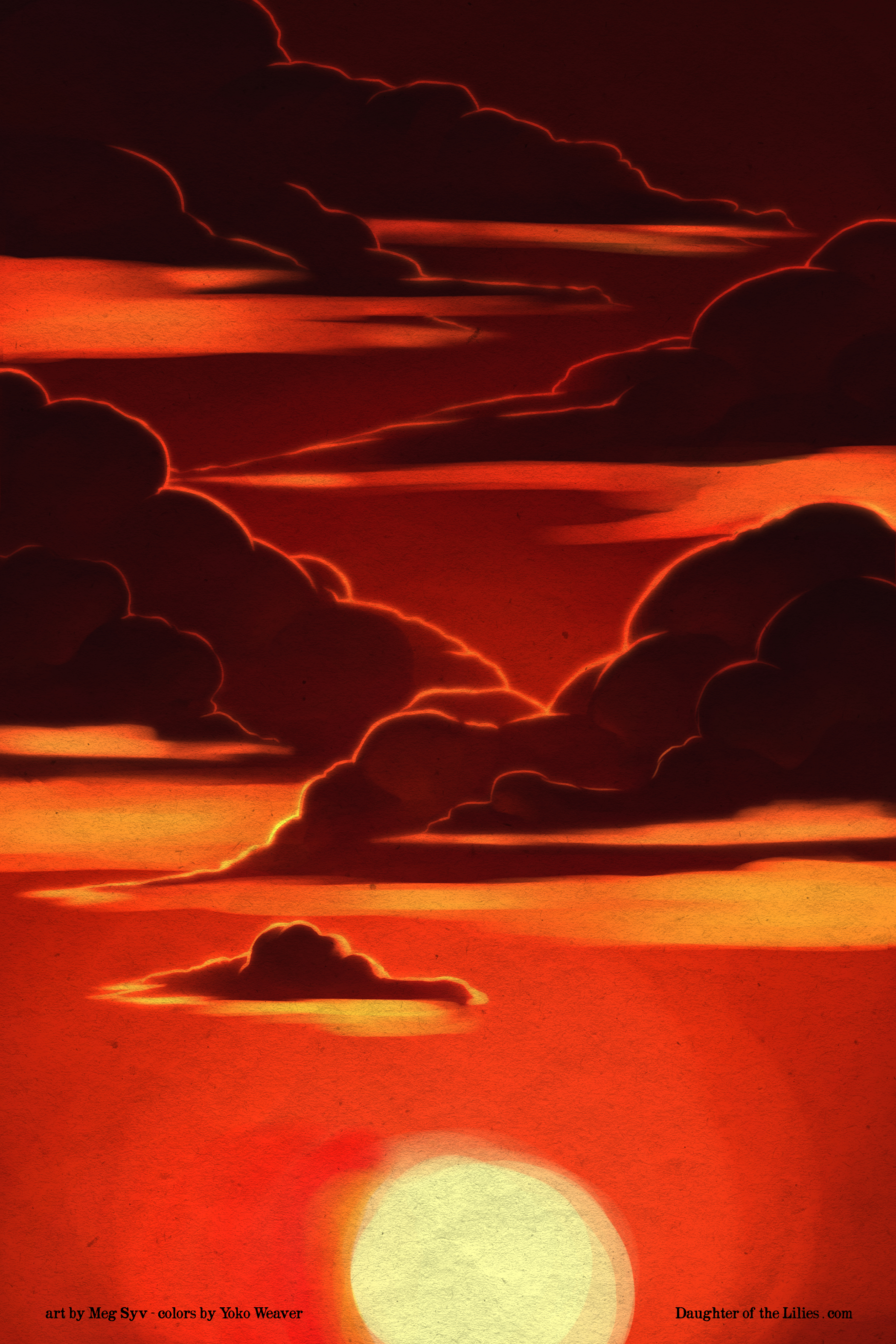
A lot of the clouds ends up getting obscured, but they came out really nice, so I thought it'd be fun to see the Background without the inks 'n all that getting in the way.

ALSO, given how dark some of it all gets, I'm a bit worried about values.  I tested it on my not-so-good monitor and it looks fine, but if you have a hard time reading the info on this image (especially you Mac owners), let me know in the comments and I'll make adjustments accordingly so Meg and I don't have to retroactively make changes when the page officially goes up.

Files

Comments

Robert

Well I'm on an iPad (one of the big ones.) The bottom text looks smudged in the post, but when I tap on it to bring up the full resolution image it's readable. The rightmost part with ".com" is kinda borderline though.

Anonymous

I'm on a Macbook. I think the text is a bit hard to read? The part of me that has designed for print is wondering if some of the most recent pages (especially Brody) are getting a little dark for printing, since whenever I try to print stuff it always comes out darker than I wanted it to (although maybe I've just used crappy printers...). You may want to go a little lighter and more blue/purple with the shadows to get a nighttime feel without worrying about the page being too dark? But so far I can read all the important things fine and I'm really digging the dramatic/atmospheric lighting. Can't wait to see what it looks like finished!

Anonymous

On my phone (galaxy note 4) the top of the clouds get a little most lost as you travel up the page. Personally I think the highlights should be brighter. If the sun is still that high and bright the too edges of the clouds should reflect that brightness. I get that maybe them getting lost is potentially part of the idea but I think they get a little too lost. It would really depend on how much of them gets covered up and what parts of them get covered.

Anonymous

Personally I like

Anonymous

I'm using a Mac. I can see the clouds fine. The bottom left text "art by Meg" I can read fine. The bottom right text ". com" could have the brightness toned up just a little. Overall everything is readable.

MegSyv

The sun actually isn't that high, it's behind background that represents the ground/ broken roofline. Thanks for the feedback!

MegSyv

I'm pretty sure almost all of the pages need test printing and adjustment before being sent to a printer, since the pages are in RGB but will be printed in CMYK. That just comes with the territory of digital to print work. Thanks for the feedback!

maninblack

Great sunset too bad the group is likely missing it