Home Artists Posts Import Register

Content

Who's ready to learn about some Graphic Design? This is what I was formally trained to do before I realized that I just wanted to draw for a living and winged it from there. It's pretty handy for stuff like this, though.

Step 1: Game Plan

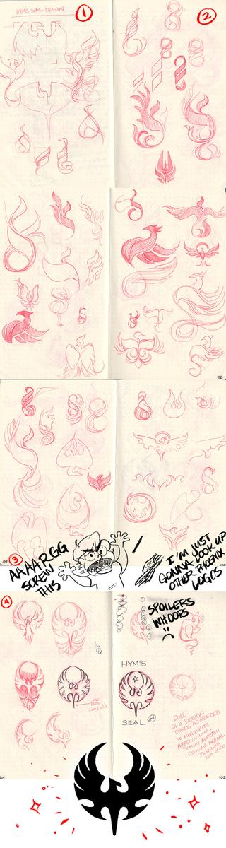
Okay, so I know I need a cool looking logo. I know it needs to be a phoenix. I know it needs to look regal and act as a seal. So from the get go I have a general idea of what I want and how I want it to feel. So that's good.

(If you've read the sketch comics, you already know Hym. He's very important.)


Step 2: Copy

4 years of college and thousands of dollars in tuition have taught me the most effective way to make a cool logo is just google the crap out of that concept and look at what has worked for other people. 

So after a quick google image search for "flame logo" I immediately have some shapes and ideas that I'm tinkering with. I'm not tracing, I'm mimicking shapes and tweaking them into new shapes that I like. I don't google "phoenix logo" because I want to at least be a little original in my solution.


Step 3: Copy (: The Sequel)

Get frustrated and give up on the "flame logo" route and just google "phoenix logos."


Step 4: Tweak the H-E-Double Hockey Sticks Out of It

Immediately I find a logo that I like I begin to create my own  versions inspired by the shapes in the original. (Remember, kids: good artists copy, great artists steal.) 


Step 5: The Digital Transition

Scan that final sketch you really like and do what you can to convert it into pixels and vectors. Scan your image into Photoshop so that you can easily trace over and recreate the shape, export that bad boy as a transparent PNG, and then move that image over to Illustrator to Live-Trace or hand vector that baby. I'm going to do what I can to make the phoenix's head look more centered above the tail/body - right now it looks a little asymmetrical, and that's the opposite of what I want for this insignia.

This will be your final product!

At this point, I'm choosing to end this tutorial/process/explanation because everything is going to get really technical and boring - it all involves anchors and points and how to get an organic shape in Illustrator and that might be boring. 


Unless you guys actually want to see the rest. I'm here to please.

Files

Comments

Mary Williams

I. Suck. So bad. At graphic design. I just don't have the turn of mind for it. So, if you feel up to showing any other steps, I'd love to see more of the thought that went into it! The final result is -so- much better than anything I could have come up with and would look beautiful as a seal in metal, wood, or magic! One question: Are Photoshop's vector tools too limited to do a really nice job of turning a raster into a vector? I adore the pen tool to death but, admittedly, I don't work with vectors a lot unless I know from the start that I'm going to want to have something I need to be able to resize back and forth a bunch of times. (Like text.) PS: Some of those flame logos looked pretty cool, too! The very top one to the right of the centerfold has some nice balance to it, and the large, middle, to-the-right-of-the-centerfold on p98 would be perfectly balanced if you added a smidge of floating ember dots or something on its left side. But maybe I just like swirly phoenixy things, too. :D Thank you for sharing your process!!!

MegSyv

I have a secret: I SUCK AT GRAPHIC DESIGN TOO!!! It's why looking at other people's solution is such an integral part of the process for me. I just can't whip up anything from scratch. aaaa i'm so glad you liked the final result thank you *blush blush* Oh gosh no, I would never even dream of rendering a vector logo in Photoshop. I use Illustrator for anything relating to that. Since Photoshop's foundation is built on pixels, and Illustrator's is vectors and points, the choice is obvious. Illustrator is really challenging for someone who has only had experience in PS, but once you get over that initial hump it's a really convenient tool. Anything logo-related for DotL has a source file in Illustrator that I can manipulate as the needs arise. Do you have any experience in Illustrator, or any questions I can answer for you? (Yeah, I liked those, too! Unfortunately I couldn't make the first one work without it getting too needlessly complicated, and the second one wasn't symmetrical, which is typically what demands that regal feel that I was going for. Maybe for another project...?) ((Recycling ideas is also a vital tool for Graphic Designers. You'd be surprised how many logos I've made that have just been concepts for other projects/commissions.))