Home
Artists
Search
Recent
Random
Posts
Search
DMs
Popular
Hash Lookup
Tags
Random
Importer
Import
FAQ
Account
Register
Favorites
Review DMs
Login
Community
Partychan
Telegram
ThePornDude
Home
Artists
Posts
Import
Register
Login
‹ previous
next ›
jbernal
Notes and Musings on Succubi, page 11
(Patreon)
Published:
2017-09-25 17:23:23
Edited:
2017-09-26 13:07:48
Imported:
2021-07
⚑
Flag
Content
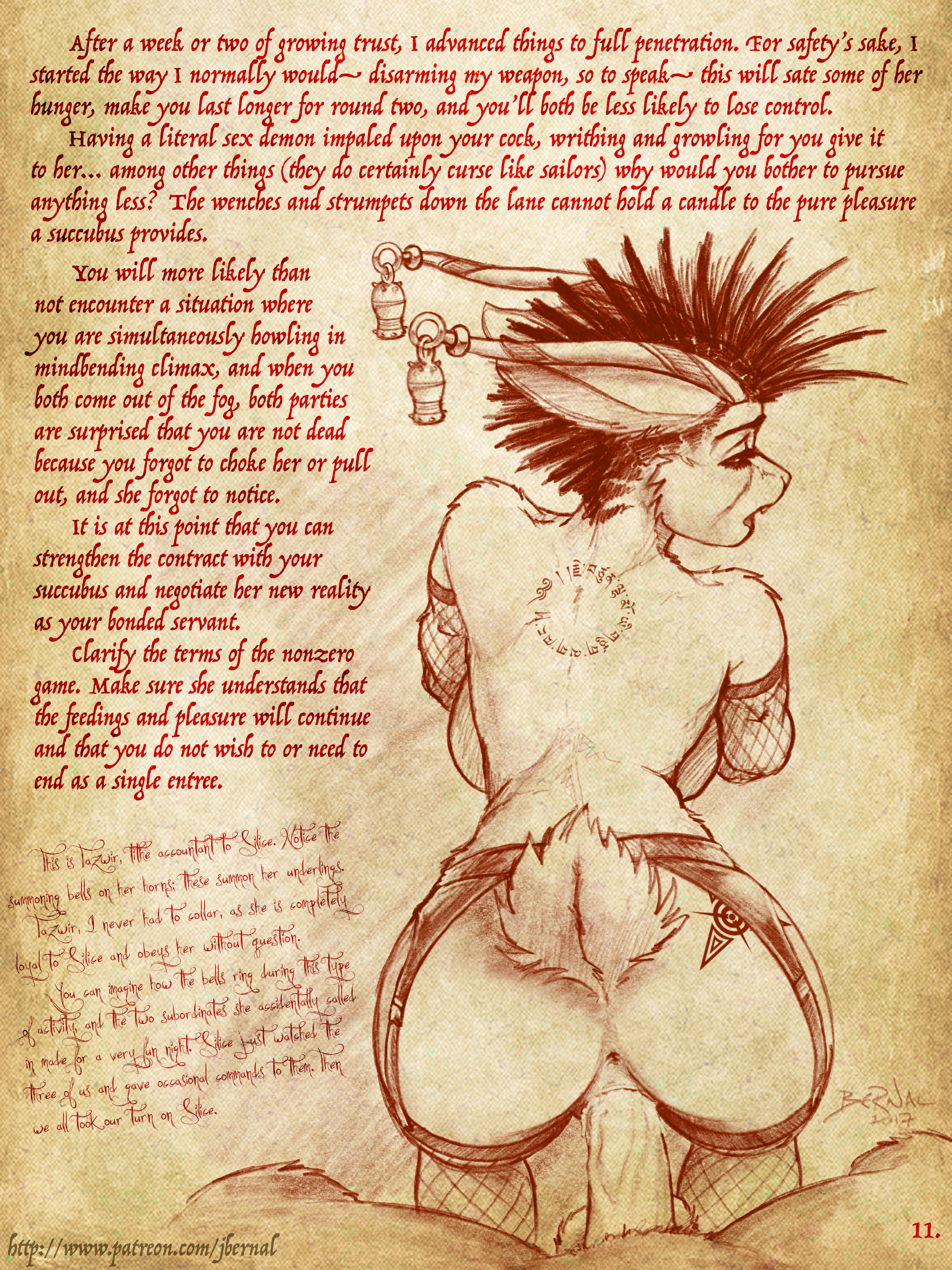
Jingle jangle
Files
Close
 Home
Home

 Artists
 Search
 Recent
 Random
 Posts
Posts
 DMs
DMs
 Tags
Tags
 Random
 Importer
 Import
 FAQ
FAQ
 Account
 Register
 Favorites
 Login
Login