Home
Home

 Artists
 Search
 Recent
 Random
 Posts
Posts
 DMs
DMs
 Tags
Tags
 Random
 Importer
 Import
 FAQ
FAQ
 Account
 Register
 Favorites
 Login
Login

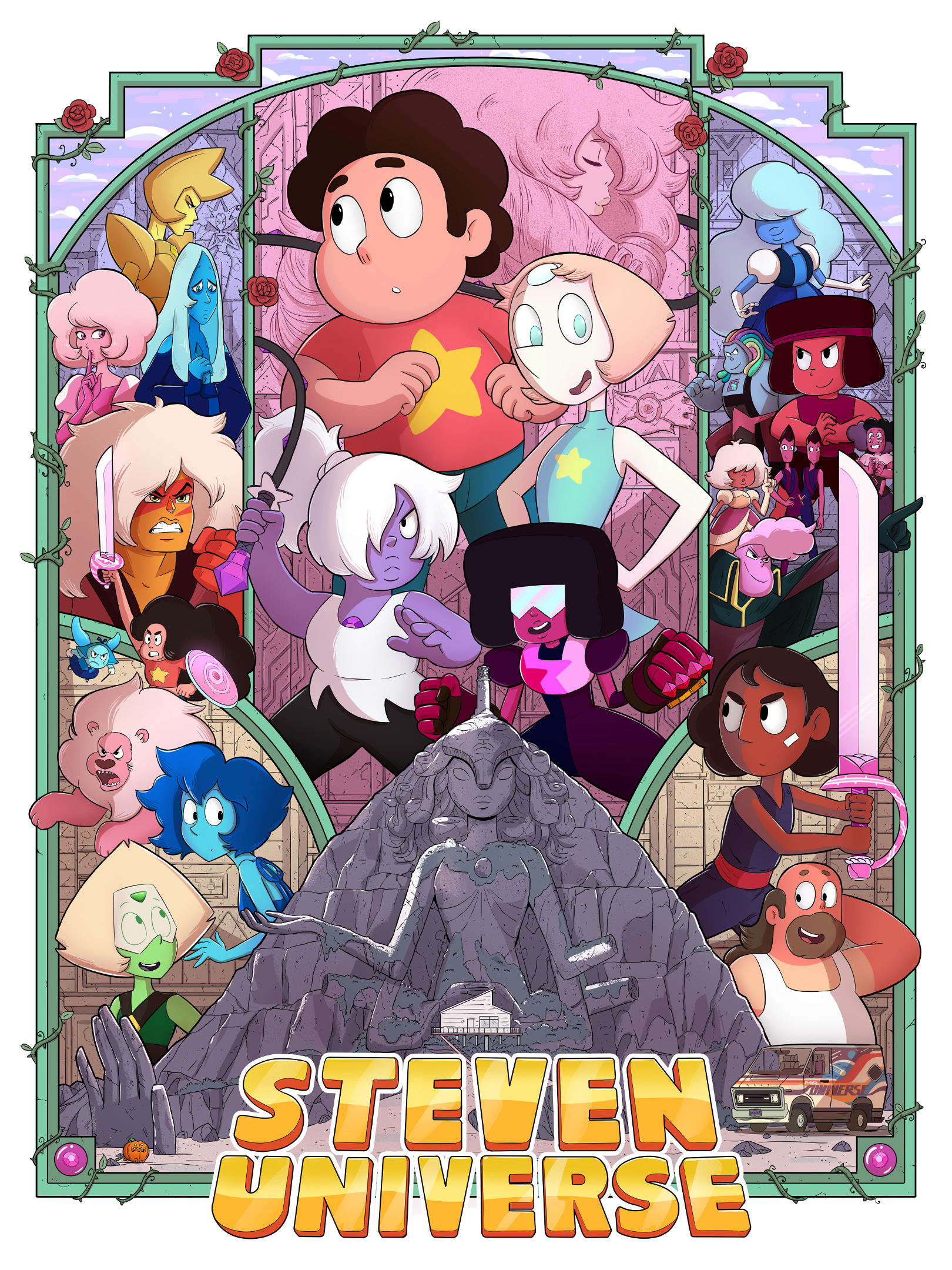
Poster final feedback & alt logos (Patreon)
Published:
2018-06-17 01:00:41
Imported:
2021-01
Content
I've gotten some really good suggestions from patreon members regarding the poster before, so I wanted to give everyone a last chance to help spot anything that should be fixed or improved before the art gets sent off to the printers. I don't want to make any major changes to the overall layout, but if anything looks kinda off or something, let me know because I'd rather fix it now than regret it later.
Anyways, a good recent suggestion was to maybe offer versions with different logos. Does anyone prefer the official logo? What about the Japanese logo? Let me know if you think any of these should be available.


Files