Home
Home

 Artists
 Search
 Recent
 Random
 Posts
Posts
 DMs
DMs
 Tags
Tags
 Random
 Importer
 Import
 FAQ
FAQ
 Account
 Register
 Favorites
 Login
Login

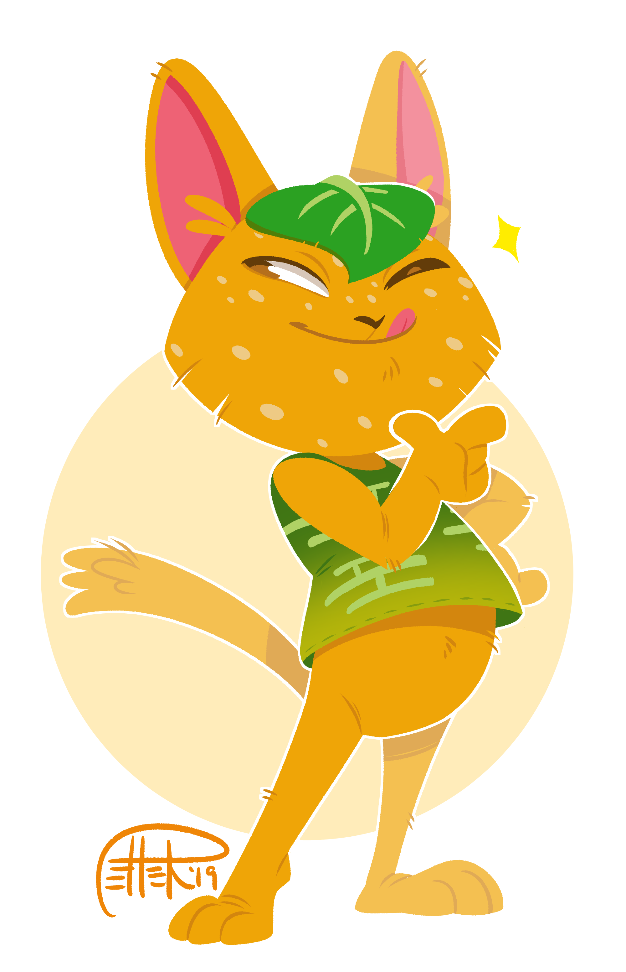
lineless tangy - heavily commentated walkthrough (Patreon)
Downloads
Content
i decided to publish my first walkthrough/tutorial to give insight on my process and a few tips and tricks! and i'll only go on a few tangents, i swear! (don't worry, most of my walkthroughs won't be this way and will be more step-by-step series of images. this is just for the few who might be looking for a tutorial)
today i'm sharing my process of this lineless piece i did of tangy from animal crossing. PSD download will be included as an attachment if you wanna dig through my layers and see how it was put together, or follow along
the process was in clip studio paint, but the meat of my lineless technique can be done in photoshop or paint tool sai since it's all pretty straightforward. there are a few tips and tricks along the way that may be CSP specific, but i imagine they could be replicated in other software as well
first is SETUP. here's how i get set up to color a thing:

my sketch is usually fairly high-resolution, because the larger you work the less visible small errors in your work are. that's something to keep in mind in general!
you'll notice i changed the background color to a purple color here. this is just to see what i'm doing when blocking in, and also to be able to see more easily when pixels within nooks and crannies are left uncolored after a fill. if the character was very dark in color i'd just leave it white instead
for blocking in, i'm fond of the 'real g pen' default tool in clip studio - it has a nice texture to its edge. but you can use any hard brush you like to block in!
blocking in for me looks kind of like this:

you can see the lines are kind of all over the place in the first part before i fill. that's because here i'm using fast, loose strokes, concerning myself more with following the direction of each edge and form than just outright tracing my sketch in a calculated way
to me, the fun thing about lineless over inking is that you can be quite loose and only really have to worry about the outer edge of whatever it is you're getting ready to block in. you don't need to worry about the width/weight each stroke so much, and you have the choice to either do edges to fill in like i did here, or just grab a fat brush and blob in your shapes. after a fill or blobbing, it's fine if it's not perfect, because you can simply erase to trim up the edges of your shape and make it look right after you do your filling! erasing is as just important to my process as adding
MOVING ON, i block in the shapes of the head and the tummy+front leg in one layer, since they're all related objects that aren't overlapping too much. i'm considering these the central parts of the character, and they will serve as a basis for where to place other parts in the layer stack (whether behind or in front). basically i'm separating objects in my mind based on their depth. here's where i'm at:

now using the same blocking in methods as before, i work on the parts of the body behind the previous ones. i choose a darker color to differentiate them from the ones in the front
couple more tips: it's helpful to hide the sketch from time to time to make sure the edges of your shapes doing what you want them to do and the silhouette is shaping up how it should! additionally, temporarily hiding an obstructing color layer or lowering its opacity can be really useful too, so you can see what you're doing beneath it. and remember you can be as messy or nonsensical as you like in areas that will be covered by other objects

it's coming along! now to do the same with objects in front of the body. i create a new layer above body for the leaf AND the shirt (they aren't touching so they can share a layer), then another for the other arm.

silhouette looks okay! now i can move on to the face. i generally like to make a folder for this (positioned directly above the layer containing the head) since i prefer to make the face in multiple layers. it keeps things organized since i can collapse a folder when i'm not editing it. for the face, i usually do line stuff like eyelids+mouths on one layer, and take care of any stuff adjacent to those lines that in layer(s) below

here's a lil tip on how i go about cleanup and essentially erase the same way i add, even using the same textured tool:

using the pink of the ears as an example here, i can erase parts of it away to show the orange of the head in a layer beneath it to fake that i've 'drawn' in the fluffs of the ears. since i use my 'real g pen' tool as the eraser, the grit texture of the line is consistent to all the other parts of the drawing. this is basically the only way i erase/clean up during my process since line consistency is a must for me and the actual eraser tool is just too smooth for my tastes. i use that "c" hotkey almost as often as "ctrl+z"!
anyways, now each individual part of tangy has form, i can alpha lock each layer (aka transparency lock, lock transparent pixels, etc) and start adding in the other necessary colors (markings, etc) as well as choose a slightly darker color to the base one to add juicy bits. there are 3 things i like to put in with the darker color in this process:

1. straight up detail - things like fur tufts, wrinkles or folds, etc
2. separation - lines to differentiate adjacent forms of the same color. for example in this picture, lines between the toes, or the lines i added around the front thumb since you wouldn't be able to tell where the face ends and the thumb begins otherwise with the overlap. separation and form definition is generally what your average lineart does, but we're doing a very minimalistic version of it here
3. simple shade - blobs of cell shading in essential areas such as under the shirt, base of the tail, etc. i don't usually go too far with shadows in this style, but a little bit can go a long way
with these 3 things in mind, in addition putting the secondary colors where they belong, i chug right along giving each layer the same treatment! alpha lock > color > detail. eventually i reach the 'i could be done now' stage!

this could be the end if i wanted it to be. but there are a few things i like to do to spiffy up an image
time for extraneous bits!
usually i like to add that little outline to the outer edges of the character. this can separate your character from any background you put them on, make them look kinda like a sticker, or just help unify the image. the color can be whatever, but i usually go for a lighter color. in this case, white
i have a funky method for achieving this outline, but it works for me:


awesome! now she's easy to place onto any background, present with a transparent background, etc. i decided to change the background color back to white, and plopped an ellipse of color behind as i always do, yknow
something else that's often part of my process is adding simple rim to objects up front to make these objects pop a bit more. basically it looks like an extension of the outer line (and is always the same color), but it goes inside the object as well. i add these lines using a clipping mask (aka clipping group, or 'clip to the layer below') layer above the folder containing the character, then trace along some of the forms like this:

it's easy to go overboard when you're having fun with that method, but i gotta remind myself sometimes that less is more and this is supposed to be as lineless a piece as possible. i try to use the rim sparingly!
similarly to making things up front pop, i will sometimes attempt to pull certain things that are behind a bit further back using this method (again, using a clipped layer):

sometimes i use a light color, sometimes dark like shading. it depends on the mood, background, color of the character etc to decide what color will be suitable. you could even play around with layer blending modes for different effects
all these combined got me to this final image!

i guess that concludes my EXTREMELY long-winded commentary!
i hope someone out there will be able to take something useful from this. it was actually somewhat satisfying to put together, so i look forward to sharing more process stuff in the future (with the added benefit of less blab). btw i'm very open in general to share my art methods, so if anyone ever has questions on how i handle specific things, don't be afraid to shoot me any questions and i'll do my best to answer!
💖💖💖
Files