Home Artists Posts Import Register

Content

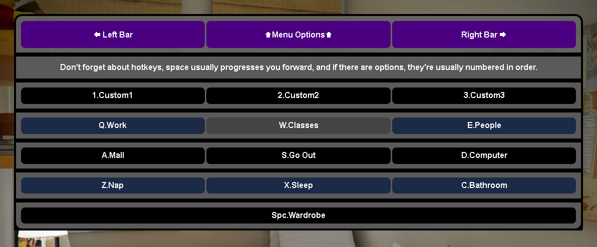
So I'm working on making the UI a bit sleeker and less bulkier, and someone recommended I do a color scheme something like this, but the actual colors are still up in the air. Do you like it? Hate it? Want to see a different color or idea? Let me know in the comments below.

Files

Comments

Wild Bill

The relevant part being the alternating colours I take it? That can be helpful in some circumstances, more so in a table where following rows is important but if the colours are consistent it could still help quick identification of buttons. One thing I've always thought was weird about the design is why each row is in its own box? That's pretty non-standard UI design.

Austinhaney6969

That was mostly so they didn't run into each other and look like a garbled mess. Not sure how well it works in practice... But I think it "looks" alright at least.

Princess Narii

So as an ITguy Id say: Looks nice and sleek like the new colors they work well. Uhm as a sissy id say: Not enough pink in there xD haha

Wild Bill

I'm not sure what you mean by 'run into each other'? Like they didn't have enough padding between the rows?

Austinhaney6969

More like, because they were the same size and shape, I'd either have to have something separating them, or some sort of color difference so that at a glance they wouldn't just blur together.

Wild Bill

Normally you would just have the padding separating them, and the background being of sufficient contrast to the buttons. Alternating colour rows would help with that a bit if it needs it.