Home
Home

 Artists
 Search
 Recent
 Random
 Posts
Posts
 DMs
DMs
 Tags
Tags
 Random
 Importer
 Import
 FAQ
FAQ
 Account
 Register
 Favorites
 Login
Login

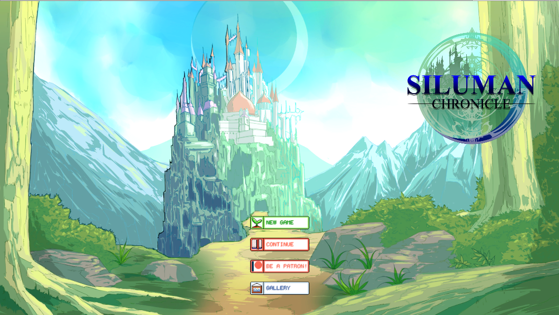
About Title Screen (Patreon)
Published:
2017-10-29 12:34:00
Imported:
Content
At least here is the title screen we designed.
There is also another 2 variation.
Which one the better one do you think?


Files