Home Artists Posts Import Register

Content

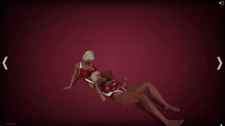
I wonder, how self-explanatory is this Finisher Screen UI? I'm trying to keep the screen for punishment after the fight as simple as possible, so big buttons would not distract you from the action :D
Is it clear that with left/right arrows you can switch between different "finisher cards" while the exit button in the upper-right corner will... (wait for it) exit the finisher mode?

Files

Comments

Frank Baum

Having read the post, it is clear. However, I am not sure it would be clear if I didn't read the post. I like the concept of hiding the big buttons. I will admit it openly: I am not into this game for its big buttons. But that may just be me. What might help is a small explanation when hovering the mouse over the icons (like "next finisher move" or "previous finisher move" or "Exit fight"). The right and left arrows may be misinterpreted as rotating the view and the exit sign may be overlooked.

Anonymous

Could there be so way for the finisher mode to be more of a build up and scripted or the transitions more smooth somehow? I find that the cards don't always align in a way that would add to the realism... As regards the button it may not be obvious at first but I'm the type of person who likes to click on things to discover what things do so I'd likely figure it out on my own!

nakedfighter3d

I’m not sure I fully understand what’s “buildup and scripted” but apparently the answer would be no, there is no way, unfortunately

nakedfighter3d

“Explanation on hovering” aka tooltips are already there, they just didn’t show up on the video 😅

Luccassor

The left and right buttons are pretty intuitive (although I don't think that adding some text beneath them for 'Next' and 'Previous' would detract from anything), but I do think that the 'exit' button could be maybe 4 times larger or else people might miss that it's up there (likewise, it could also use an 'Exit' text underneath it) With the above said, I would personally miss having the Finisher selection library since I'd prefer being able to choose which Finisher to see next, even if that might be 'distracting' - maybe make it a minimizable drop-down box if possible?

nakedfighter3d

Yep, adding some text sounds like a good idea! Actually, I had a plan to add proper selection of finishers but for now, I just want to have something fast and simple enough so I can spend time on other parts of the game :D