Home
Home

 Artists
 Search
 Recent
 Random
 Posts
Posts
 DMs
DMs
 Tags
Tags
 Random
 Importer
 Import
 FAQ
FAQ
 Account
 Register
 Favorites
 Login
Login

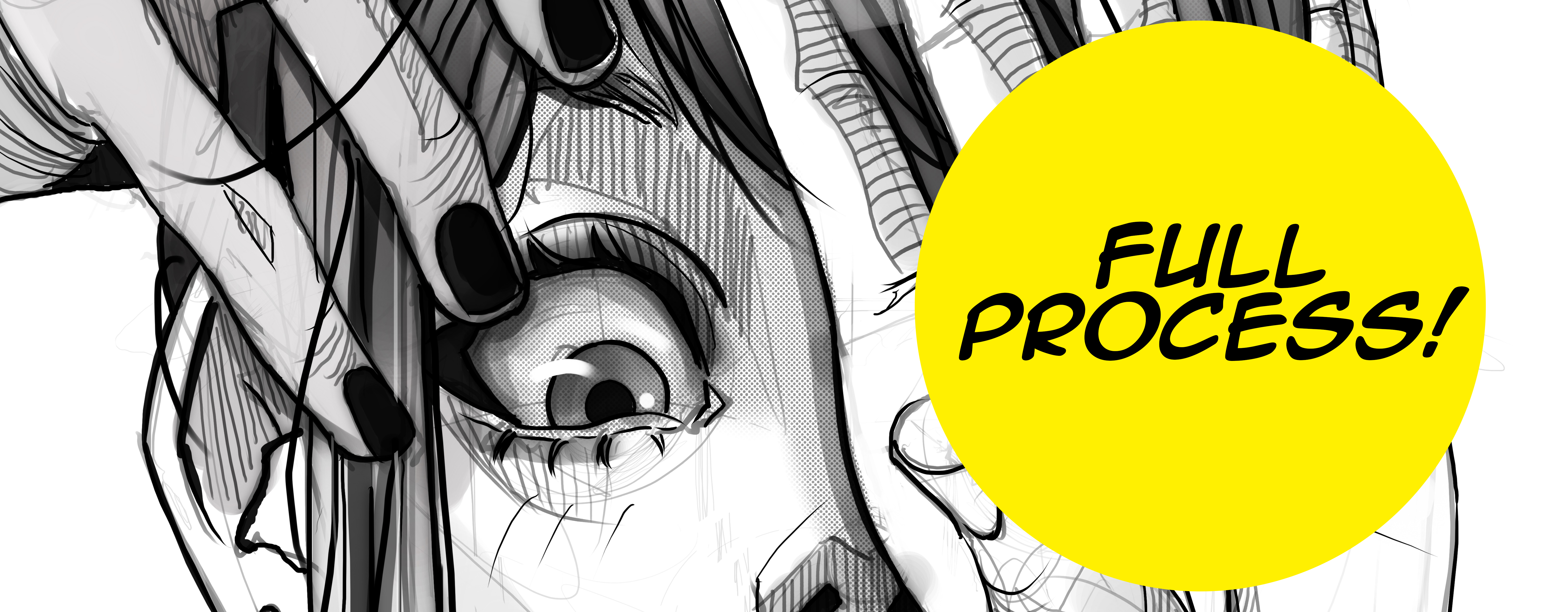
Portrait tutorial (brushes included!) (Patreon)
Downloads
Content
By popular demand, here is the complete tutorial on how to draw a portrait using my style! Here you will have access to high resolution images of each step, with their respective explanation, and as a gift, my pack of brushes!
Keep in mind that this tutorial and brushes are mant to be used in Adobe Photoshop.
Thanks for your support!
And now onto the detailed step by step process!
Please refer to each numbered image and its respective counterpart properly listed below.
LET'S DO THIS!
Before we begin, and to guarantee an adequate workflow, it is important to organize each step in layers.
The canvas size is 6393px X 7320px. When you are finished, make sure to export using the Save for web option, and then setting 1350px on the longest side.
This is to ensure that instagram does not lower the quality of the drawing.
1.- First things first, we need a base sketch! Using the Sketching brush, (Opacity: 80%, Flow: 80% and with the Always use Pressure for Opacity option activated) and with a soft gray color, proceed to loosely sketch the portrait.
2.- With our sketch ready, create a new layer above, with Multiply mode, using the same Sketching brush, (Opacity: 100%, Flow: 100% and with the Always use Pressure for Opacity option deactivated ) now with a pure black color. Set the sketching layer transparency to 40% so you can properly "ink" the image.
Don't worry, after you finish, the image may look flat, with no personality, but trust the process!
3.- Now we move onto a very important aspect, the "line weight"! Again, create a new layer, with Multiply mode, using the same brush as before, and proceed to accent the lines in areas where they overlap, such as eyelashes, nostrils, the lines of the neck, some hairlines, etc. You can always browse the web for references, don't forget that.
This will give our piece more dynamism and line contrast.
4.- In a new layer, multiply mode, add some details with the same brush as before, such as the lines of the hands and fingers, extra hair strands. some shadow shape guidelines (this will help in the next step)
You can play with the brush size to add even more life to the piece! Remember that the line guides the eye.
5.- Now let's return to our sketch layer and raise the opacity up to 75%, and now we can begin to see a more solid piece! But we are just getting started! Now is were the magic begins!
6.- Create a new layer over all, and here with the sketching brush (Opacity: 80%, Flow: 80% and with the Always use Pressure for Opacity option activated) and with a soft gray color, we begin to use something similar to the Cross Hatching technique, to add volume to our portrait. How to to this? basically we draw lines following the shape of the object. For example, regard the finger as a cilinder, and start throwing lines following that path. (See the cross hatching attached image ofr reference)
This is a very personal touch I like giving my portraits.
Remember you can also play with the direction of the lines! Sometimes they work better following different directions, but thats more of a personal taste thing. You are more than welcomed to experiment!
7.- Here is a secret: duplicate the ink layer, put it to Color burn mode, and add a Gaussian blur, 15% ip to 25% is okay but you can play with it. This will discretely enhance the lines giving more in depth shadows! You can always experiment with the opacity of this and the sketch layer. It's up to you!
8.- Now we move onto one of my favorite part: the halftones! A very characteristic aspect of the manga style illustrations, is definitely this!
Create a new layer below the sketch one, and using the Halftone texture brush (Opacity: 100%, Flow: 100% and with the Always use Pressure for Opacity option deactivated) with a dark gray color, start giving shadows to the darker parts of the portrait, around the eyes, neck, and some parts of the hair. This also relies on personal taste so don't be afraid to try shading different areas but don't overdo it!
9.- Something that helps me a lot, is to create a selection for the hair, and in a new layer, give it a base color. Trust me, this helps A LOT in the final stages.
10.- Now to add more shadows. Create a new layer below the halftones one, using the Round brush with a very low opacity and flow, around 15% and with a light gray color, start painting delicately the areas where the shadow rest. Follow the reference. This is because if we shade the whole portrait using the halftones, it may become a noisy image. We avoid that by using 3 shading methods: the cross hatching, the halftones, and the light grays with the round brush... and also our blur layer will continue to enhance our piece!
11.- Now its just adding details, onto a new layer we go and we add things like hair strands, eyelashes, maybe more shadows in our shadow layer, a line here, a line there, lights with pure white color, hair shading (remeber the hair selection we made before? This is the time to use it!) to deepen even more the overall look of the piece, 'et voilà!
12.- The final step is for special arrangements, such a portrait framing or modifying some parts of the drawing. For this, group all the layers, duplicate this group to have a back up just in case, and then merge the first group.
For bigger halftone textures, you can use the provided image (halftone.png)
With this done, you may want to increase the size of the portrait a bit, or maybe do some magic with the Liquify tool, its totally up to you!
And that's it! I hope you find this tutorial useful, its the first time I make one, so please if you have any doubts don't hesitate to reach out! I will be glad to help!
Thank you!
Files