Home
Home

 Artists
 Search
 Recent
 Random
 Posts
Posts
 DMs
DMs
 Tags
Tags
 Random
 Importer
 Import
 FAQ
FAQ
 Account
 Register
 Favorites
 Login
Login

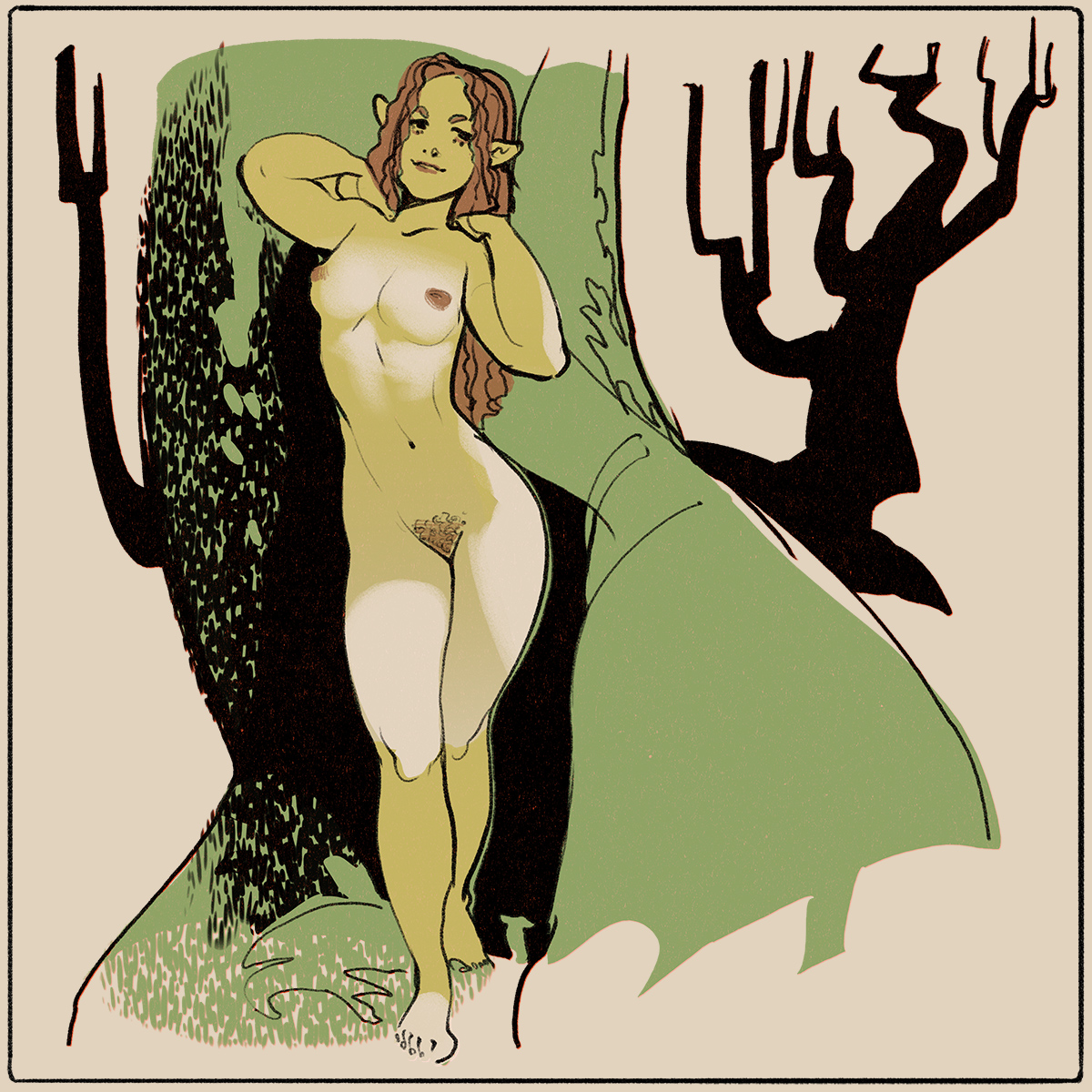
Dryads (Patreon)
Content
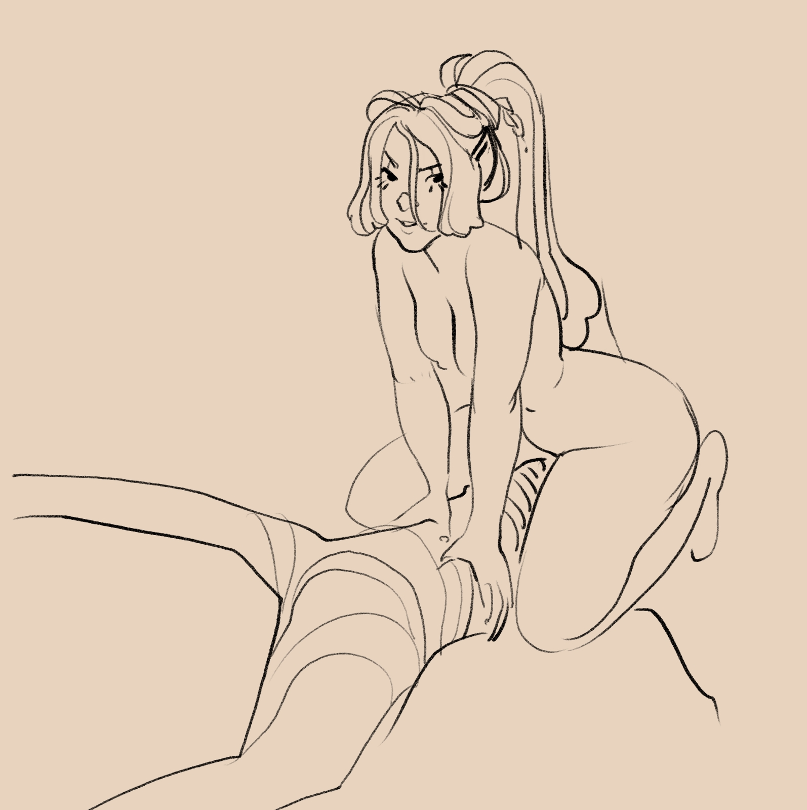
I think you fine folks might just be seeing the ugly part of my process for the next week or so where I'm trying to just draw in circles until I stumble upon the unifying idea that makes all this stuff make sense to me and fall into place.
It happens on every project and the solution usually comes from trying to simplify and find a aesthetic benchmark to stick to. Right now I'm a little all over the place on this and I apologize for the false start, but it just happens sometimes.
It's that moment when I realized that Bilibin/Dulac would be a great aesthetic to layer over Zelda and Urbosa and also a great restriction of alternate compositions page to page from 1 to 3 panels.
Right now I just keep staring at Smokey the Bear and wonder what I can take away from it and apply to smut. Thank you for your patience as I go through this frustrating stage in the project. I think I may just make a short, sloppy comic just to explore one corner of this creative problem over the next couple of days.

Thank you all for supporting my work even when the output is kinda stop and go. October has been a way more difficult month than expected for me.
Winton.
Files