Home
Home

 Artists
 Search
 Recent
 Random
 Posts
Posts
 DMs
DMs
 Tags
Tags
 Random
 Importer
 Import
 FAQ
FAQ
 Account
 Register
 Favorites
 Login
Login

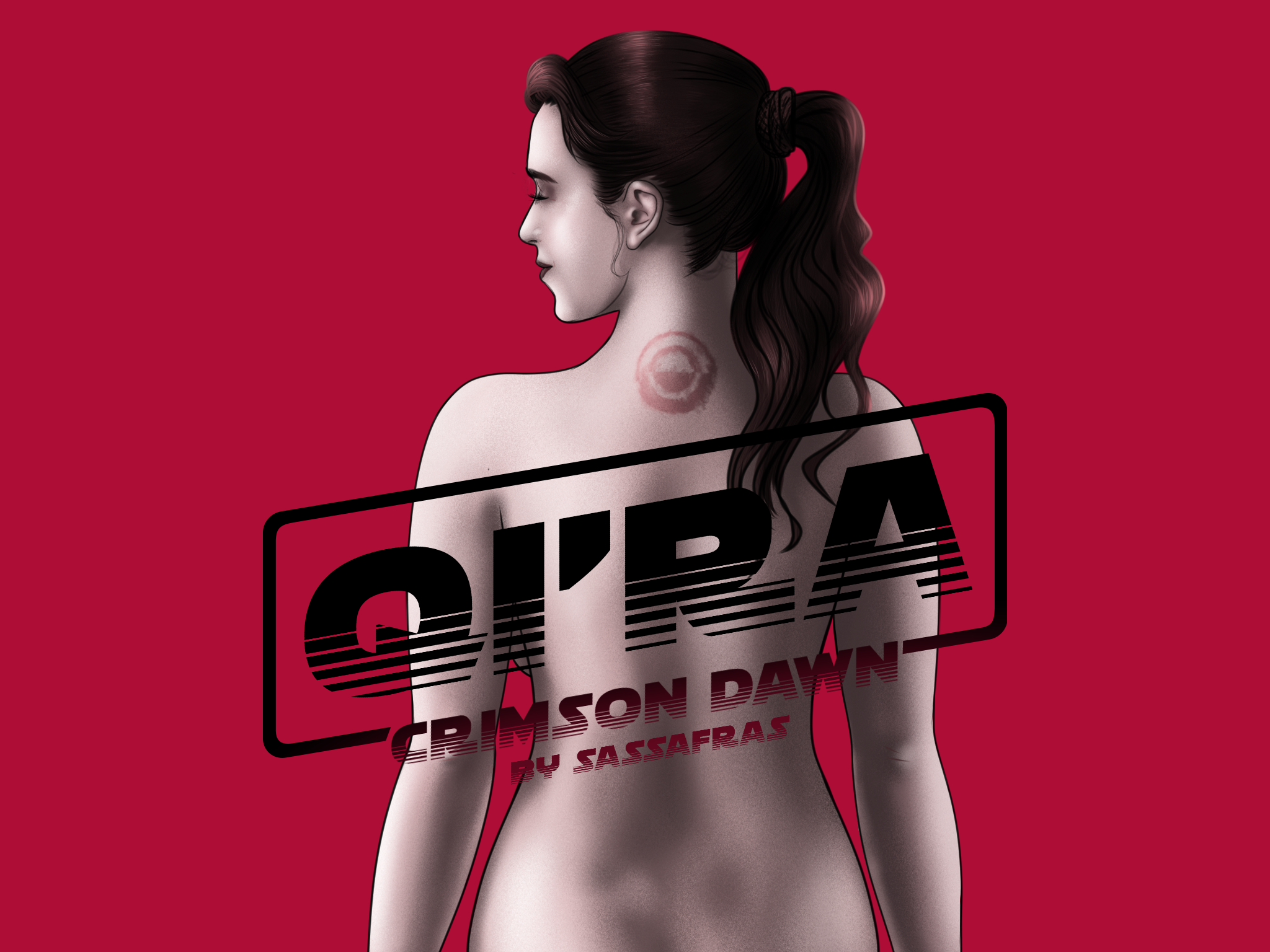
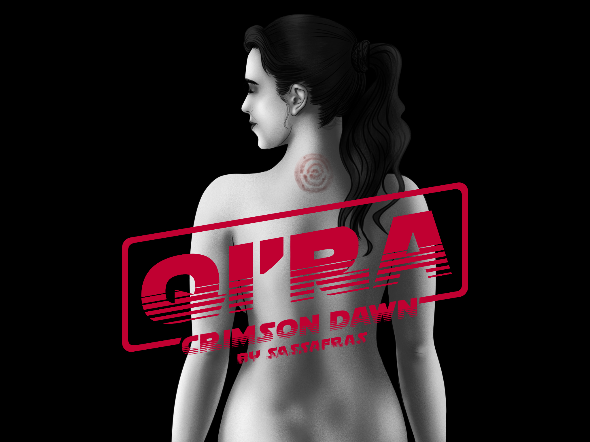
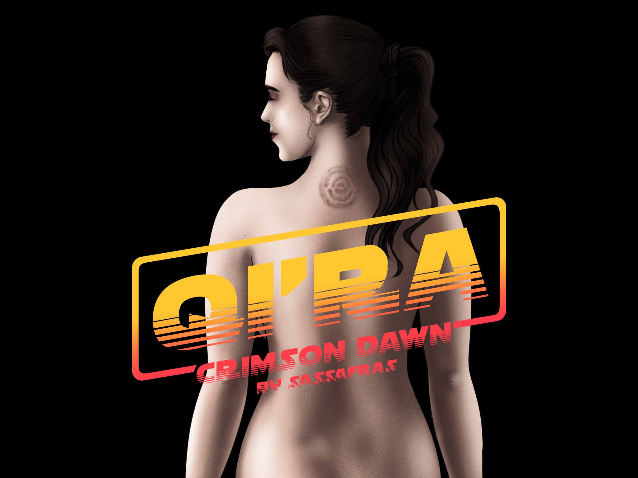
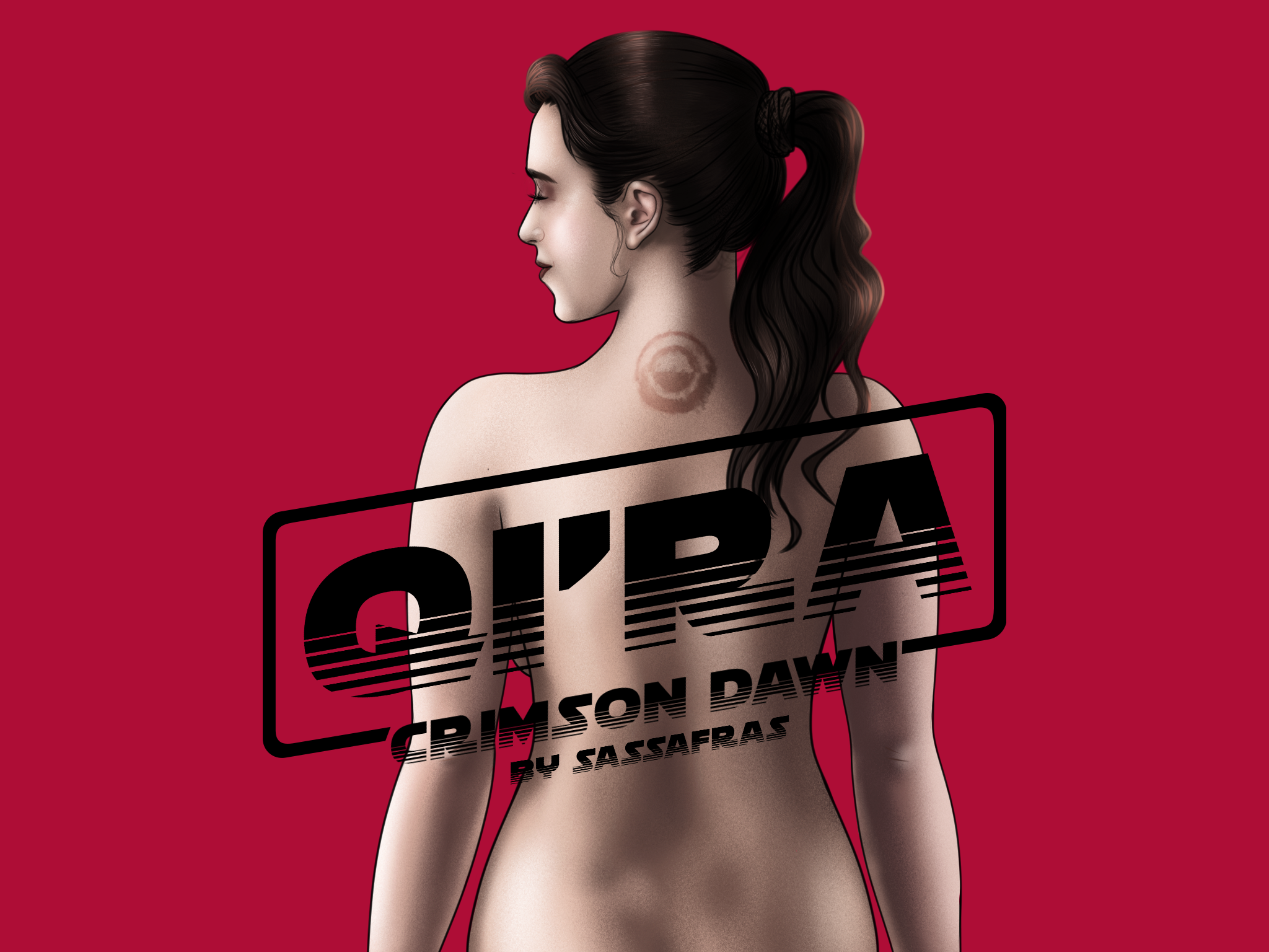
Crimson Dawn Cover (Patreon)
Published:
2020-08-24 13:18:33
Imported:
2022-02
Content
In the homestretch now, one page to finish, two more to draw, a few bonus sketches and it will be ready to go live. Sorry for the lack of posts, final few requests from the poll coming later or maybe tomorrow after university.
As for the cover, suggestions welcome to make changes for the final one, colour wise it’s a bit tricky to figure out. First one is the most recent, others are older ones before final changes were made, but just showing off different colour scheme possibilities.
Files