Home
Home

 Artists
 Search
 Recent
 Random
 Posts
Posts
 DMs
DMs
 Tags
Tags
 Random
 Importer
 Import
 FAQ
FAQ
 Account
 Register
 Favorites
 Login
Login

2nd & 3rd place (January 2020 Contest) (Patreon)
Content
This time there were actually three entries, it was difficult to choose, all had something going for it. But eventually i decided on the first place, it will be quite interesting to draw.
Funnily enough, all three entries included yuri content. Which of course i personally love(but it wouldn't have been a factor in the decision who wins! Personal taste isn't a criteria I judge by)
The second place was really difficult to tell with just a single artwork. But maybe one day it will get resubmitted to a contest and will be made then.
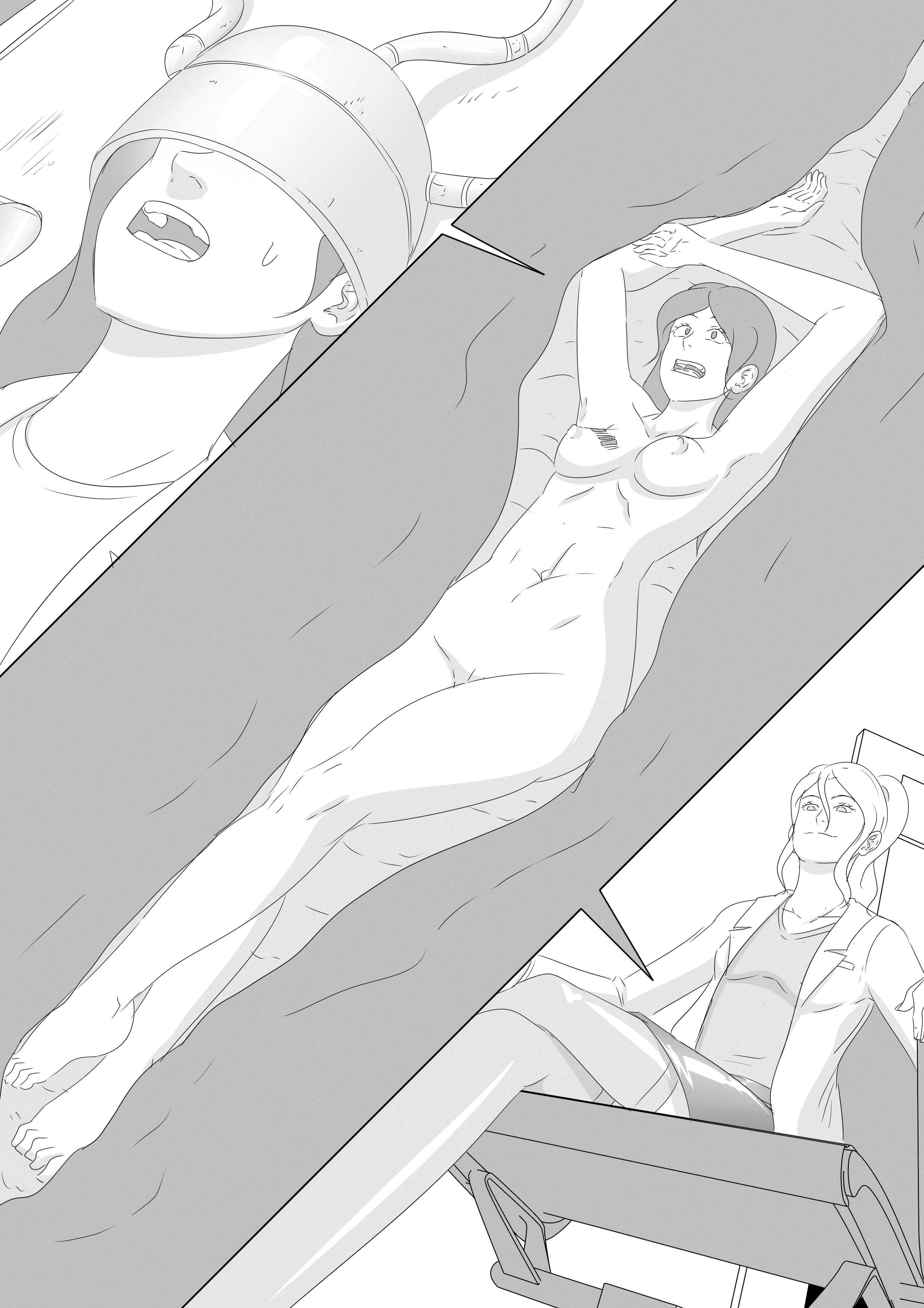
The third place is a sequel to My Friends Mom. It was this moment in the story that i really liked.
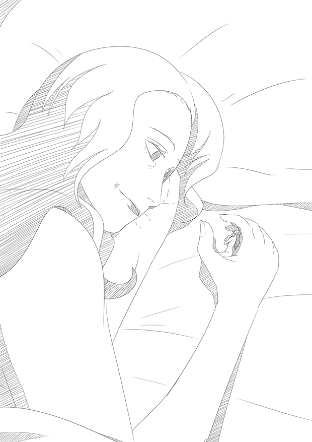
After finishing the 3rd place sketch i started on the 2nd place one, at which point i was thinking to myself, that i wanted to give the stockings on the bottom right a glow-like effect i have seen a few times in manga. Thus after looking up references and experimenting a bit, i decided to do the shading with fake-screentone instead of the hatching method.
I think i may do this one for the 1st. place comic as well, as it will have 9 pages, thus i need to cut time a bit. Whether it will look or better, i am not really sure. When i did the screentone method on my free patreon, me and others agreed the hatching method looked better, but here in this experiment i think the screentone looked better. Maybe it's simply that if there are more details, then the screentone version looks better?
Files